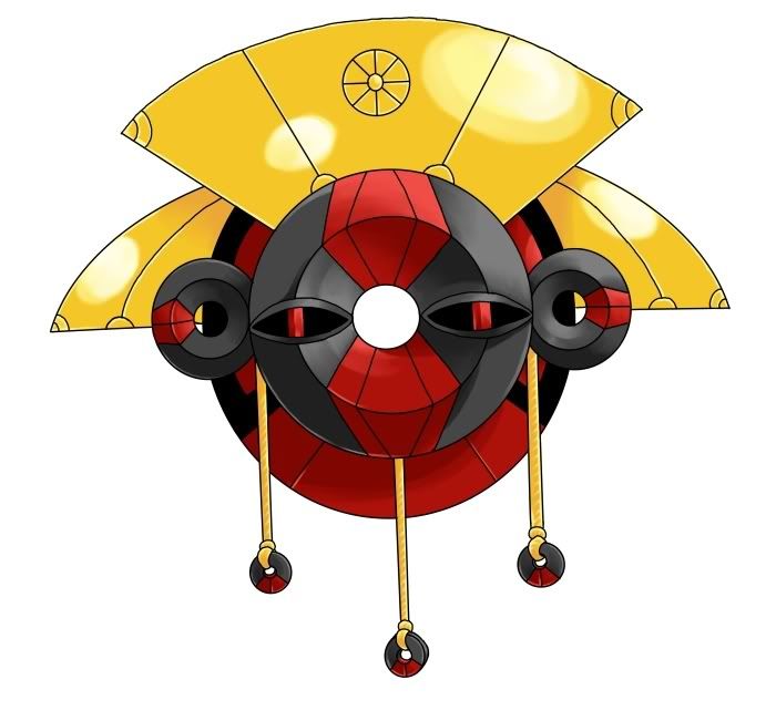
I am an unabashed Flygon fanboy, and one of the coolest things about Flygon are those see-through eye coverings. The goggles on my Planet design certainly derive from my penchant for that look.Looks like the goggle eyes are back from the first one doug :P
My favourites so far would have to be either Kopies, Regi's or Dougs.
The goggles actually started as a clear glass "helmet" that covered the head and eyes. I wanted to add something to the basic planet sphere to make it look "astronaut-ish". Unfortunately, the helmet made the design look less like a planet, and more like a floating head with a weird belt or something. Not good. When I erased the top of the helmet, it reduced the visual distraction from the overall "planetary" look. That "half helmet" gave rise to the idea for the stylized "wraparound goggles" you see in the design.
I'm glad to see you've been paying such close attention to all the CAP art polls! Or did you "cheat" and just notice the similarity because of my semi-recent posting of past CAP designs in my art thread? Either way, I'm glad someone out there notices my stuff. Thanks for the compliment.