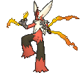
Or you could just edit the flying pose so that it included a few dramatic flaps every now and again, so that you could really see both the menacing side of Skarmory (the bloodred underside of the wings) and have the bird compete easily in sky battles.I think that could have been "solved" by having all Pokemon eligible for Sky Battles have an idle pose where they are on the ground, for other battles. Well, at least for those that could be on the ground. At least these awkward poses would not be seen all the time.

-
Welcome to Smogon! Take a moment to read the Introduction to Smogon for a run-down on everything Smogon, and make sure you take some time to read the global rules.
-
Congrats to the winners of the 2023 Smog Awards!
Let's talk about Pokémon designs
- Thread starter Codraroll
- Start date
While there are many legitimate criticisms towards the jump to 3D models on pokemon designed with 2D sprites like
1. The forced Sky Battle poses for many flying pokemon
2. Washed out colors
3. Exposing awkward geometries that the sprites used to obscure
4. Gas textures like Musharna, Torkoal, Weezing...
I do stand that the models are really great for Pokemon as a whole. It's hard to see if you only look at the stand-by model, but factoring in all the other animations and these are the most living models we've seen so far.
Cobalion would be fine if it weren't for its weird boot feet, actually. They don't look right or make any sense in any form-- sprite, artwork, model. They're so shapeless, without a distinct joint which makes the bent leg in its artwork looks like floppy noodle (it also really bothers me that so much of Cobalion's appearances mimic this pose, making it seem as if it has 3 stiff legs and 1 noodley leg that can't its own weight). Its back sprite makes it look like the foot bends at the black "toe" making the "heel" a very stiff and predominant portion of the foot. Its feet look less like boots and more like leg casts. Large, clunky, with highly limited movement. The black slabs that are the "toes" are so undefined they don't look natural at all.While I normally disagree with "genwunners" and the like who claim that all of the new Pokemon designs are terrible, I would like to address one thing that I feel has been happening more with later generations: overdesign.
There are a few Pokemon that I would call slightly overdesigned: Sylveon, Sigilyph, Palkia, Haxorus, Xerneas, Barbaracle (OK, Barbaracle's just plain ugly), but let's look in particular at the poster children for overdesign: The Kyurem Formes.

First of all, I understand what they were going for. They're supposed to be (possibly unnatural) fusions of Kyurem and one of the Dragons. But the designs are just so busy. You have tubes whose purpose I can't imagine, big chunks of ice seemingly glued on, and massive tail generators. (That's a complaint I have with the Unova dragons in general, actually - the tail generators look incredibly out of place and impractical for actually moving around.) Kyurem-B is the worse one in my regard, both due to Zekrom being fairly overdesigned itself and the fact that they just couldn't decide on a scheme for its wings and arms - one of each is Zekrom's and the other is Kyurem's. Wouldn't it make at least a bit more sense to give it Zekrom's wings and then Kyurem's arms (or vice versa)? This also happens with Kyu-W, but not nearly to the same degree. I feel like when GF designed it, they were just thinking "It doesn't look legendary enough. Why don't we just add more stuff to it?", the end result being something that doesn't even look like a Pokemon. Indeed, the Kyurem Formes are the perfect examples of what happens if you try too hard.
But I'm not one to rant. And Gen V's legendaries aren't all clunkers - For example, Cobalion.

Now this is an example of legend design done right! It has a simple colour scheme, being mainly blue with lighter feet. This gives it the appearance of boots, which is a very nice touch in my opinion. Cobalion is often depicted as the eldest and wisest of the Swords of Justice, and its long white "beard" and stoic gaze excellently complement that. Most importantly, though, there isn't a lot going on with it; only the horns, beard, and fins on its front legs.


Let's compare to his pal, Virizion

Virizion's 'boots' look a lot better because they look way more like a single toed hoof thanks to the size and shape of the boot (more pointy, the toe looks like less bendy). Compare the 'heel' in the linked picture of a horse's hoof to Cobalion's hooves, and you'll see why it bothers me so much. The 'ankle' should not reach the ground (Virizion still has this issue, but not nearly as bad).
Terrakion bypasses this issue by having hooves based more on a rhino or elephant, which are very thick, stalk-like, and flat, so it works. But Terrakion also has no neck so you win some, you lose some.

Terrakion is literally an ugly human face bulging out of the chest of a headless horse body.
Arceus, I have a ton of stuff to add here. But first, before I get to that, I want to talk about stuff people have already talked about where I haven’t heard what I think about them yet, so I’m dropping my own thoughts about them...
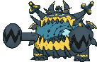
1) Garbodor
Honestly, I love Garbodor for the same reason so many people hate it: it’s hideous. It’s clearly designed to be as hideous as possible. From the beady eyes that look derpy and stupid, to the deformed trash hand, to all its pokedex entries just making it sound like just the most disgusting thing ever. And nobody knows where those pink and blue spots came from.
It’s overall just really trashy and disgusting...
...just like real trash.
It’s like they took the idea of trash, and did their absolute best on selling the idea of trash, really painting a picture of what trash would be as a Pokemon. And they nailed it hard.
2) The Klink Line


So Klink. It’s two gears that move. At first that seems kinda dumb and silly, but think about where you catch it: Chargestone Cave right? With all those weird magnetic and electric rocks everywhere? Probably the same kinds of rocks that spurred ancient Joltik and Galvantula to become electric types? Is it really that much of a stretch to assume that these same rocks spurred a pair of gears to become living creatures?
To me, Klink perfectly represents the wonders of Chargestone Cave, and reinforces the kind of ethereal otherworldliness of that location in Unova. So not only do I like Klink and its evos, they even contribute to worldbuilding too!
And the very mechanical and weirdly simple designs they have reinforces that. Why does Klinklang look like just a bunch of gears slapped together? Because it literally is a bunch of gears slapped together. It’s not supposed to look like it can survive. It’s not supposed to exist. It’s a freak of nature. It exists through pure accident. An accident by Chargestone Cave’s hand.
Now what the heck Klink and its evos would be doing in Kalos is beyond me. But that’s less an issue with Klink itself and more an issue that Pokemon likes to reuse concepts that are based on a specific event without justifying how that happened again. It’s stupid with Klink, and it’s stupid every time they’ve done it, but HEY, PEOPLE LIKED THAT STUFF, SO WE HAVE TO THROW IT IN ANYWAY!!!
3) The Vanillite Line


This design also makes sense to me. Much as the electricity in Chargestone Cave gave Klink its sentience, so too did the cold of that Unovan Freezer give Vanillite its sentience. Then again, I believe the lore says that Vanillite have been around for a long time, so I guess that’s not the case? So exactly why they’re around beats me. And I'd definitely like a clearer answer on that, because origin stories always fascinate me. But until then...asking why there’s sentient snow-cones is a lot like asking why there’s sentient sludge, and the answer for that is the same: because there just is. This is a weird wacky world with weird wacky creatures that form through weird wacky ways. That’s just how this world works. It’s happened all the time, and it will continue to keep happening. Good enough for me.
As far as the design itself, it’s clearly designed to be cute ice cream. And well...it’s ice cream. That looks cute. Vanillish looks a little weird, what with its blank stare and slightly deformed mouth. And Vanilluxe gets even weirder, looking like it tried to split into two but failing. Does this mean they reproduce by budding? Maybe.
Also notice that in the Gen VI moving sprites, this pokemon rocks back and forth progressively more slowly after every evolution. It's struggling more and more to move as it continues to evolve into increasingly unviable forms. What these sort of weird designs tell me is that, like Klink, these things aren’t supposed to exist. They formed through sheer accident, and are only continuing to exist through sheer dumb luck.
Honestly, I think the theme here is that these Pokemon all look creepy and unnatural because they are creepy and unnatural. They don't look like they should exist because, as far as in-game lore goes, they shouldn't exist. And there are a lot of pokemon in the Pokemon Universe that are like this.
Now, with that in mind, let's bring this back full circle. To the sixteenth post on this thread, on the very first page...:
4) Kyurem-Black and Kyurem-White
I agree. These guys look pretty darn weird. When I first saw them, I did think that they looked generally pretty cool, but I still always felt like something was...off about them. Something...unsettling. And LucarioMaster2 explains exactly why this is. Because of all the stuff they have on them, just walking around would be next to impossible for either form. I won't keep repeating LucarioMaster2's points, but the idea is that they look like unholy abominations that shouldn't exist.
I'm sure you know where I'm going with this by now.
They are unholy abominations that shouldn't exist. They were created when some jerk decided it would be a good idea to stuff a tao dragon back into Kyurem. And at first it looks like it worked too. You can see how Kyurem is trying its best to morph its other half to look like the half Zekrom or Reshiram took up as a result of the fusion. In addition, its base stats go way up, and now they're only twenty points lower than the literal god of all Pokemon. It looks like this thing is gonna potentially be powerful.
Also interesting to note that the Reshiram and Zekrom parts of Kyurem are taking up opposite sides: Reshiram on the left, and Zekrom on the right. This reinforces the idea that yes, these three really were one being once, to the point where if you try to reverse the split, they'll just naturally take up a specific side of Kyurem's body.
But that split happened a long time ago. And while they may have originally been one creature, they are very much their own beings now. It's too late to change the past. All you're gonna get by fusing two individuals together, especially by force, is just this awful looking thing, whose colors and design aspects clash horribly with each other as Kyurem and the tao dragon fight internally for control. They were once one before, but they're not now, and neither of them really want to submit to the other. Not again. Not like this. And almost certainly not now, when they've tasted the freedom of being on their own.
So even if at first it looked like fusing Kyurem back together would be a good idea, it's clearly been proven not to be. Reinforcing this is just how much weaker competitively either Kyurem form is compared to other pokemon with similarly monstrous stats. It has the raw power to get things done, but due to all the internal clashing and incompatibilities it suffers from, it just can't use that power well at all.
And the very fact that these forms are so over-designed and look like they wouldn't work or be practical just reinforces all of that.
Okay wow that was a lot longer than I was planning for this to be. I haven't even gotten around to answering the prompt yet. -sigh- next tiiiiiime...
I guess this concludes the "there are actually some brilliantly ugly Pokemon designs out there" segment of my design talk. Next time I'll answer the prompt, and then I'll go on to talk about how visual designs and typings can reinforce or contradict each other. Until then! I'll wait for like a couple posts to go by before continuing, don't wanna double post and all that, yadda yadda yadda. I know what you guys are like ;).
1) Garbodor

Honestly, I love Garbodor for the same reason so many people hate it: it’s hideous. It’s clearly designed to be as hideous as possible. From the beady eyes that look derpy and stupid, to the deformed trash hand, to all its pokedex entries just making it sound like just the most disgusting thing ever. And nobody knows where those pink and blue spots came from.
It’s overall just really trashy and disgusting...
...just like real trash.
It’s like they took the idea of trash, and did their absolute best on selling the idea of trash, really painting a picture of what trash would be as a Pokemon. And they nailed it hard.
2) The Klink Line


So Klink. It’s two gears that move. At first that seems kinda dumb and silly, but think about where you catch it: Chargestone Cave right? With all those weird magnetic and electric rocks everywhere? Probably the same kinds of rocks that spurred ancient Joltik and Galvantula to become electric types? Is it really that much of a stretch to assume that these same rocks spurred a pair of gears to become living creatures?
To me, Klink perfectly represents the wonders of Chargestone Cave, and reinforces the kind of ethereal otherworldliness of that location in Unova. So not only do I like Klink and its evos, they even contribute to worldbuilding too!
And the very mechanical and weirdly simple designs they have reinforces that. Why does Klinklang look like just a bunch of gears slapped together? Because it literally is a bunch of gears slapped together. It’s not supposed to look like it can survive. It’s not supposed to exist. It’s a freak of nature. It exists through pure accident. An accident by Chargestone Cave’s hand.
Now what the heck Klink and its evos would be doing in Kalos is beyond me. But that’s less an issue with Klink itself and more an issue that Pokemon likes to reuse concepts that are based on a specific event without justifying how that happened again. It’s stupid with Klink, and it’s stupid every time they’ve done it, but HEY, PEOPLE LIKED THAT STUFF, SO WE HAVE TO THROW IT IN ANYWAY!!!
3) The Vanillite Line


This design also makes sense to me. Much as the electricity in Chargestone Cave gave Klink its sentience, so too did the cold of that Unovan Freezer give Vanillite its sentience. Then again, I believe the lore says that Vanillite have been around for a long time, so I guess that’s not the case? So exactly why they’re around beats me. And I'd definitely like a clearer answer on that, because origin stories always fascinate me. But until then...asking why there’s sentient snow-cones is a lot like asking why there’s sentient sludge, and the answer for that is the same: because there just is. This is a weird wacky world with weird wacky creatures that form through weird wacky ways. That’s just how this world works. It’s happened all the time, and it will continue to keep happening. Good enough for me.
As far as the design itself, it’s clearly designed to be cute ice cream. And well...it’s ice cream. That looks cute. Vanillish looks a little weird, what with its blank stare and slightly deformed mouth. And Vanilluxe gets even weirder, looking like it tried to split into two but failing. Does this mean they reproduce by budding? Maybe.
Also notice that in the Gen VI moving sprites, this pokemon rocks back and forth progressively more slowly after every evolution. It's struggling more and more to move as it continues to evolve into increasingly unviable forms. What these sort of weird designs tell me is that, like Klink, these things aren’t supposed to exist. They formed through sheer accident, and are only continuing to exist through sheer dumb luck.
Honestly, I think the theme here is that these Pokemon all look creepy and unnatural because they are creepy and unnatural. They don't look like they should exist because, as far as in-game lore goes, they shouldn't exist. And there are a lot of pokemon in the Pokemon Universe that are like this.
Now, with that in mind, let's bring this back full circle. To the sixteenth post on this thread, on the very first page...:
Let's talk about this.There are a few Pokemon that I would call slightly overdesigned: Sylveon, Sigilyph, Palkia, Haxorus, Xerneas, Barbaracle (OK, Barbaracle's just plain ugly), but let's look in particular at the poster children for overdesign: The Kyurem Formes.
First of all, I understand what they were going for. They're supposed to be (possibly unnatural) fusions of Kyurem and one of the Dragons. But the designs are just so busy. You have tubes whose purpose I can't imagine, big chunks of ice seemingly glued on, and massive tail generators. (That's a complaint I have with the Unova dragons in general, actually - the tail generators look incredibly out of place and impractical for actually moving around.) Kyurem-B is the worse one in my regard, both due to Zekrom being fairly overdesigned itself and the fact that they just couldn't decide on a scheme for its wings and arms - one of each is Zekrom's and the other is Kyurem's. Wouldn't it make at least a bit more sense to give it Zekrom's wings and then Kyurem's arms (or vice versa)? This also happens with Kyu-W, but not nearly to the same degree. I feel like when GF designed it, they were just thinking "It doesn't look legendary enough. Why don't we just add more stuff to it?", the end result being something that doesn't even look like a Pokemon. Indeed, the Kyurem Formes are the perfect examples of what happens if you try too hard.
4) Kyurem-Black and Kyurem-White


I agree. These guys look pretty darn weird. When I first saw them, I did think that they looked generally pretty cool, but I still always felt like something was...off about them. Something...unsettling. And LucarioMaster2 explains exactly why this is. Because of all the stuff they have on them, just walking around would be next to impossible for either form. I won't keep repeating LucarioMaster2's points, but the idea is that they look like unholy abominations that shouldn't exist.
I'm sure you know where I'm going with this by now.
They are unholy abominations that shouldn't exist. They were created when some jerk decided it would be a good idea to stuff a tao dragon back into Kyurem. And at first it looks like it worked too. You can see how Kyurem is trying its best to morph its other half to look like the half Zekrom or Reshiram took up as a result of the fusion. In addition, its base stats go way up, and now they're only twenty points lower than the literal god of all Pokemon. It looks like this thing is gonna potentially be powerful.
Also interesting to note that the Reshiram and Zekrom parts of Kyurem are taking up opposite sides: Reshiram on the left, and Zekrom on the right. This reinforces the idea that yes, these three really were one being once, to the point where if you try to reverse the split, they'll just naturally take up a specific side of Kyurem's body.
But that split happened a long time ago. And while they may have originally been one creature, they are very much their own beings now. It's too late to change the past. All you're gonna get by fusing two individuals together, especially by force, is just this awful looking thing, whose colors and design aspects clash horribly with each other as Kyurem and the tao dragon fight internally for control. They were once one before, but they're not now, and neither of them really want to submit to the other. Not again. Not like this. And almost certainly not now, when they've tasted the freedom of being on their own.
So even if at first it looked like fusing Kyurem back together would be a good idea, it's clearly been proven not to be. Reinforcing this is just how much weaker competitively either Kyurem form is compared to other pokemon with similarly monstrous stats. It has the raw power to get things done, but due to all the internal clashing and incompatibilities it suffers from, it just can't use that power well at all.
And the very fact that these forms are so over-designed and look like they wouldn't work or be practical just reinforces all of that.
Okay wow that was a lot longer than I was planning for this to be. I haven't even gotten around to answering the prompt yet. -sigh- next tiiiiiime...
I guess this concludes the "there are actually some brilliantly ugly Pokemon designs out there" segment of my design talk. Next time I'll answer the prompt, and then I'll go on to talk about how visual designs and typings can reinforce or contradict each other. Until then! I'll wait for like a couple posts to go by before continuing, don't wanna double post and all that, yadda yadda yadda. I know what you guys are like ;).
breh
強いだね
idk, I've never been a very big fan of the klink line. I like a lot of gen 5 designs - even vanillite+ I think is cool - but klink is pretty much a now 20 year old concept (magnemite) repeated. pokemon resembling inanimate objects aren't a fundamental problem (see litwick line) but it starts to get worse when they begin being overly artificial. magnemite still kind of bothers me in this same way years later (its magnets shouldn't really have any coloration and the screws have literally no reason to be there when it could just as well have just been horns, nubs, weird little metal tendrils, anything) but it's a bit more excusable considering it was a concept that came out in the first game 15 years earlier... it also still manages to look cuter in comparison. the relatively stupid forced expressions on klink line don't help its case.
I feel like klink etc. would have been more acceptable if it took a bronzong route and attempted to make them look like they were made from something more natural... in bronzong's case this is bronze with a patina on it, but in klink's case this could have been accomplished by, say, adding some rust onto them, making them deep black (they are magnetized gears, aren't they? why not make them out of magnetite-looking stuff), making them look like they're not made of uniform <generic silvery metal>, whatever. other pokemon get a pass for this because they do not look inherently artificial (ex skarmory, steelix) or are meant to look artificial (registeel).
admittedly I also run into this problem with the pokemon wearing clothes (machop line and sawk / throh especially) or wielding other objects (every timburr is born with a log? does the log conveniently evolve into an I-beam?) but I'm again more willing to overlook it because the pokemon itself looks cool.
I've been reading into some of those arguments complaining about how ugly/lazy/uninspired some gen 1 or 5 designs are and it's got me re-evaluating some pokemon I thought that I hated. In particular I wanna talk about a pokemon that I have a newfound appreciation for:

For whatever reason I just never cared about this guy for literally being "just a poke ball with eyes." That's where its coolness comes in because that's exactly what it's SUPPOSED to be and it never aspires to be anything more or less than just that. It follows that common JRPG trope of opening a fake treasure box only to be ambushed by a monster instead, and that is perfectly fine. All those little moments where you hoped to find a potion or revive just to get attacked by a Voltorb instead helped to make your adventure that much more exciting and unpredictable. However...

It's not all sunshine and roses for Voltorb because its evolution is one of the biggest missed opportunities in the franchise. Whereas Voltorb serves as a nice little trap for unwary travelers, Electrode isn't fooling anybody. They could've done so much more; they could've made it a 3-stage evolution line with Voltorb as the mock poke ball, Electrode as a mock great ball, and a 3rd evolution as a mock ultra ball. It would've continued the mock-monster trope and it would have been so much cooler than just...an upside-down poke ball with goofy eyes and a shit-eating grin. Who knows...if they went the 3-stage route it could've gotten a mega evolution where it turned into a mock master ball and I would've used the ever-living fuck out of it. That....that'd be cool. Voltorb is cool. Electrode is not.
If this idea has been done already and there's fanart of it then I apologize lmao


Voltorb and Electrode also have a little subtlety to their design: They're two-component batteries, which explains their Electric typing. Electrode even has a positive and a negative side (a big smile and frowny eyes, respectively). Short-circuit a battery, and it may explode.
Also, their penchant for explosions. Without it, the designs would have been boring, but their tendency to explode really adds character to them. When Voltorb or Electrode show up, you know you have to tread carefully to avoid something going boom. When they show up unexpectedly, even more so. Voltorb and Electrode may explode for any reason, up to and including boredom, joy, or no reason at all. I can imagine them being some of the worst vermin in Pokémon, sneaking into buildings or transformer stations to suck power from electrical systems. They're nice and calm as long as they're not disturbed (or get too bored), but when discovered, things can easily go awry.
Also, their penchant for explosions. Without it, the designs would have been boring, but their tendency to explode really adds character to them. When Voltorb or Electrode show up, you know you have to tread carefully to avoid something going boom. When they show up unexpectedly, even more so. Voltorb and Electrode may explode for any reason, up to and including boredom, joy, or no reason at all. I can imagine them being some of the worst vermin in Pokémon, sneaking into buildings or transformer stations to suck power from electrical systems. They're nice and calm as long as they're not disturbed (or get too bored), but when discovered, things can easily go awry.
I don't dislike many pokemon simply because Game Freak has the full right to decide what a pokemon is, and I can't say "that doesn't look like a pokemon" because it DOES and it IS
What makes a Design for me is a lot of factors.
1. Interesting appearance
not necessarily "cute" or "cool". For, me, what happens for me to like a pokemon initially is a porportional looking appearance, if not "natural". this includes pokemon that initially hook me like dieno, eevee, most starters (not you chimchar)
anyways, let's go back to the example of why I don't like chimchar:

Chimchar bothers me, but this is based soley on appearance.
Chimchar's neck and arms are too skinny. they seem disporportionate to me.
i think the visual problem for me is how much wider the head is than the body, in comparison,
piplup and turtwig:

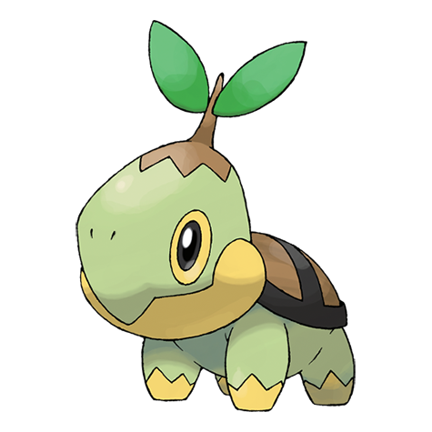
their heads are much closer to the width of their bodies, i think making them look much better.
certain other pokemon suffer from too-big head syndrome. i find this affects mostly first stage, "cutesey" pokemon (it's more noticable on pokemon who stand upright) (*cough* Snivy *cough*)
2. What they are based on
in general, I think most pokemon look good. Animal pokemon can be cute and cool, although it can be dissapointing when they have no elemental or pokemon elements to them.
Normal types tend to suffer from lack of elemental features the most
3. In game significance
sometimes all it takes to make a cool design is a cool backstory
I like the idea of Zygarde as a protector of nature
the idea of a pokemon who can control space or time sounds cool.
this usually only applies to box legends.
4. in game usefulness
some pokemon just DO NOT WORK in terms of in game useage (luvdisc) the biggest factor in terms of me liking a pokemon is if I like to use it in battle
I have found that if a pokemon is fun to battle with, you start to overlook design aspects you don't like
Only recently, I didn't really have an opinion on trubbish. I didn't have a problem with the "garbage" design. Until, recently, i decided to pick one up of the journey. once it got stockpile, sludge bomb, and swallow, i was having a blast using one, because it had an interesting strategy to utilize. I can't say i dislike trubbish because it really do like it. I think this just goes to show how nuzlockes or even just forcing yourself to use a completely different team can go a long way and you can discover pokemon you like that you didn't think you would (furfrou was a blast to use)
I think overall i can't say i dislike many pokemon based soley on design, say what you want about luvdisc, i have used one, it was horrible, but it was cute and frankly kind of hilarious.
Bumping this thread to give my analysis on various Pokemon designs.
I want to start by analyzing Tapu Fini.
I've actually never seen this design until I did the 'Choose your favorite Pokemon' game. For several reasons, this design ended up usurping Bayleef as my my favorite design.
The idea of having a Pokemon protected by a shell is nothing new (Shellder, Cloyster, Clamperl, etc). However, where this design differs from the other designs is that it lacks an organic shell. This shell is smooth and resembles a marlin, giving the impression that this thing moves with great speed. I would not want to be on the receiving end of that horn speeding my way!
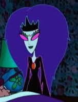
The color scheme of this Mon is nice as well. The dark purples, pale blues and black reminds me of the sea witch from Courage the Cowardly Dog.
I got a feeling from my first impression of the design that there was a malicious side to this Pokemon. Here's what the Sun entry from the Pokedex says: "The dense fog it creates brings the downfall and destruction of its confused enemies..." This confirms my impression that Tapu Fini is a troublemaker, much like this character from Courage, which only makes me embrace the design moreso.
Something nice about this design is that it doesn't appear to suffer from overdesign. There are several complicated things going on here (Fini's hair, arms, and patterns on the shell). However, the design is saved from being encased in a simple, open-pistachio shape. Having the design in a contained, concentric area makes it well rounded (no pun intended) as a result.
Edit: I like to draw, and can totally see something like this working for Tapu Fini with a couple of Horseas:
I want to start by analyzing Tapu Fini.
I've actually never seen this design until I did the 'Choose your favorite Pokemon' game. For several reasons, this design ended up usurping Bayleef as my my favorite design.
The idea of having a Pokemon protected by a shell is nothing new (Shellder, Cloyster, Clamperl, etc). However, where this design differs from the other designs is that it lacks an organic shell. This shell is smooth and resembles a marlin, giving the impression that this thing moves with great speed. I would not want to be on the receiving end of that horn speeding my way!
The color scheme of this Mon is nice as well. The dark purples, pale blues and black reminds me of the sea witch from Courage the Cowardly Dog.
I got a feeling from my first impression of the design that there was a malicious side to this Pokemon. Here's what the Sun entry from the Pokedex says: "The dense fog it creates brings the downfall and destruction of its confused enemies..." This confirms my impression that Tapu Fini is a troublemaker, much like this character from Courage, which only makes me embrace the design moreso.
Something nice about this design is that it doesn't appear to suffer from overdesign. There are several complicated things going on here (Fini's hair, arms, and patterns on the shell). However, the design is saved from being encased in a simple, open-pistachio shape. Having the design in a contained, concentric area makes it well rounded (no pun intended) as a result.
Edit: I like to draw, and can totally see something like this working for Tapu Fini with a couple of Horseas:
Last edited:
Remember when I was griping about how pretty much all of the Fairies we had at the time were fluffy cutemons, and that I hoped Sun and Moon brought some creepier ones? Welp, they delivered, and did they ever.

Mimikyu is one of my favourite Pokemon, and possibly my favourite that was added in Gen 7. I could ramble on about how fun it is to use competitively and how it singlehandedly got me a 30-win streak in the Battle Tree, but since this is a design thread, let's talk about its design.
I love how its Pikachu disguise is recognizable enough to know what it's supposed to be, but still gives the impression that something is very, very wrong. In particular, the badly drawn face looks downright creepy, and to me it even conveys the idea that it shouldn't exist at all. Both of its Pokedex entries detail how its true self is underneath the disguise, but the last person to look at it died from horror.

Actually, now that I look at its official art, I think I've figured out why Mimikyu is creepy, even compared to other Ghost-types. You know the possessed dolls from horror movies that consume the souls of children? Yeah, it's like that. Its badly drawn face seems to be saying "come play with me", but its ragged appearance, dull colours, and aforementioned bad drawing give away its true nature. Heck, let's look at when we first encounter Mimikyu in the games, during the Ghost Trial as the Totem Pokemon. You look all around the room with the camera and find nothing, until you get the idea to turn around... and suddenly it's there, silently watching you. It caught me completely off guard and genuinely freaked me out. And then, after the trial, you tell Acerola about the room in the back... and then find out that it doesn't exist. But then... where were you during the battle?
This of course begs the question: what is underneath the cloth? Were Game Freak to show what it truly looks like, the 'magic' of this Pokemon would end: we would eventually get used to the design until it simply becomes another Pokemon. But by leaving it to the imagination, they ensure that it will always be a mystery, and a spooky one at that.
This brings me to my main point: its typing. Game Freak could have easily made it a pure Ghost-type, or even a Ghost/Normal type since it more closely resembles classic "white bedsheet" ghosts. But instead, they made it a Fairy, which in my opinion was an excellent choice. It's much closer to the terrifying creatures of Ye Olde Faerie Tales than to most other Fairy-type cutemons, which is a real breath of fresh air with them acknowledging that not all Fairies are sweet. Here's hoping they keep up the trend in future generations!
I'd also like to talk about Ninetales-A and the Tapus, but I'll save those for their own post later on.
Last time on japanese influenced pokemon designs
the tread died so we didn't finish talking about pokemon designs
This time we'll be focusing on pokemon designs that get worse once you know their origins
let's start with a design that isn't even a pokemon but is nonetheless representative of the whole Pokémon franchise

yes the pokeball itself is terribly unoriginal, how could such an iconic design be unoriginal you say?

these are gachapon capsules, if you don't know about them they where first introduced on February 17 1965, they been popular in japan ever since then
"but pokeballs have a button in the center!" says the objecting fan, and yeah but unfortunately, as big a change as that is, it was the anime's idea to put a button on it's center just like in the whole pokemon saying their names thing Gamefreak had nothing to do with it
in fact we have it on record that Pokémon Special is the closest that any adaptation is to the original vision, so what was Gamefreak's vision for pokemon?

yup
Now let's move on to actual pokemon whose designs aren't as impressive as people in "the west" think they are
First let's look at fossil pokemon, part of their charm is that they aren't the same old tired prehistoric animals everyone always depicts (screw you Tyrantrum) but interesting seldom seen in fiction animals
or so western fans think
Pokemon such as Omanyte and Kabutops are interesting in gen I because they're based on ammonites and trilobites fossils that are both common and generally ignored by non-palaeontologist/biology fans, but in japan such creature are well know, I mean even Anpaman has a character whose whole role is to talk about them

that's quite literally as if Dora the explorer had a character whose identity was based on talking to kids about the Cambrian period!
and speaking of the Cambrian period

Anorith may not have many fans, but those of us who do like it do so because it's based on the anomalocaris the "star" of the Cambrian explosion and an even more obscure animal than ammonites or trilobites
unless you're Japanese


now in japan anomalocaris is a real star and is not only in toys if you play Yu-Gi-Oh you seen this creature , heck the whole Cambrian has its own anime!
and while it's nice such creatures are well know somewhere in the world it definitely makes their pokemon counterparts less original
Finally let's look at a gen I pokemon that's usually praised because he's "not based on anything he's just a cool monster pokemon"
now I already mentioned Nidoking in my first post, but since its been so long let me just show you
this is Baragon the Subterranean Terror, created in 1965 by Toho films for the film Frankenstein Conquers the World while he has few movie appearances but is none the less a favourite among kaiju fans since he's considered a bit of an underdog
here he's fighting Godzilla (shakycam warning)
Baragon use Dig!
hopefully I don't have to point out why Nidoking is such an unoriginal design man this is the longest post with the least of words, SO ENDS THE MOST CONVOLUTED OF SERIES
the tread died so we didn't finish talking about pokemon designs
This time we'll be focusing on pokemon designs that get worse once you know their origins
let's start with a design that isn't even a pokemon but is nonetheless representative of the whole Pokémon franchise

yes the pokeball itself is terribly unoriginal, how could such an iconic design be unoriginal you say?

these are gachapon capsules, if you don't know about them they where first introduced on February 17 1965, they been popular in japan ever since then
"but pokeballs have a button in the center!" says the objecting fan, and yeah but unfortunately, as big a change as that is, it was the anime's idea to put a button on it's center just like in the whole pokemon saying their names thing Gamefreak had nothing to do with it
in fact we have it on record that Pokémon Special is the closest that any adaptation is to the original vision, so what was Gamefreak's vision for pokemon?

yup
Now let's move on to actual pokemon whose designs aren't as impressive as people in "the west" think they are
First let's look at fossil pokemon, part of their charm is that they aren't the same old tired prehistoric animals everyone always depicts (screw you Tyrantrum) but interesting seldom seen in fiction animals
or so western fans think
Pokemon such as Omanyte and Kabutops are interesting in gen I because they're based on ammonites and trilobites fossils that are both common and generally ignored by non-palaeontologist/biology fans, but in japan such creature are well know, I mean even Anpaman has a character whose whole role is to talk about them

that's quite literally as if Dora the explorer had a character whose identity was based on talking to kids about the Cambrian period!
and speaking of the Cambrian period

Anorith may not have many fans, but those of us who do like it do so because it's based on the anomalocaris the "star" of the Cambrian explosion and an even more obscure animal than ammonites or trilobites
unless you're Japanese


now in japan anomalocaris is a real star and is not only in toys if you play Yu-Gi-Oh you seen this creature , heck the whole Cambrian has its own anime!
and while it's nice such creatures are well know somewhere in the world it definitely makes their pokemon counterparts less original
Finally let's look at a gen I pokemon that's usually praised because he's "not based on anything he's just a cool monster pokemon"

now I already mentioned Nidoking in my first post, but since its been so long let me just show you

this is Baragon the Subterranean Terror, created in 1965 by Toho films for the film Frankenstein Conquers the World while he has few movie appearances but is none the less a favourite among kaiju fans since he's considered a bit of an underdog
here he's fighting Godzilla (shakycam warning)
Baragon use Dig!
hopefully I don't have to point out why Nidoking is such an unoriginal design man this is the longest post with the least of words, SO ENDS THE MOST CONVOLUTED OF SERIES
Last edited:
Aimed at children as well :Di knew about ammonites from hamtaro games!!!! which was... another japanese video game series.
Okay, so I see in the "Worst Pokémon" thread that - SPOILERS, by the way - the new you-know-what designs have been met with some skepticism. I think they're a great example of the evolving creature design philosophy of Game Freak.
You see, Pokémon have always been designed according to the technological limitations of the games they're introduced in. When the limitations have changed, so have the design philosophies.

In the first generation, there were pretty harsh limits to what the GameBoy could display, so Pokémon had to be designed accordingly. Simple geometries, no patterns if it could be helped, and colour schemes dominated by a base colour plus either black or white. Even with the designers sticking to those limitations, the artists often had to enlarge Pokémon's heads in the sprites in order to make detailed features possible. See Nidoqueen, Nidoking, Snorlax, Magmar, or Rhydon for examples.


Along came the second generation, with better hardware. The GameBoy Color could, as its name suggest, display colours, which allowed designers to create new Pokémon designs that utilized vivid colours. Well, to some degree, at least: Each Gen II sprite only contains two colours, plus black and white. Better graphics capabilities also allowed for more details in sprites, improving the detail level of Pokémon designs. See the notches in Noctowl's eyebrow feathers, for instance, or the little bumps in Dunsparce's tail. Those wouldn't have been possible to render on the GameBoy. Technical improvements also allowed the inclusion of Unown, which does something as radical as having different sprites tied to the same Pokédex number. They had to split Nidoran in two to do this feat previously (likewise, Hidden Power represented quite a shift in move mechanics, but that's not for this thread). I guess this breakthrough is also what allowed them to add the Shininess mechanic.
Still, most Gen II Pokémon were originally designed alongside Gen I Pokémon, so most of the same design rules apply. You could argue that Gen II was the first generation to be able to portray the Gen I Pokémon as originally envisioned, so really one should treat the Gen I and II designs roughly as equals. I think the rules didn't quite start changing radically between Generations I and II, but change was coming quickly with the GBA games:


Many Gen III designs abide by the "Two primary colours + black and white" rule, but there are many that don't. Some designs now utilized a whole rainbow of colours, since the GBA could display thousands of colours at the same time. For practical purposes I believe the limitation was 8 or 16 colours per sprite (Smogon's sprite artists could definitely prove me wrong here), but this did not restrict many Pokémon's colour pallettes. Better screen resolutions also allowed even more details than previously. With Spinda, they even started experimenting with dynamic sprites. Form differences also improved, now with forms that could be changed at a whim, even in battle (Castform), as well as out-of-battle transformations (Deoxys). The latter form change was not properly implemented in the games until Gen IV, but that didn't stop them from creating the design in Gen III anyway.


In Gen IV, they obviously decided to take the "Different sprites for the same Pokémon" concept and run with it. Gender differences were introduced, and the concept of Forms was fleshed out even more. This meant that Pokémon could be designed around permanent form differences, like Combee or Shellos/Gastrodon, or even out-of-battle transformations (Burmy, Wormadam, Arceus).
The usual improvements in sprite resolutions also allowed for even more fidelity with Pokémon details and patterns. Try imagine what Mothim would have looked like on a GameBoy, for instance.


It turned out that the DS hardware was powerful enough for more tricks, which were put in great use in Gen V. Until now, Pokémon designs had to be fairly static. Pokémon had to convey all their personality through still images, or maybe a short introductory animation. But with Gen V's perpetually moving sprites, Pokémon that conveyed personality through motion could be created. This meant that the animation itself could become a vital part of the Pokémon's design. I think I have to mention Spoink (Gen III) here as an example of a Pokémon that was way ahead of its time with its constant bouncing, but at least it was allowed to express the full extent of its design in the GameCube games.
As demonstrated by Sigilyph, this was also the generation where patterns and colour variety was taken to its logical extreme. The DS could render the complicated patterns of this crazy contraption, in motion even. By now it was clear that the designers could add any pattern they wanted.


Gen VII took the step into the third dimension, did away with sprites, and let the games show full Pokémon models instead. This let the designers showcase their Pokémon from several angles at the same time, with several postures, and even more personality was conveyed through attack animations. The animations were more fluid than in Gen V too, which was widely shown off by numerous Pokémon designs involving flowing ribbons. Sure, this transition was not a success for every Pokémon design, but it worked really well for those that had been designed with it in mind from the get-go.
A smaller revolution was the introduction of transparency, which allowed Bug Pokémon like Beedrill and Scizor to have transparent wings, and gave the designers the freedom to go absolutely crazy with Mega Sableye.
And now, Gen VII. I dare say the designers were only experimenting with 3D animation in Gen VI, but now they have fully embraced it and grown more comfortable:
That one Gif will do; too many would just clutter the page. Notice how this is a custom attack animation for one move. Look at how Decidueye's pose changes and how much that pose change conveys its personality. I have a pet theory that the human-like animations is the reason why all the starters have been humanoid for the past two generations now. It's so easy to convey a personality with these human-like motions (which we are evolutionary hardcoded to recognize as displaying specific behaviours, rather than funny creatures moving funnily).
Improving technology gives the designers more possibilities, which again means that the limitations of what a Pokémon can be are constantly pushed. The designers get more ways to create and showcase new Pokémon, and more means to convey their personality. It would just have been strange to design Pokémon according to the old limitations when they can do so much more.
I'm not even sure if I like the Ultra Beasts from a lore or gameplay perspective, but they sure provide great showcases of what is possible to design these days.
And don't even get me started on Z-moves. I really dislike them for lore and gameplay, but the quality animation is hard to argue against. Leaps and bounds beyond what was possible on the previous hardware generations.
I think the limits will be moved once again in the future. The obvious area of potential improvement lies with textures. Right now, every Pokémon behaves like it's made of the same plastic-like material, but in the future we might see real fur, leather, metal, goo, rock, or what-have-you. I also suspect a lighting engine to be implemented in the future (giving Pokémon/attacks a realistic glow that will shine upon their surroundings), and can't wait to see what Pokémon they will design with it.
You see, Pokémon have always been designed according to the technological limitations of the games they're introduced in. When the limitations have changed, so have the design philosophies.

In the first generation, there were pretty harsh limits to what the GameBoy could display, so Pokémon had to be designed accordingly. Simple geometries, no patterns if it could be helped, and colour schemes dominated by a base colour plus either black or white. Even with the designers sticking to those limitations, the artists often had to enlarge Pokémon's heads in the sprites in order to make detailed features possible. See Nidoqueen, Nidoking, Snorlax, Magmar, or Rhydon for examples.


Along came the second generation, with better hardware. The GameBoy Color could, as its name suggest, display colours, which allowed designers to create new Pokémon designs that utilized vivid colours. Well, to some degree, at least: Each Gen II sprite only contains two colours, plus black and white. Better graphics capabilities also allowed for more details in sprites, improving the detail level of Pokémon designs. See the notches in Noctowl's eyebrow feathers, for instance, or the little bumps in Dunsparce's tail. Those wouldn't have been possible to render on the GameBoy. Technical improvements also allowed the inclusion of Unown, which does something as radical as having different sprites tied to the same Pokédex number. They had to split Nidoran in two to do this feat previously (likewise, Hidden Power represented quite a shift in move mechanics, but that's not for this thread). I guess this breakthrough is also what allowed them to add the Shininess mechanic.
Still, most Gen II Pokémon were originally designed alongside Gen I Pokémon, so most of the same design rules apply. You could argue that Gen II was the first generation to be able to portray the Gen I Pokémon as originally envisioned, so really one should treat the Gen I and II designs roughly as equals. I think the rules didn't quite start changing radically between Generations I and II, but change was coming quickly with the GBA games:


Many Gen III designs abide by the "Two primary colours + black and white" rule, but there are many that don't. Some designs now utilized a whole rainbow of colours, since the GBA could display thousands of colours at the same time. For practical purposes I believe the limitation was 8 or 16 colours per sprite (Smogon's sprite artists could definitely prove me wrong here), but this did not restrict many Pokémon's colour pallettes. Better screen resolutions also allowed even more details than previously. With Spinda, they even started experimenting with dynamic sprites. Form differences also improved, now with forms that could be changed at a whim, even in battle (Castform), as well as out-of-battle transformations (Deoxys). The latter form change was not properly implemented in the games until Gen IV, but that didn't stop them from creating the design in Gen III anyway.


In Gen IV, they obviously decided to take the "Different sprites for the same Pokémon" concept and run with it. Gender differences were introduced, and the concept of Forms was fleshed out even more. This meant that Pokémon could be designed around permanent form differences, like Combee or Shellos/Gastrodon, or even out-of-battle transformations (Burmy, Wormadam, Arceus).
The usual improvements in sprite resolutions also allowed for even more fidelity with Pokémon details and patterns. Try imagine what Mothim would have looked like on a GameBoy, for instance.


It turned out that the DS hardware was powerful enough for more tricks, which were put in great use in Gen V. Until now, Pokémon designs had to be fairly static. Pokémon had to convey all their personality through still images, or maybe a short introductory animation. But with Gen V's perpetually moving sprites, Pokémon that conveyed personality through motion could be created. This meant that the animation itself could become a vital part of the Pokémon's design. I think I have to mention Spoink (Gen III) here as an example of a Pokémon that was way ahead of its time with its constant bouncing, but at least it was allowed to express the full extent of its design in the GameCube games.
As demonstrated by Sigilyph, this was also the generation where patterns and colour variety was taken to its logical extreme. The DS could render the complicated patterns of this crazy contraption, in motion even. By now it was clear that the designers could add any pattern they wanted.


Gen VII took the step into the third dimension, did away with sprites, and let the games show full Pokémon models instead. This let the designers showcase their Pokémon from several angles at the same time, with several postures, and even more personality was conveyed through attack animations. The animations were more fluid than in Gen V too, which was widely shown off by numerous Pokémon designs involving flowing ribbons. Sure, this transition was not a success for every Pokémon design, but it worked really well for those that had been designed with it in mind from the get-go.
A smaller revolution was the introduction of transparency, which allowed Bug Pokémon like Beedrill and Scizor to have transparent wings, and gave the designers the freedom to go absolutely crazy with Mega Sableye.
And now, Gen VII. I dare say the designers were only experimenting with 3D animation in Gen VI, but now they have fully embraced it and grown more comfortable:

That one Gif will do; too many would just clutter the page. Notice how this is a custom attack animation for one move. Look at how Decidueye's pose changes and how much that pose change conveys its personality. I have a pet theory that the human-like animations is the reason why all the starters have been humanoid for the past two generations now. It's so easy to convey a personality with these human-like motions (which we are evolutionary hardcoded to recognize as displaying specific behaviours, rather than funny creatures moving funnily).
The new Ultra Beasts clearly required all those technological leaps to be feasible.
Look at how UB-Assembly consists of bricks that have eyes on one side, and how the bricks keep shifting around to reveal even more of its eyes. Thanks to the 3D animation, you get glimpses of its inside being completely lined with eyes. And UB-Burst, that little dance it does which involves taking off its head and making it explode. That would not have been feasible in earlier generations.
Look at how UB-Assembly consists of bricks that have eyes on one side, and how the bricks keep shifting around to reveal even more of its eyes. Thanks to the 3D animation, you get glimpses of its inside being completely lined with eyes. And UB-Burst, that little dance it does which involves taking off its head and making it explode. That would not have been feasible in earlier generations.
Improving technology gives the designers more possibilities, which again means that the limitations of what a Pokémon can be are constantly pushed. The designers get more ways to create and showcase new Pokémon, and more means to convey their personality. It would just have been strange to design Pokémon according to the old limitations when they can do so much more.
I'm not even sure if I like the Ultra Beasts from a lore or gameplay perspective, but they sure provide great showcases of what is possible to design these days.
And don't even get me started on Z-moves. I really dislike them for lore and gameplay, but the quality animation is hard to argue against. Leaps and bounds beyond what was possible on the previous hardware generations.
I think the limits will be moved once again in the future. The obvious area of potential improvement lies with textures. Right now, every Pokémon behaves like it's made of the same plastic-like material, but in the future we might see real fur, leather, metal, goo, rock, or what-have-you. I also suspect a lighting engine to be implemented in the future (giving Pokémon/attacks a realistic glow that will shine upon their surroundings), and can't wait to see what Pokémon they will design with it.
Last edited:
As a long time Pokemon fan, I have quite a few designs that I think are great.
Camerupt

I think the design of Camerupt is great; For a region as divided by land and sea as Hoenn, Camerupt is a perfect design choice to match the land aspect. The two "humps" on top of it's back represent rocky volcanoes, which was a perfect design choice for a camel-like Pokemon. This also compliments the fact that it's found near volcanic or mountainous areas.
Many people question the blue rings on it's sides, but I think it was a great addition to the overall design. For one, it makes Camerupt less boring looking, as well as adds to the fact that it adds to the lore of Hoenn. The "blue rings" can be interpreted to be what connect the land and sea. If you can imagine what Camerupt looks without the blue rings, you'll realize it's design is quite boring without it.
Swirlix

When generation 6 introduced a new typing, hype arose very quickly. It got older players back into the game, and players who were still around were just as excited. This new typing was Fairy, and I believe Swirlix is a great representation of what Fairy types are all about.
For one, Swirlix is known as the Cotton Candy Pokemon. I personally think that Cotton Candy is a great concept for a Fairy type Pokemon, as Cotton Candy is generally something that makes people happy, and fairy types are generally Pokemon that are always happy, and fun to be around. Now, aside from the fact that it looks like Cotton Candy, it look likes it would like to eat some Cotton Candy as well. It's tongue sitting out at the side of it's mouth really adds to the design that this Pokemon is supposed to be super jumpy and all over the place.
In the anime, Swirlix is seen to float about, spraying a sticky string on it's enemies. I think this is perfect for a Fairy type Pokemon, as it shows that, while they are cute, they aren't completely defenseless as well, and many other Fairy types show this. Lastly, the floppy tail on Swirlix is also cute too.
Guzzlord
While I'm sure many people disagree, I find the design of Guzzlord to be quite appealing. It really looks like some kind of deep-sea cave monster that comes out for a meal every so often. It's intimidating claws show it means business, and is not afraid to snap anything that may enter it's path. It's mini-claws on the top of it's head are also a great design addition, as it really makes the whole design over the top, which isn't a bad thing.
One of the things I actually dislike about Guzzlord is how small it's eyes are. I feel if they were slightly larger, they would actually improve the design. However, it can be argued that this isn't possible due to the enormous mouth that it bears, which is the most threatening part about Guzzlord.
So, all in all, those were some of the Pokemon that I like the designs of. If you happen to disagree, which I'm sure you do, I'd like to hear why!
Camerupt

I think the design of Camerupt is great; For a region as divided by land and sea as Hoenn, Camerupt is a perfect design choice to match the land aspect. The two "humps" on top of it's back represent rocky volcanoes, which was a perfect design choice for a camel-like Pokemon. This also compliments the fact that it's found near volcanic or mountainous areas.
Many people question the blue rings on it's sides, but I think it was a great addition to the overall design. For one, it makes Camerupt less boring looking, as well as adds to the fact that it adds to the lore of Hoenn. The "blue rings" can be interpreted to be what connect the land and sea. If you can imagine what Camerupt looks without the blue rings, you'll realize it's design is quite boring without it.
Swirlix

When generation 6 introduced a new typing, hype arose very quickly. It got older players back into the game, and players who were still around were just as excited. This new typing was Fairy, and I believe Swirlix is a great representation of what Fairy types are all about.
For one, Swirlix is known as the Cotton Candy Pokemon. I personally think that Cotton Candy is a great concept for a Fairy type Pokemon, as Cotton Candy is generally something that makes people happy, and fairy types are generally Pokemon that are always happy, and fun to be around. Now, aside from the fact that it looks like Cotton Candy, it look likes it would like to eat some Cotton Candy as well. It's tongue sitting out at the side of it's mouth really adds to the design that this Pokemon is supposed to be super jumpy and all over the place.
In the anime, Swirlix is seen to float about, spraying a sticky string on it's enemies. I think this is perfect for a Fairy type Pokemon, as it shows that, while they are cute, they aren't completely defenseless as well, and many other Fairy types show this. Lastly, the floppy tail on Swirlix is also cute too.
Guzzlord

While I'm sure many people disagree, I find the design of Guzzlord to be quite appealing. It really looks like some kind of deep-sea cave monster that comes out for a meal every so often. It's intimidating claws show it means business, and is not afraid to snap anything that may enter it's path. It's mini-claws on the top of it's head are also a great design addition, as it really makes the whole design over the top, which isn't a bad thing.
One of the things I actually dislike about Guzzlord is how small it's eyes are. I feel if they were slightly larger, they would actually improve the design. However, it can be argued that this isn't possible due to the enormous mouth that it bears, which is the most threatening part about Guzzlord.
So, all in all, those were some of the Pokemon that I like the designs of. If you happen to disagree, which I'm sure you do, I'd like to hear why!
Guzzlord is inspired by a zooplankton species. By making ordinary sized animals out of microscopic organisms you can get some incredibly otherworldly designs. Also the well established black hole theme, with its inner mouth being the event horizon and its tail looking like a gravity well. Also I think its teeth are supposed to look like the Bohr atomic model for electrons. Also it's supposed to look like a fucking demon.As a long time Pokemon fan, I have quite a few designs that I think are great.
Camerupt
I think the design of Camerupt is great; For a region as divided by land and sea as Hoenn, Camerupt is a perfect design choice to match the land aspect. The two "humps" on top of it's back represent rocky volcanoes, which was a perfect design choice for a camel-like Pokemon. This also compliments the fact that it's found near volcanic or mountainous areas.
Many people question the blue rings on it's sides, but I think it was a great addition to the overall design. For one, it makes Camerupt less boring looking, as well as adds to the fact that it adds to the lore of Hoenn. The "blue rings" can be interpreted to be what connect the land and sea. If you can imagine what Camerupt looks without the blue rings, you'll realize it's design is quite boring without it.
Swirlix
When generation 6 introduced a new typing, hype arose very quickly. It got older players back into the game, and players who were still around were just as excited. This new typing was Fairy, and I believe Swirlix is a great representation of what Fairy types are all about.
For one, Swirlix is known as the Cotton Candy Pokemon. I personally think that Cotton Candy is a great concept for a Fairy type Pokemon, as Cotton Candy is generally something that makes people happy, and fairy types are generally Pokemon that are always happy, and fun to be around. Now, aside from the fact that it looks like Cotton Candy, it look likes it would like to eat some Cotton Candy as well. It's tongue sitting out at the side of it's mouth really adds to the design that this Pokemon is supposed to be super jumpy and all over the place.
In the anime, Swirlix is seen to float about, spraying a sticky string on it's enemies. I think this is perfect for a Fairy type Pokemon, as it shows that, while they are cute, they aren't completely defenseless as well, and many other Fairy types show this. Lastly, the floppy tail on Swirlix is also cute too.
Guzzlord
While I'm sure many people disagree, I find the design of Guzzlord to be quite appealing. It really looks like some kind of deep-sea cave monster that comes out for a meal every so often. It's intimidating claws show it means business, and is not afraid to snap anything that may enter it's path. It's mini-claws on the top of it's head are also a great design addition, as it really makes the whole design over the top, which isn't a bad thing.
One of the things I actually dislike about Guzzlord is how small it's eyes are. I feel if they were slightly larger, they would actually improve the design. However, it can be argued that this isn't possible due to the enormous mouth that it bears, which is the most threatening part about Guzzlord.
So, all in all, those were some of the Pokemon that I like the designs of. If you happen to disagree, which I'm sure you do, I'd like to hear why!
In general Ultra space and its inhabitants could be reminiscent of deep sea organisms, like the Ultra recon squad from USUM are named after seaweed species, while most characters from Alola are named after flowers.
There could be many theories about what common theme the ultra beasts have. It's incredible how we have gone from literal rats, pidgeons and crabs to these multifaceted designs that could be argued non stop about what they are inspired from that also incorporate personality traits, like Guzzlord begging you in refresh/amie for some pokepuffs.
I don't know about Camerupt's rings, they don't seem to be inspired by anything specific so I would say they shouldn't be there, because they don't match its other colors either. If the designer didn't know what it is supposed to be, then it's a bad design. https://en.wikipedia.org/wiki/Bactrian_camel
Attachments
-
 130.5 KB Views: 431
Last edited:
Well technically blue is the complement of orange so they technically work. I kinda liked them when I first saw them. They were all neon like. Maybe it's to represent some blue fire burning at its core or whatever. It's not like fire can't be blue, after all. Plus, the two colors looked pretty good in Finding Nemo in my opinon.I don't know about Camerupt's rings, they don't seem to be inspired by anything specific so I would say they shouldn't be there, because they don't match its other colors either. If the designer didn't know what it is supposed to be, then it's a bad design. https://en.wikipedia.org/wiki/Bactrian_camel
You are doing some huge logic leaps here, blue fire is represented by blur rings somehow? The blue rings make no sense at all, other than to mix up an otherwise bare-bones design. We give too many excuses to the boring designs of older generations. Try to judge them all with the same standards.Well technically blue is the complement of orange so they technically work. I kinda liked them when I first saw them. They were all neon like. Maybe it's to represent some blue fire burning at its core or whatever. It's not like fire can't be blue, after all. Plus, the two colors looked pretty good in Finding Nemo in my opinon.
Mega Camerupt is better however as it gives it personality through its grin and smug stare, replaces the nonsense rings and gives it a more characteristic coat fur for that camel species it is inspired of.
That is a mega done right, it either fixes, expands or takes a twist on the original design instead of spiking its shit up.
Similar to how the alola geodude line is actually interesting and more than just a round rock with arms. It did well to fix a bland gen1 pokemon.
Smoke rings.I don't know about Camerupt's rings, they don't seem to be inspired by anything specific so I would say they shouldn't be there, because they don't match its other colors either. If the designer didn't know what it is supposed to be, then it's a bad design. https://en.wikipedia.org/wiki/Bactrian_camel


So, since the release of Sun & Moon, I've had 2 Pokemon whose designs have really stood out to me, and that I've grown fond of.

Pyukumuku
I'm always drawn Pokemon that are based on unique plants/animals, and Pyukumuku, being based on a sea cucumber, immediately caught my eye. And as far as Pokemon go, Pyukumuku's design relatively accurate to the anatomy of an actual sea cucumber. The anterior end contains the mouth on Pyukumuku just as it does on sea cucumbers, and many other features are included. I also loved the addition of the organs planting themselves to the ground when Pyukumuku faints, as well as being visible in Pokemon Refresh. On top of all of this, it's also super adorable.
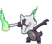
Alolan Marowak
When anyone asks me my favorite alolan form, it's always a quick reply from me--this beauty. The color choice suits Alolan Marowak perfectly, and with that same shade of purple, they added a little symbol on top of the skull. That, within itself, would be enough for me to fall in love with it, but a feature that trumps the other two stood out to me even more--the green flames on each end of the bone. Probably one of the most unique additions on alolan forms, and perfectly suits its typing.
While these two were my favorites from Gen VII, so many others appealed to me as well. Sun & Moon definitely brought in some well designed Pokemon.
Better technology opens up more avenues for designs, but that doesn't mean the new ones are automatically better. George Lucas had all the technology he could want when he made the prequels, but the iconic imagery of Star Wars is still from the old movies where you couldn't just put everything you want on a computer. It's so dense.
But in reverse, better technology can also highlight flaws in the original designs that were excused due to either technological limitations or benign due to being designed for the medium at the time.
Gassy pokemon are some of the clearest culprits, as the gas looks okay as a still image but isn't really ready for 3D yet, hence the horrible textures on things like Torkoal, Musharna, and Weezing. Especially Musharna!
Another frequent culprit is Golem, as the body proportions and arms looked okay in early generations but get more and more awkward with every generation, it's almost no wonder that it's Alola form turned it's arms into stumps.
The poke-myspace poses can only conceal so much, but in actual 3d everything is revealed.But in reverse, better technology can also highlight flaws in the original designs that were excused due to either technological limitations or benign due to being designed for the medium at the time.
Gassy pokemon are some of the clearest culprits, as the gas looks okay as a still image but isn't really ready for 3D yet, hence the horrible textures on things like Torkoal, Musharna, and Weezing. Especially Musharna!
Another frequent culprit is Golem, as the body proportions and arms looked okay in early generations but get more and more awkward with every generation, it's almost no wonder that it's Alola form turned it's arms into stumps.
Praising sprites is like praising someone based on their online pictures and not their actual appearance irl. They have to understand that models are meant to be judged together with their animations that reveal design details and flaws that we never would have known before, even in the generation they were intoduced (eg Zigzagoon, Rayquaza, Blaziken, Metagross)
This is my favorite post here and everything you said about Klink and Vanillite is mentioned in game here.Arceus, I have a ton of stuff to add here. But first, before I get to that, I want to talk about stuff people have already talked about where I haven’t heard what I think about them yet, so I’m dropping my own thoughts about them...
1) Garbodor
Honestly, I love Garbodor for the same reason so many people hate it: it’s hideous. It’s clearly designed to be as hideous as possible. From the beady eyes that look derpy and stupid, to the deformed trash hand, to all its pokedex entries just making it sound like just the most disgusting thing ever. And nobody knows where those pink and blue spots came from.
It’s overall just really trashy and disgusting...
...just like real trash.
It’s like they took the idea of trash, and did their absolute best on selling the idea of trash, really painting a picture of what trash would be as a Pokemon. And they nailed it hard.
2) The Klink Line
So Klink. It’s two gears that move. At first that seems kinda dumb and silly, but think about where you catch it: Chargestone Cave right? With all those weird magnetic and electric rocks everywhere? Probably the same kinds of rocks that spurred ancient Joltik and Galvantula to become electric types? Is it really that much of a stretch to assume that these same rocks spurred a pair of gears to become living creatures?
To me, Klink perfectly represents the wonders of Chargestone Cave, and reinforces the kind of ethereal otherworldliness of that location in Unova. So not only do I like Klink and its evos, they even contribute to worldbuilding too!
And the very mechanical and weirdly simple designs they have reinforces that. Why does Klinklang look like just a bunch of gears slapped together? Because it literally is a bunch of gears slapped together. It’s not supposed to look like it can survive. It’s not supposed to exist. It’s a freak of nature. It exists through pure accident. An accident by Chargestone Cave’s hand.
Now what the heck Klink and its evos would be doing in Kalos is beyond me. But that’s less an issue with Klink itself and more an issue that Pokemon likes to reuse concepts that are based on a specific event without justifying how that happened again. It’s stupid with Klink, and it’s stupid every time they’ve done it, but HEY, PEOPLE LIKED THAT STUFF, SO WE HAVE TO THROW IT IN ANYWAY!!!
3) The Vanillite Line
This design also makes sense to me. Much as the electricity in Chargestone Cave gave Klink its sentience, so too did the cold of that Unovan Freezer give Vanillite its sentience. Then again, I believe the lore says that Vanillite have been around for a long time, so I guess that’s not the case? So exactly why they’re around beats me. And I'd definitely like a clearer answer on that, because origin stories always fascinate me. But until then...asking why there’s sentient snow-cones is a lot like asking why there’s sentient sludge, and the answer for that is the same: because there just is. This is a weird wacky world with weird wacky creatures that form through weird wacky ways. That’s just how this world works. It’s happened all the time, and it will continue to keep happening. Good enough for me.
As far as the design itself, it’s clearly designed to be cute ice cream. And well...it’s ice cream. That looks cute. Vanillish looks a little weird, what with its blank stare and slightly deformed mouth. And Vanilluxe gets even weirder, looking like it tried to split into two but failing. Does this mean they reproduce by budding? Maybe.
Also notice that in the Gen VI moving sprites, this pokemon rocks back and forth progressively more slowly after every evolution. It's struggling more and more to move as it continues to evolve into increasingly unviable forms. What these sort of weird designs tell me is that, like Klink, these things aren’t supposed to exist. They formed through sheer accident, and are only continuing to exist through sheer dumb luck.
Honestly, I think the theme here is that these Pokemon all look creepy and unnatural because they are creepy and unnatural. They don't look like they should exist because, as far as in-game lore goes, they shouldn't exist. And there are a lot of pokemon in the Pokemon Universe that are like this.
Now, with that in mind, let's bring this back full circle. To the sixteenth post on this thread, on the very first page...:
Let's talk about this.
4) Kyurem-Black and Kyurem-White
I agree. These guys look pretty darn weird. When I first saw them, I did think that they looked generally pretty cool, but I still always felt like something was...off about them. Something...unsettling. And LucarioMaster2 explains exactly why this is. Because of all the stuff they have on them, just walking around would be next to impossible for either form. I won't keep repeating LucarioMaster2's points, but the idea is that they look like unholy abominations that shouldn't exist.
I'm sure you know where I'm going with this by now.
They are unholy abominations that shouldn't exist. They were created when some jerk decided it would be a good idea to stuff a tao dragon back into Kyurem. And at first it looks like it worked too. You can see how Kyurem is trying its best to morph its other half to look like the half Zekrom or Reshiram took up as a result of the fusion. In addition, its base stats go way up, and now they're only twenty points lower than the literal god of all Pokemon. It looks like this thing is gonna potentially be powerful.
Also interesting to note that the Reshiram and Zekrom parts of Kyurem are taking up opposite sides: Reshiram on the left, and Zekrom on the right. This reinforces the idea that yes, these three really were one being once, to the point where if you try to reverse the split, they'll just naturally take up a specific side of Kyurem's body.
But that split happened a long time ago. And while they may have originally been one creature, they are very much their own beings now. It's too late to change the past. All you're gonna get by fusing two individuals together, especially by force, is just this awful looking thing, whose colors and design aspects clash horribly with each other as Kyurem and the tao dragon fight internally for control. They were once one before, but they're not now, and neither of them really want to submit to the other. Not again. Not like this. And almost certainly not now, when they've tasted the freedom of being on their own.
So even if at first it looked like fusing Kyurem back together would be a good idea, it's clearly been proven not to be. Reinforcing this is just how much weaker competitively either Kyurem form is compared to other pokemon with similarly monstrous stats. It has the raw power to get things done, but due to all the internal clashing and incompatibilities it suffers from, it just can't use that power well at all.
And the very fact that these forms are so over-designed and look like they wouldn't work or be practical just reinforces all of that.
Okay wow that was a lot longer than I was planning for this to be. I haven't even gotten around to answering the prompt yet. -sigh- next tiiiiiime...
I guess this concludes the "there are actually some brilliantly ugly Pokemon designs out there" segment of my design talk. Next time I'll answer the prompt, and then I'll go on to talk about how visual designs and typings can reinforce or contradict each other. Until then! I'll wait for like a couple posts to go by before continuing, don't wanna double post and all that, yadda yadda yadda. I know what you guys are like ;).
One of the themes/meanings of BW/2 was the relationship between Pokemon and humans and by this they wanted to point out that Pokemon could always be independent and evolve on their own to adapt to their environment.
People aren't entitled to pokemon, they should treat them with respect as equal beings and befriend them out of their own accord.
Attachments
-
 627.6 KB Views: 353
Last edited:


today let's talk about these bois


the mega mewtwo forms have never received much attention, because for the most part they actually suck in every format they're allowed in because of how they take your mega slot. because of this i think their designs are very overlooked.
first off mega mewtwo x has blue eyes and mega mewtwo y has red ones. that's kinda cool. now on to the main point
the mega mewtwos represent extreme specialization. mmx has the highest base attack in the game, and mmy has the highest special attack. mmx was given an additional fighting typing to really get it into the "physical attacker" role.
but ultimately, these literal genetic modifications end up leading to some downsides as well. with such an intense focus on psychic power, mega mewtwo y has devolved physically. this guy needs to float in the air because of those nonexistent legs.
mega mewtwo x is just a really awkward pokemon in general. it has the power to accomplish superhuman feats, but it has no good moves to take advantage of this power besides stuff like low kick and zen headbutt.
and that's what i really like about it thematically–mewtwo can't just turn into a super saiyan out of nowhere. mienfoo has been practicing its high jump kicks for thousands of years. mmx has only been around for a tiny fraction of that.
in addition to showing the amazing things that can be done through this modification, the mega mewtwo forms also show us its limits, which i think is really cool. instead of pulling a mega ray, they gave us mons that have the raw numbers to be really good, but aren't without their flaws as well.
I want to talk about a Pokemon which hasn't been released yet but it's design had made me think of something which I've always heard other's say about certain Pokemon but wasn't until this Pokemon I thought it: it looks a Digimon. This Pokemon is the newest mythical:
As I've said, "looks like a Digimon" had become a common comment for several Pokemon within recent years. The first time I remember hearing that said was when Gen III was released, primarily for the Weather Trio of Rayquaza, Groudon, & Kyogre as some saw the markings that's suppose to make them look ancient to making them look robotic (then there were others such as Blaziken and the Lati@s twins). While I could see where they were coming from, at that time I thought it was just because of the new art style making them look different from the washed out art style of the previous generations. Also, Digimon tends to go overboard with designs in order to make them look X-TREME (not to mention usually adding military weaponry, cybernetics, and armor for many higher level Digimon)!
Let's move past Gen IV and V (while I do remember some saying Lucario and Zoroark looking like Digimon, they were the only vocal ones and that's because they were the mons being pushed that generation. Which if funny considering Gen V gave us Genesect which sort of follows a Digimon formula of design though still kept enough to a Pokemon aesthetic I would still disagree it looking like a Digimon) and go to Gen VI. While the Pokemon introduced in Gen VI generally were able to ignore this, this was the gen that introduced the Mega Evolution and, oh boy, "looks like a Digimon" was in full force. Skipping over them being called "Mega" (though this would only effect the perception of the international fans as Japan used a different naming convention for the Digimon stages: Baby I, Baby II, Child, Adult, Perfect, & Ultimate. International was Fresh/Baby, In-Training, Rookie, Champion, Ultimate, & Mega), Mega Pokemon were overly design on purpose with particular mention going to the usual suspects: Mewtwo, Blaziken, Lucario, Rayquaza, and Gallade (notice how many are usually bipedal). While indeed the comparison to Mega Pokemon and Digimon were similar and amusing, still I think anyone would is familiar with both franchises though haven't caught up with the recent iterations would probably be able to tell the difference between a Mega Pokemon and Digimon.
We now come to the current gen, Gen VII, but let's take a quick detour before our main topic. Most of Gen VII's Pokemon ignore the "looks like a Digimon" issue, but that's because those who would say that were looking at a new group of Pokemon: The Ultra Beasts. Ultra Beasts were intentionally made to buck the usual Pokemon design rules and so were allowed to go weird. Buzzwole looks like a Tentomon evolution, Pheromosa looked like a bug version of an angelic Digimon, Celesteela is a rocket ship which wouldn't be out of place for a Digimon, Poipole and Naganadel have a robotic look to them due to being from the technologically advanced Ultra Megalopolis, and Stakataka and Blacephalon are just wacky looking like some Digimon are. But, that was intentional, so I'm willing to overlook that. Ultra Beasts "look like Digimon" because they're not meant to look like Pokemon, good job GF.
But, now we come to our main topic, Zeraora. It looks like Renamon's cousin. And it's not an Ultra Beast as its stats aren't prime numbers so that excuse is out the window. Can't exactly pin down why it looks like a Digimon to me because other Pokemon have had similar design aspects yet never did I think they looked like Digimon. Zeraora's fur looking like its wearing gloves and pants, its fur creating a scarf behind it, it being bipedal, the markings adding additional design details, the cyan blue creating a clash with its yellow and black palette. It just seems so strange how, up till now, I didn't think any Pokemon looked that much like a Digimon (at least not on purpose) but then this electric punching cat comes along and my first thought was "that looks like a Digimon" yet it's not an Ultra Beast.
Anyone feel the same?
Zeraora.


As I've said, "looks like a Digimon" had become a common comment for several Pokemon within recent years. The first time I remember hearing that said was when Gen III was released, primarily for the Weather Trio of Rayquaza, Groudon, & Kyogre as some saw the markings that's suppose to make them look ancient to making them look robotic (then there were others such as Blaziken and the Lati@s twins). While I could see where they were coming from, at that time I thought it was just because of the new art style making them look different from the washed out art style of the previous generations. Also, Digimon tends to go overboard with designs in order to make them look X-TREME (not to mention usually adding military weaponry, cybernetics, and armor for many higher level Digimon)!
Let's move past Gen IV and V (while I do remember some saying Lucario and Zoroark looking like Digimon, they were the only vocal ones and that's because they were the mons being pushed that generation. Which if funny considering Gen V gave us Genesect which sort of follows a Digimon formula of design though still kept enough to a Pokemon aesthetic I would still disagree it looking like a Digimon) and go to Gen VI. While the Pokemon introduced in Gen VI generally were able to ignore this, this was the gen that introduced the Mega Evolution and, oh boy, "looks like a Digimon" was in full force. Skipping over them being called "Mega" (though this would only effect the perception of the international fans as Japan used a different naming convention for the Digimon stages: Baby I, Baby II, Child, Adult, Perfect, & Ultimate. International was Fresh/Baby, In-Training, Rookie, Champion, Ultimate, & Mega), Mega Pokemon were overly design on purpose with particular mention going to the usual suspects: Mewtwo, Blaziken, Lucario, Rayquaza, and Gallade (notice how many are usually bipedal). While indeed the comparison to Mega Pokemon and Digimon were similar and amusing, still I think anyone would is familiar with both franchises though haven't caught up with the recent iterations would probably be able to tell the difference between a Mega Pokemon and Digimon.
We now come to the current gen, Gen VII, but let's take a quick detour before our main topic. Most of Gen VII's Pokemon ignore the "looks like a Digimon" issue, but that's because those who would say that were looking at a new group of Pokemon: The Ultra Beasts. Ultra Beasts were intentionally made to buck the usual Pokemon design rules and so were allowed to go weird. Buzzwole looks like a Tentomon evolution, Pheromosa looked like a bug version of an angelic Digimon, Celesteela is a rocket ship which wouldn't be out of place for a Digimon, Poipole and Naganadel have a robotic look to them due to being from the technologically advanced Ultra Megalopolis, and Stakataka and Blacephalon are just wacky looking like some Digimon are. But, that was intentional, so I'm willing to overlook that. Ultra Beasts "look like Digimon" because they're not meant to look like Pokemon, good job GF.
But, now we come to our main topic, Zeraora. It looks like Renamon's cousin. And it's not an Ultra Beast as its stats aren't prime numbers so that excuse is out the window. Can't exactly pin down why it looks like a Digimon to me because other Pokemon have had similar design aspects yet never did I think they looked like Digimon. Zeraora's fur looking like its wearing gloves and pants, its fur creating a scarf behind it, it being bipedal, the markings adding additional design details, the cyan blue creating a clash with its yellow and black palette. It just seems so strange how, up till now, I didn't think any Pokemon looked that much like a Digimon (at least not on purpose) but then this electric punching cat comes along and my first thought was "that looks like a Digimon" yet it's not an Ultra Beast.
Anyone feel the same?
Last edited: