Judge a Pokémon: The Smog's 8th Art Panel
| « Previous Article | Home | Next Article » |
Greetings all, and welcome to the 8th edition of Judge a Pokemon. Also, everyone welcome Birkal, a recent heavy contributor and poster in Smeargle, as our guest commentator! As one could guess from our previous articles, today we'll be featuring designs finding their roots in the ADV gen; ADV was the first gen not on the primitive gameboy / gameboy color consoles, but featuring the crisp and colorful sprites of the Gameboy Advanced. This gave the designer's a lot of liberty, and for better or worse, was the beginning of more complex Pokemon designs that have continued into the 4th and 5th generations. Advanced set the "look" of future Pokemon generations, so I hope you'll enjoy our commentary on this big-shift generation's designs. —Chou Toshio
1. Exploud
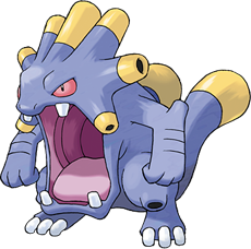

Ah, Hoenn. I know this isn't popular opinion, but it's actually my favorite generation in every way. Perhaps that's only because of the nostalgia factor, it being my first Pokémon game, but the designs were great too. Imagine as I wander through Rustboro Tunnel and come across a small pink thing with an expression like +_+; I wasn't very impressed then, and I wasn't too impressed with Loudred either. Then, BAM! Here comes a hulking beast with a huge-ass mouth and things that look like cannons sticking out of its back. Dang, I was impressed then. I guess the ability to learn things like Blizzard, Fire Blast, and the elusive Hyper Voice was pretty impressive too.
I wonder what an Exploud playing Chopin would be like.

This is a very unique design certainly, but it's also very ugly. A sound-based Pokémon that uses pipes on its body to emit sonic attacks sounds good on paper, but it's another matter entirely when you put pen to paper. Exploud's gaping maw isn't the most pleasant thing to look at, and when it dominates the Pokémon's design, you know you have a problem. It's hard to imagine Exploud with its mouth closed, which means this Pokémon is basically stuck with the same expression and design for near-perpetuity. The color scheme and the concept is nice to begin with, but in the end, Exploud is just too one-note.

Haha, how interesting: I was just talking about Exploud's design today with some Smogon members. I'd like to start things off by complementing Game Freak on their excellent choice of name for this Pokémon. The combination of explosions and sound was really a clever move, in my opinion. Anyways, some of you know that I am a music major, so I am crazy for any Pokémon that has some sort of connection to sound and music. Exploud is very unique in that it apparently emits sounds from the piping in its back, which adds an awesome biological dimension to the design. I can just imagine this thing striking fear into the hearts of spelunkers when it screams.
My only criticism is that Exploud seems like such an angry Pokémon. I wish that a more sensitive side could have been utilized in its expression. Some of my favorite music is relaxing pan flute solos; I could definitely imagine a creature with built-in piping to play some soul-seeking tunes when alone and in need of comfort. The only vibe that Exploud gives me is "I AM ANGRY AND CONSEQUENTIALLY GOING TO YELL ABOUT IT". While I s'pose it's not a bad thing to typecast a Pokémon into a particular emotion (does Luvdisc get angry?), I feel that a bit of depth to Exploud's personality wouldn't have been amiss.

I think this mon is totally underrated!! I love how he is, like, 90% mouth, and the four teeth he has are just great big chunky slabs. Aside from his mouth, obviously his other defining characteristic are his tendrily "pipes" dotted around his body, though my favorite of these are the ones that flare around his head. I can totally imagine Exploud standing on the battlefield heaving and huffing and those little pipes wheezing or whistling lightly as he does. The color scheme is really simple but pleasing, with the yellow on the pipes accenting them. Great! EVERYBODY LOVE THIS MON

Exploud is one of the most awesome Pokémon you will always forget. I actually had to look up what tier it is. The design is as loud as the Pokémon; its brutish body and cannon-like tubes give it an explosive personality—too bad its attacks aren't also explosive. On the other hand, perhaps it is because Exploud basically sucks (and therefore the Pokémon is forgettable that makes its design feel so "fresh" every time I look at it. This design toots my horn. Wait, that sounds wrong. Oh, God, Ray Jay is right; my attempts at humor really are pitiable.
2. Mudkip

When I first started up my copy of Ruby, I had not a single clue what Mudkip was supposed to be. It looked like Game Freak just stuck a bunch of vaguely aquatic concepts with fins and gills together and called it a day, and then I found out it was based on a real animal. Even though I still don't see much resemblance, I have to say that Mudkip has grown on me as a cute Water-type starter. The combination of blue, blue-grey, and orange is pleasant enough, and its four paws with its wide grin just makes you feel fuzzy inside. Yes, Mudkip is good, but still not as good as Totodile.
Mud... kip! Mud... kip! Mud... kip! Mud... kip! Mud... kip! Mud... kip!
Ugh, I had finished my entry there (I thought it was perfect), but APPARENTLY I need to write more as a guest panelist. This thing is adorable and anyone who wouldn't want a pet Mudkip might not have a heart. Its beady, shiny little eyes and stubby legs are just begging for praise and endearment. I can just imagine jumping into a picturesque lake in the bucolic countryside with a Mudkip and having watery adventures for an entire afternoon.
The color palette used on Mudkip is also quite admirable; I love how the side fins on its face are bursting with bright, orange vibrancy. The subtle shades of blue and gray on the rest of its body are similarly fitting. Oh, fun fact, I used to make Mudkip vinyl stickers in high school and put them on my friends' calculators.
Mud... kip!
I don't know how to talk about Mudkip. I'm not even sure I can look at Mudkip and really see him for what he is; he is forever tainted by an incomprehensible meme. His colors are pleasing (opposites on the color wheel, etc.) and I GUESS you can't help but smile when you see his cheery grin. I like the orange spikes that all of the Mudkip line possess (apparently external gills? Who would have known?) and I actually think the tail fin probably looks better in this color than it does in the evolutions where it is much darker. So... Ugh. Yeah, I GUESS I like Mudkip...
Mudkip, the Mud Fish Pokémon. Mudkip uses the sensitive radar receptors on its headfin to determine what's going on around it. In a pinch, it can release enough power to crush rocks.
...
...
...
... :3 I luv mudkipz. <3 But seriously, incredible bad internet memes aside, I find Mudkip absolutely adorable. When I first saw it I wondered why they copied Wooper to make another design on gilled salamanders, but Mudkip is so charming and Swampert so awesome that I've pretty much forgiven the lack of creativity (though I do have to ask just wtf happened with Marshstomp... it's awful... ). From its big broad grin and roly-poly body, Mudkip is just about the only amphibian I'd ever want to give a hug. It would probably still be gross though... :P
Greetings, sane people out there reading this article. I tried my best not to have this featured, but I guess it wasn't enough. If you share my hatred of a certain internet meme, then take solace in this little paragraph of mine. I'll try to avoid using those words.
I will admit, I actually do think the design of Mudkip is likeable. Despite it looking a tad unhappy before Emerald came around, it nevertheless had a very interesting design. It isn't often that Water-types are quadrupeds, and the distinctive fin atop its head adds a lot of depth. The integration of the orange with the saturated blue—far more saturated than either of its evolutions—is also a triumph.
Overall, I enjoy Mudkip.
3. Tropius
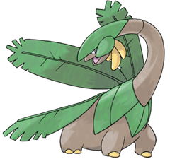
Tropius!! I still recall bumping into a Tropius for the first time playing Sapphire. Running through the enormous long grass area of Route 119 in torrential rain... I couldn't believe it. I love cutesy little mons and all, but honestly Pokémon probably needs more of these enormous lumbering giant monster types. His color scheme totally fits for a Pokémon that lives amongst the trees, and the long-necked design reminds me of the diplodocus scene in Jurassic Park... Ahh... The banana-like fruit growing from their heads or necks is another really nice touch and makes Tropius feel believable. The tropical leaves on their backs recall Ivysaur and Venusaur (always a good thing!) and make me really yearn to see one take off. Oh, Tropius...
This design drives me bananas. lol To be honest, I've never really liked Tropius... it's just so bizarre... A dinosaur that flies with banana leaves... it's just completely utterly random. None of the parts even make sense together. For instance, with Exeggutor, it's kind of cool that the coconuts of a coconut tree were turned into heads with different personalities. Tropius just seems put together randomly (not that it'd be the first—a leek carrying wild duck also makes no sense). That said, I do have to give Game Freak props for creativity... flying banana dinosaurs... it's true that none of the newer designs share such creative spark... or utter bizarreness, whatever you want to call it.
Chou be hatin'. I absolutely adore Tropius' design and think it has a lot of ingenious elements that I wish Game Freak would incorporate into all their Pokémon. Although the design is seemingly "random" at face value, I am of the opinion that the design meshes together into something successful. Just the idea of using a banana tree as the neck of a brontosaurus is a stroke of genius. Grass-type Pokémon are my favorite types, and one of the downsides of that is it's nearly impossible to incorporate fruit into a design. Tropius, thankfully, incorporates fruit in a really innovative way into its design.
I think the fact that it can fly is a bit obnoxious (those leaves must be crazy durable in order for it to fly), and I would have preferred that it be Grass / Dragon in terms of typing. I don't think that detracts from the excellence of this design, however. Tropius is a beautiful Pokémon and I hope that if Game Freak ever tackles the concept of a fruitmon in the future, they keep it on par with Tropius's sleek design.
This Pokémon is bananas, B-A-N-A-N-A-S. Like Az, I remember when I ran into Tropius in the wild for the first time and thinking that I had run into some rare legendary Pokémon by accident, as its lumbering frame filled up damn near the whole field. A fruit-tree dinosaur is an immensely creative and clever design on Game Freak's part, the color scheme is spot-on, and the bananas that grow under Tropious's chin are a neat touch. However, I do agree with Birkal that the wings and Flying typing seem unnecessary. It's based on a sauropod and a banana tree! When have those two things flown ever?
It's a banana dinosaur.
A
banana
dinosaur!
4. Camerupt
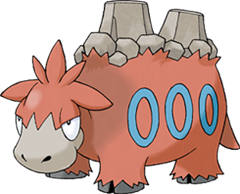
I'm not wild about Camerupt. Let's start positive though, and talk about what I do like. The humps on the back as miniature volcanoes work well, especially with the little outcrops of rubble around the base. The base colors are also fitting for a Fire / Ground-type. That said, though, they're almost too fitting—they're a little plain, and I get the impression the three blue rings on the side were just slapped on as an admission of that fact. They don't really work, in my opinion! I'm also not a huge fan of his tufts of hair and ear flaps, but I guess they were supposed to look silly, really. I certainly don't think Game Freak set out to make camels particularly cool. A miss for me, this one!!
While it wasn't my favorite at the time of playing, I think over time Camerupt has grown to be one of my preferred designs of R/S/E, for a good number of reasons. Firstly, it's a camel. Camels are adorable, or at least this one is: look at that huggable schnoz! Look at the adorable expression! Beyond this, it has volcanoes in its back. Now, an adorable camel with only one volcano in its back would be brilliant. Two? That deserves an eruption of applause!
Alright, alright, that was bad. I get it.
I hold great affection for Camerupt, and I couldn't believe it when my Numel evolved into something so badass. The volcanoes on its back, while not necessarily perfectly integrated into the design, look tremendous in their own right and works well enough as part of a whole anyway. The bulky frame and the calm expression of Camerupt echo the restrained power of real camels; they look docile enough at first glance, but get them riled up and there'll be hell to pay. The blue rings on the side have always reminded me of smoke rings or ovens and serve well to liven up what is otherwise a whole chunk of plain space. This one, I really like.
I think the only redeeming quality of this design is the "volcanoes for humps" deal. Everything else about Camerupt just strikes me as either bland or confusing. The bizarrely bright blue rings on its sides, for example, are completely unnecessary and in my opinion, heinous. Also, its face isn't really lovable to any degree; it's reminiscent of something like Eeyore from Winnie the Pooh, but not adorable or cuddly. I look at this design and the awkwardness of it all frightens me.
Perhaps the most ridiculous thing of all is that this monstrosity evolves from Numel, which is arguably one of the cutest Pokémon of all time. I'm baffled as to how the designers took away the simplicity and adorableness of Numel and forced it to evolve into the embarrassing aesthetic mess that is Camerupt.
See, this is a great example of NOT having the problems seen with Tropius. Camerupt is a camel with volcanoes on its back—but that at least has some ironic sense to it, because real camel humps look like mountains. It's creative, it's witty—it takes a real-world object and spins a creative flare on it, instead of piecing together random bits that have nothing to do with each other. Speaking more of Camerupt itself, though, I just love the concept if that wasn't apparent, and the execution is pretty good too! The face is just the right mix of derpy, adorable, and badass. It's a freaking walking volcano after all! The only thing I don't like is the random blue rings drawn on it. Actually, a lot of the 3rd gen designs suffer from random markings that seem put on for little design reason beyond the level of putting stickers on a refrigerator. Unlike 1st / 2nd gen Pokémon like Arbok, Electabuzz, or Suicune that have markings emphasizing parts of its character (like biology or element), many 3rd gen designs have added markings "just because" (Medicham, Whiscash, Sharpedo, Crawdaunt, Kyogre / Groudon / Rayquaza, etc.).
It's like comparing the older Star Wars to the newer Star Wars: limitations in technology forced greater human creativity. In Star Wars, lightsaber battles were few, but packed with human emotion and character conflict because they didn't want to do the special effect for it too much. The new movies are full of crap. In Pokémon designs, a limited color pallet and pixel space forced designers to create Pokémon that had more character in simpler designs. Now you can stick random shiny crap on the design to "make it look cool".
ADV was just the first step in this development, but it's up to personal preference to decide whether Game Freak got better or worse on this point over the generations.
5. Cradily
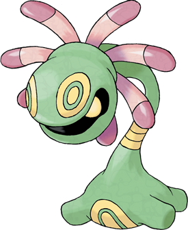
Random ass markings... yeah. Though in Cradily's case, at least they have some biological rationalization—fake eyes. But, wait, you don't need fake eyes on a non-mobile creature that is covered in protective armor. Wait, what? I will say that coming from GS, Rock / Grass was a typing I really wanted to see, but had no idea how it would be done. Game Freak did it great in my opinion, as a monster anemone / coral thing fits that example perfectly (for those who don't know, coral also has tentacles it feeds with at night; it is closely related to anemones, but raises algae inside its body that conduct photosynthesis by day). I do wonder why an anemone or crinoid was chosen as a fossil Pokémon when such creatures are very much extant life forms to this day and age but... eh, whatever.
Ughh hh h. Maybe I just have bad memories of having my team crushed by Cradily, but I'm not too huge a fan of its design either. It's just too all over the place for me. I'm not certain what it is supposed to be based on or take inspiration from. It looks a little like some carnivorous plant out of another Nintendo game, something like Mario or Kirby. Looking at the Sugimori art, though, I think doesn't really do Cradily justice. Sugimori's colors are very washed out and subdued, whereas the sprites for Cradily have much sharper, more vibrant colours. These are much more appealing and help to emphasize the black recess where its eyes lurk. Very sinister!! The alternate colors in Cradily's shiny form also deserve a special mention!!
Cradily's design looked too garish to me at first encounter, but then I realized its real eyes were hidden in its "mouth", and things looked much much cooler. The fake eyes and the pleasant combination of pink, green, and yellow really are the big draws for this Pokémon, which Game Freak must be commended for. The thin craning neck has its roots in biology, sure, but it does make Cradily's design look a bit top-heavy and unbalanced. The anchor at the bottom really reminds me of a soft toy and its cuddly rotund paws, and adds a dash of unexpected cuteness that is missing from the rest of the design, though I do wish it were bigger so as to counterbalance Cradily's enormous head. Overall, with a few minor adjustments, this Pokémon would just perfect.
I named my first Lileep "Karl"; she and I went on to have a very special bond in Pokémon Sapphire. In fact, when I went on to breed a bunch of Lileep eggs some years later, I made sure that all of them were descendants of Karl the Cradily. As I said before, Grass-type Pokémon are my favorites, so naturally I love Cradily. I think that utilizing a land-bound coral theme was brilliant and went on to make Cradily a successful design. While I personally believe that the circular designs on its stalk and base are unnecessary, the fake eyes totally make up for it. I love it when a Pokémon can fool you visually, if only for a brief second. Cradily is one of those Pokémon, and it is arguably the Pokémon that does it best. Its "hidden" eyes are by far the most creative part of this design; I applaud Game Freak for having the bravery to go out on a limb and hide its eyes so well.
Although I don't understand the pink tentacle members that are under its head, perhaps that is the beauty of the design. Can any of us really understand Cradily and the suffering it goes through? How can we understand humanity? What is art? All of these are valuable questions to consider when pondering Cradily's design.
Hey, let's go check out the corner of this desert because I can. Oh, look, rocks! Root Fossil, eh? Alright then. Hot damn!
Okay, so I really like Cradily. I think it's mainly because it's an oddball of the fossil Pokémon: when using that term, Pokémon like Aerodactyl and Armaldo spring to mind, but not something like Cradily. The majority of its body is neck, and the rest is a cute little stumpy thing on the ground. It's also great that Game Freak has somehow managed to work pink into a design which is mainly green, and the bands on its neck are a nice, simplistic touch to make the design flow more easily.
I don't know if I'm the only one, though, that always thought Cradily's eyes were the markings on the top of its head, and its actual eye a tooth? I can't have been, surely...
| « Previous Article | Home | Next Article » |