Judge A Pokémon: NU thought we were done
| « Previous Article | Home | Next Article » |
Judge-a-Pokémon is back with NeverUsed Pokémon. Given that they're never used anyway, they might as well be judged! We're cutting costs this time with a smaller panel, featuring skylight, Aurora, and Danmire, and Bummer's back once again.
Ludicolo


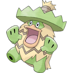
Ludicolo is interesting. It has a duck face, but having a duck face is usually something you'd think is slutty on everything other than a duck. It has a poncho, but you never see what's underneath the poncho, so you kind of wonder what it has to hide. Is it a green duck? Is it a Mexican (such as Smogon user TFC) hiding illegally inside it? Is it a rebellious Cacturne? That's why it has gotta lose the poncho. Once it does that I will approve of its design— until then, it is just a crazy, rain-dancing weirdo.

This Pokémon is a shining example of how, in my opinion, Sapphire's version exclusives trump Ruby's. Just look at how carefree and happy it is next to the grouchy Shiftry! Spending all of your time salsa dancing must be a panacea for any and all forms of depression. As a matter of fact, I feel as if Shiftry would appreciate some dancing lessons from Ludicolo. Complementing Ludicolo's disposition is its neat design. Its skin, if you can call it that, isn't obnoxiously vivid in color&emdash;it's actually the perfect shade of green—and the pale brown down is a really nice touch. I also have a certain fondness for Ludicolo's hat, which, depending on how you look at things, could be either an integral part of its anatomy or just something that appears on its head when it finishes evolving. I am surprised replicas of it are not yet available in my local millinery, as I would totally wear one to a party. Overall, this is an excellent Pokémon—it's happy, well-designed, and acutely aware of underrated fashion trends.

There's just something about this Pokémon that fascinates me. Its two previous evolutions, at least in the game, don't really look all that excited and happy. Enter Ludicolo. A weird science experiment of a duck and some other plant, this Pokémon even comes equipped with a sombrero. According to trainers, this is one hyperactive Pokémon that goes nuts whenever it hears music. I'm thinking Game Freak was listening to Salsa or Merenge, or some other form of Latin music, when they were creating Ludicolo. It even wears a poncho! Ludicolo is a very funny looking Pokémon, but it might not please everyone. One thing's for sure, though: I'd love to take dancing lessons from this Pokémon.

Ludicolo is one of the better examples of official Pokémon showing off a manmade invention while still making it seem fairly natural. Unlike certain Pokémon, like say Sawk and Throh, Ludicolo's sombrero is a part of itself as a majestic lily pad, rather than a separate object that's placed on its head for no reason other than to create a theme. Its typing also works excellently with its lily pad and kappa origins, and its color scheme is not over-the-top and instead makes for a mellow selection of green and yellow tones. I'd like to make fun of it because of how silly it seems with its goofy smile and inflated hands, but honestly, this design has been well thought out. It might not be serious, but it's fun and innovative, and has certainly made several people silently think "I wish I had thought of that". And if you don't like it, Ludicolo has no issues dancing its troubles away.
Samurott


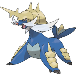
Samurott's design has a lot going on at once. I think they overdid the amount of shells on Samurott. Walking seems really difficult for it, so its main use seems to be a flotation device. That'd be wonderful if not for the fact that while riding on Samurott you have a chance at being impaled as well as developing a rash thanks to its mustache. Without those two things though, Samurott would literally be... just a blue otter. Given that Oshawott and Dewott pull off being a blue otter so well, I'm sure Samurott would, too, if it just removed its armor.

Imagine a common clump of garbage. Done? Good. Now imagine that your clump of garbage has been painted dark blue and somehow shaped into something barely resembling an angry sea lion. You have? Congratulations! You now have a relatively accurate mental image of Samurott. This is hands-down the ugliest starter Pokémon ever created. Samurott's dark blue skin does not go well with the cream-colored shells that cover its head and legs—they are forced together by an arranged marriage of the vivid and the dull, perpetrated by a designer who obviously didn't know any better. In addition, Samurott's heavily waxed facial hair, which could have been its saving grace, comes off as little more than a pretentious attempt at replicating Alakazam's enviable mustache. The most ridiculous thing about Samurott, however, is its feet. They're too small! I would imagine that Pokémon circuses all feature a segment where the audience laughs at a muzzled Samurott attempting to lug its hefty body around with those pint-sized paws. Adding to Samurott's woes is the fact that it is just another common Water-type in the grand scheme of things. If you ever decide to have another crack at any of the Generation V games—they're all very replayable—I advise you steer clear of Oshawott. Don't be reeled in by its cuteness, because chances are you'll wind up carrying this thing in your party. Don't say I didn't warn you.

I didn't really feel like Generation V was the best. In fact, I think it was the weakest generation in terms of how hyped things were, or what there was to offer. But I did like the designs of the Pokémon very much and there was always one starter that I had to pick. Oshawott's final evolution, Samurott, is probably my second favorite Water starter in the entire series. Its awesome aquatic mammal design, which seems to take the form of pinnipeds and sea otters, plus its samurai design is just outstanding. The body armor reminiscent of shoguns shows a sign of toughness and it is quite the Pokémon you shouldn't mess with. Its striking blue primary color, however basic, is also very pleasing to the eye. All in all, Samurott is also definitely an awesome-looking monster.

Samurott has caught quite some undeserved criticism ever since its reveal, even though most of the bitterness has faded away by now. To be fair, most of it stemmed not from its actual design, but more how dissimilar it was to its former stage, Dewott. To this day, I still haven't fully grasped the idea behind Samurott, but I've been told that it can be summarized as a 'sea lion samurai', and most of my doubt was thus brushed away. Judging purely by the visuals, there are several cool features about Samurott. Cool body plates, a menacing helmet, and a rugged mustache to top it all off. So while it might not have been the most logical next step from a bipedal otter, I'd say Samurott's positives more than well outweigh its negatives.
Miltank


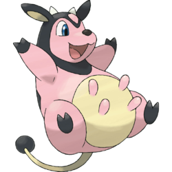
Miltank is like that big sister you never had. It can provide a Milk Drink when you're thirsty, a soft body to lay on when you're tired, and when you're feeling extra lazy, don't worry: once it uses Rollout you'll be up soon enough (once you de-flatten yourself obviously.) Design-wise, Miltank doesn't steer that far away from what a real cow would look like. The pink coat just adds character, like, you really don't want to mess with a pink cow, do you? That's why Whitney having Miltank in the Johto games was so good—Miltank got a chance to show that it's more than a pretty face. Literally. Pretty nice design, no complaints here.

I've always found Miltank a bit off-putting. This might have something to do with the fact that, should you search for it on Google Images, you will be on the receiving end of some rather strange and unauthorized artistic impressions of it. When you ignore this, however, you'll find that Miltank's pretty ordinary. It at least appears to derive some level of contentment from the fact that it is not very remarkable, as you can see from its facial expression. A high level of self-esteem is always a good thing. Besides this, however, Miltank isn't much more than a bipedal, pink cow with very short limbs and a round face. The black accents on its head, feet, and tail go nicely with the shade of pink, I guess. I suppose it is also redeemed in some way by its altruistic nature, as it happily allows Pokémon that aren't feeling the best to drink its cure-all milk from its teats. However, there's not much else I can say about Miltank. It's just that unremarkable.

I was never much the one to complain about designs being "lazy" when it came to those arguments about Generation 1 being cooler than everything else because of designs. Milktank, to me however, isn't all that exciting. I don't hate it, not at all. Everyone and their mother knows about Whitney's Milktank and what a pain it was to go against it. That's probably what stems off my opinion on Milktank. I'm indifferent about it, but I don't hate it either. Its design is simple and easy to look at though. It's based off a cow with a very noticeable utter. Next.

Miltank is based on a cow and, as a result, looks like a cow. With that sentence, most of what I planned to say has already been used up, forcing me to examine this dairy queen closer. Like many others, I, too, have faced the wrath of this milky terror in both GSC and HGSS, hence why its black hood was a wise design choice to further emphasize its role as an unforgiving butcher. The choice of making it bipedal is unusual given the way cows normally move around, but seeing how Tauros existed in the prior generation, I can only assume that they wanted Miltank to stand out in more ways than one. But with the pink skin and the cheerful smile, there has yet to be a design quite like Miltank.
Weezing


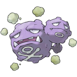
Weezing is an awesome idea. An awesome idea for a balloon, that is. In terms of having an awesome design, not really. Who would want to own a cloud of toxic gas? Being around it literally would poison you, and if people thought Garbodor was a bad idea, well... at least you can make cool things out of trash! Despite the fact that they had to make a poison gas Pokémon, Weezing looks kind of alright. It looks like it has decayed to the point where it hates life. Weezing therefore is the perfect candidate for helping to prevent global warming (except there's only global freezing in the Pokémon world, and I don't think Weezing can really be blamed for Ghetsis's flaws.)

Ah, Weezing. Forget about poor, confused, lost Numel. The fact that Weezing comprises of two depressed heads, as opposed to one, makes it possibly the saddest Pokémon around. I don't know what could have happened in the evolutionary process to cause the happy-go-lucky Koffing to suddenly experience a huge mood shift as it split into two, but it must have been pretty traumatic. Unlike Koffing, Weezing looks as if it's conscious of the foul stench that assaults wherever it floats. Both heads always have forlorn gazes painted upon their faces, as they watch the plumes of poisonous gas they exude from their craters float away into the distance, diffusing into invisible blankets of choking smog. There is clearly a level of awareness present on Weezing's sad heads that only somebody with no nose or a wealth of nose pegs will ever show it any love. I doubt that the large fangs present on Weezing's larger head act as a redeeming physical quality. You've got to feel sorry for Weezing. You really do.

Weezing is another one of those from Generation I that you can't really tell what it is. To me, it's a cool design, but not all that exciting either. Weezing appears to be three balls of toxic gas, to which they have all been fused together. Perhaps by nuclear radiation? Toxic waste from pollution? Who knows? Those saddened faces probably show some kind of pain or indifference about what the current situation is. To me, it's the latter. Weezing has that "ugh" look on its face that clearly shows it doesn't want to be here. Weezing's got a cool design, but it's not that crazy.

Weezing has existed for so long now that most Pokémon fans no longer need to pay any critical thinking to its appearance. I, on the other hand, have no such luxury, and instead need to delve deeper into this cloudy behemoth. It's a pure Poison-type, so it has a firm, almost unshakable, connection to said typing by being a floating ball of unrelenting gas. But beyond that, it doesn't really have all that much. Its levitating properties make you assume it's a balloon, but because it's also constantly exhausting gas, is it also meant to be a reference towards factories? Is its extra head a hint towards radioactive pollution and its cancerous effect? What does it even need fangs for? Where's the innocent smile that Koffing lost upon evolving? All in all, Weezing is one of those designs that purely focus on its typing and leaves little thought on how to view it as an independent living creature. Weezing exists to be in pain and cause pain in return; its thousand-mile stare beckoning its trainer and opponent to cease its suffering.
| « Previous Article | Home | Next Article » |