CAP 3 CAP 3 Art Submission Thread

Status
Not open for further replies.
Here is the male version of my art.


It's not quite finished. I'm going to add a ridge down the back and poof up the mane. Then, I'll repost it as well as the female.
 
Really though, it's basically armor. Makes it look more physically defensive to me than physically offensive.
 
Doug's Hallowmean is one of my top favorites of this thread.

Elagune's second "wood/salamander" is just amazing!

I still really like CyzirVisheen's exploding pea pod as well.
 
I think the snake would be so much better if the grass was used like blades on it, more like spikes on its body than just grass growing out of it, like Grovyle and Sceptile's leaves.
 
Design 3

.
This one is still hands-down my favorite. I really like the idea of a chili pepper/salamander type of theme, and this design seems to fit the build the best. Not to mention its just awesome looking :) My one complaint is that it's not exactly Grass-y enough, but that could change with coloring

Edit: and although at first I didn't really get it, now that it's been revised I'm starting to love the woodman too, which is good since that seems to be the most popular one
 
I just drew something but its a very rough sketch and not good at all. The concept is good though. Ill color and put up tomorrow.
 
Wow... I thought after seeing Elagune's ridiculously win submissions, it'd be an easy choice, but almost every design I've seen I've liked. I think Elagune's Woodman #2 is my favorite, closely beating out Pyro's grassnake. I also love Cyzir's tanuki and Doug's hallowmean, as well as Blu's first submission.
In my opinion, regardless of whether we use Woodman #2 or not, we should keep Woodman #1 in mind for later CAP projects. Although #2 fits our ideas better, I actually prefer #1 as a Pokemon.
 
God, all of these look amazing!! Great job so far everyone =D

I have some art to post too, they are all inked and ready to go. I'd like to color them too, though. What programs do you guys use to color? I really want my art to be up to its full potential.
 
Jesus I just realized this is going to be a mother bitch to decide on which artwork go through and which don't? I do have a few in mind though but still...
 
Jesus I just realized this is going to be a mother bitch to decide on which artwork go through and which don't? I do have a few in mind though but still...
try to get a least one from everyone if you can. I accidentally took three from King of Anime last time (I intended that for TaB because of how much work he submitted).
 
I think I'll throw my hat into the ring since I have a vivid idea of what I personally think this guy should be, but no Photoshop/tablet or scanner means it'll probably just be a good ol' fashioned pencil on lined paper picture taken with my cell phone.

I'm not exactly an artist, but I like to think I can sketch decently if I set my mind to it. Hopefully my representation will sway you all, despite it not being as fancy as some of the others (namely: all of them). Hell, if I could get someone to copy it and make it look pretty, I'd let them take credit for it, I just want my idea to be realized.
 
Haha, great to see all this feedback on my designs. I realized that a lot of the sentiment amongst you guys was that the Woodman design, as you guys have named it, looks more like a physical wall than anything else and wanted flamethrowers on the arms.

Here is my offering.


Any thoughts?
Holy crap!!Dam!!Wow!

I think we have almost redo how we do the art process.It is clear that some people are on other level art wise.My suggestion is this create a cap project art team KoA,Elagune,Doug etc... and still have the art submission thread but then after have the art team redraw some of the pokes then vote on them.

Why do this

1.We have been voting on the best looking art not necessary the best idea for the concept for the poke.

2.Raise all the art on the same level,no disrespect to some the of artist but if say eric's snake(which is awesome) or cyzir's peppersaur(which might be most pokemon like concept)was drawn by say elagune or KoA we might be thinking differently right now.

3.The little more art for the day if ever a Cap pokedex is built

I am not putting down anybody art work this art thread so far has had produce more great art work than last 2 art thread combine i think but i am staring to wonder if the best concept is winning or the best art.So far i think the best art is winning these things.Just a thought.
 
We don't vote for the best art, we vote for the best concept. It just so happens that the best art has the best concept.
 
Fuck you now i can't chose between woodman,pyro's snake thing and CyzirVisheen 3rd design. Can we submit bst with the proposed art from now on lol.


This is my favorite so far, I love the idea of it being a Chili pepper. My only problem is that this looks a little... NFE to me, like the second evo of a three stage.
 
I've been lurking on smogon for this & hooray for the new project.
I'm not really good with Photoshop so I just scanned my sketch instead

In my opinion this is the best one so far because it looks similar to ken sugimori's artwork. It actually resembles a real pokemon, someone just needs to color this sketch.
 
I really wanted to do a revision on the Gentle Giant, but I realized that I really couldn't. There wasn't anything that I wanted changed, because the Gentle Giant already fit my image of him perfectly except for his club-hands. Therefore all I will churn out for him is this image of him with his hands fixed.


It's not much of a difference, but I hope you guys like it.
 
Blu's creations are neat in their own right. The top one remind me of a fusion between an owl, a pumpkin, and metaknight for strange reason.

Elagune~ Jesus Chirst, it's Revenankh all over again. Gentle Giant choke slam some poor bastard.
 
The thing that is most important in a design of a pokemon is that it has to be simple and easily drawable, unlike digimons. The real hard part is to design a pokemon that looks like a pokemon instead of a digimon. We have some really nice designs here, but i just deel that some need to be simplified.

Anyway, i really like the Jack o Lanturn idea. I mean its like a plant with fire in it? Pretty obvious that its fire/grass type. And somehow, a pumpkin pokemon looks like it can be bulky, but slow.

Maybe i could upload a design myself, but i'm not sure cuz i'd probably be to embarrassed of the quality. But it would look abit like this:

 
Haha, great to see all this feedback on my designs. I realized that a lot of the sentiment amongst you guys was that the Woodman design, as you guys have named it, looks more like a physical wall than anything else and wanted flamethrowers on the arms.

Here is my offering.


Any thoughts?
The more i see this thing, the more i fall in love with it. People keep saying it's appearance doesn't fit Special Attacking, just look at Alakazam. It gets all the elemental punches, and doesn't look like a Special Attacker. It doesn't look all physical. Fire Blast, and probably Energy Ball is probably as far as it gets. It even looks like it can get Aura Sphere. So don't quit on the Special Attacking yet.


I'm sure my art doesn't, so let my words do justice to my vision.

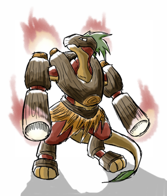
The obvious inspiration here is, as I'm assuming most of you are able to tell already, is a Tiki. It's big, it's wood, it's on fire. Already covers all three bases, all right! Now, obviously, a Tiki head doesn't allow too much room for interpretation - it's basically a Hawaiian log o' lantern. So, instead of straining myself trying to make him unique and totally out there, I took what we had and ran with it. It's simple, and his basic makeup conveys both types of our Pokemon with just accuracy. I knew he was simplistic, so he also had to be expressive - carry his weight in flavor, so to speak. The big, Gastly like eyes are menacing in effect, and flickering flame behind the pupils and the brow that's pointed both relaxed and furrowed at the same time convey an air of madness. I also wanted to keep it light and somewhat humorous, compared to the horrible looking (in effect, not in art!) Syclant and Revenankh. His big toothy grin is slightly lit from behind, and he's traveling on a flame out of a hole in his bottomside. Also, in a RARE CASE OF GENIUS BY LORD GLOOM, I made sure that his Grass subtype wasn't overshadowed completely by the fact that he's essentially a fireball - if you'll notice the odd cross thatching in the wood and the raging fire coming out of his top, he was indeed, in case you might have been wondering, modeled to look like a big ol' pineapple. It fits with the Hawaiian theme, and is just a subtle visual reminder that he is indeed part Grass.

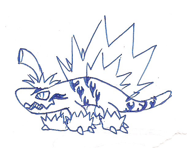
Also, the offer is still open if anyone would like to tidy him up and make a nice picture out of him, so to speak.
 
Gothic, what's the deadline for this? I'm making one as well, but it might take a bit of time.
I think of making the deadline for art submission after the overall stat have been chosen, but that might lead into problem with the whole stat =//= art conflict, but at this point I don't really care. My advice is to work super fast and pray to God it comes out like you hope it would.
 
Status
Not open for further replies.

Users Who Are Viewing This Thread (Users: 1, Guests: 1)

Top