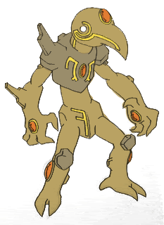
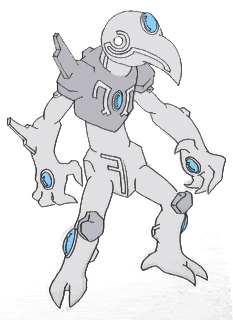
This is great. The only thing I might change on this is make the colors of the lines and stones not the same. But I really like the green theme you got there, it sets a "tribalistic" creepy like tone for this monster. I feel the green is a much more supernatural and powerful color than yellow.@Caladbolg: I did a quick recolor of your easter island pokemon:

It's not bad, but I think this pokemon could use a different (darker?) stone on certain parts of the body, namely the forearms, lower legs, chest, hips, and head. If there's interest I'll consider improving it a bit.
-
The moderators of this forum can be found in the CAP forum staff directory.
-
Welcome to Smogon! Take a moment to read the Introduction to Smogon for a run-down on everything Smogon, and make sure you take some time to read the global rules.
-
Congrats to the winners of the 2023 Smog Awards!
CAP 5 CAP 5 - Art Submissions
- Thread starter tennisace
- Start date
- Status
- Not open for further replies.


Ok it's explanation time.
Tinypic made them this size and I like it because it's noticable and helps you see the small details better
Now this is my first art submission for any Cap and it turned out better than I expected (though the coloring kind of ruined it). I know I colored outside the lines ok, my crayons weren't fine tipped. Beef is poor and doesn't have any scanners and photobucket and such so he was stuck to crayons and digi cameras, which the photos didn't turn out that well but it's the design that counts.
I accept all advice but there is very few things I can to it now without redrawing it.
Anyway on to explaining the design. The middle photo was my first drawing and I mainly included it to show you the full back spikes. That photo was also my color experimenter. The design on the back of the head on the backsprite is the same for the tip of the wings, it's suppossed to be like rock skin (like the Thing). The design was kind of based of Cranidos' body but obviously modified. It may not look very rocky to you but it has the body to survive in rocky territory. Rough feet to stand the terrain and a tail and head to smash through obsticals. You may be thinking how can it use a lot of attacks, well I was thinking it could use it's body for all the rock attacks and then it's mouth and gem for the bolts/beams/balls/blasts/etc. And then for the other moves just use your imagination I guess. Yes I gave it wings but there are a few animals with wings that don't fly so it doesn't have to fly or have levi. In my mind I think that it rarely uses it's wings at all just keeps then tucked it (except for on the backsprite). The red lines are supposed to be kind of like blood vains and to help support the skinny neck. The only thing I really don't like on this is the feet but I didn't really know how to fix it and I'm about to be swamped with homework so I wanted to submit this while I still had time.
So ya I tink I covered everything, hope you like. If anyone with nice equipment/good art skills wants to redraw this and submit it as their own I'm okay with that as long as you give me credit.
A Glass sculpted pokemon has to look like some thing. It look is more to justify is speed and stealth whilst still being a Cannon. And I already explained away teh reason behind the claws. Besides, a pokemon made of glass isn't keen on taking on anything in physical bought! the prjected base attack power of around 50 stil seem reasonable to me.It's look like a Bug-type Pokemon. Also, with those giant claws look too physical.
But this only initial sketches. The details of it's design can be changed. It's the concept behind it that I'm more interested in. Any thoughts on that?
"doesn't look like a pokemon"??? That's what we said when Palkia and Dialga came on the scene. Same with Kyogre and Groudon or Salamence and Metagross. The generic "look" of pokemon is changing ans we are growing used to it.its a nice drawing and all, but it dont look like a pokemon. lots of ppl think caladbolg's drawing doesnt look pokemon-y, but i think it does..but this goes farther down the "doesnt look like a pokemon" path than caladbolgs...in my opinion.
Like I said before. Initial sketches. Details are subject to change.
Any thoughts on the viability of the concept??
It's certainly a viable concept, if you are able to turn it into something you could envision standing next to an Alakazam or Garchomp. Take mine for example; I knew I wasn't getting any comments on my first one because, when I took a hard look at it after a day without thinking on it, I realized that there was quite a bit that could be changed to make it more pokemon-esque; specifically the eyes.A Glass sculpted pokemon has to look like some thing. It look is more to justify is speed and stealth whilst still being a Cannon. And I already explained away teh reason behind the claws. Besides, a pokemon made of glass isn't keen on taking on anything in physical bought! the prjected base attack power of around 50 stil seem reasonable to me.
But this only initial sketches. The details of it's design can be changed. It's the concept behind it that I'm more interested in. Any thoughts on that?
"doesn't look like a pokemon"??? That's what we said when Palkia and Dialga came on the scene. Same with Kyogre and Groudon or Salamence and Metagross. The generic "look" of pokemon is changing ans we are growing used to it.
Like I said before. Initial sketches. Details are subject to change.
Any thoughts on the viability of the concept??
My advice is to make it LESS organic actually. As it is, it reminds me of something like a Tyranid - an inorganic thing turned into something organic. Look at the inorganics of Pokemon - Magneton, Claydol, Solrock - they're not very organic in their designs at all, while yours is overtly so. And to top it off, it doesn't even look like something from this world, while the majority of pokemon have their bases in real life animals.
If I were you, there were two things I could do to improve: The first, being simply re-working the cannon into something with less of a Tyranid, organic feel; or, the second option is trying to find some cannonical parallel to nature with which to host your creature. Simply put, find an animal that looks like it could be morphed into a gun or holding a cannon; Rock-type Blastoise on Steroids, etc.
And that's my $0.02 on your thing vivid.
Ok, there seemed to be some interest, so I worked out a second version of Caladbolg's easter island concept:
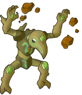
I changed some of the colors around so that it was more interesting to look at. The eye seemed to get bored of staring at the monotone in the original version. I also changed one of the stones to add a bit of pop. I noticed that the glowing "veins" did not stand out enough, so I livened those up as well. Then, I just cleaned it up a bit. What do you guys think?
EDIT: Caladbolg, the drawing is pretty good, but keep practicing and pay close attention to perspective. In case you didn't notice, the right arm (our right; its left) is a bit out of perspective. It should have been turned more and the gem needed to be relocated. That being said, it isn't extremely noticeable at first glance. The drawing is certainly good enough for a concept submission in my opinion.
Skyshroud that looks great. No complaints here!
Ok, there seemed to be some interest, so I worked out a second version of Caladbolg's easter island concept:

I changed some of the colors around so that it was more interesting to look at. The eye seemed to get bored of staring at the monotone in the original version. I also changed one of the stones to add a bit of pop. I noticed that the glowing "veins" did not stand out enough, so I livened those up as well. Then, I just cleaned it up a bit. What do you guys think?
EDIT: Caladbolg, the drawing is pretty good, but keep practicing and pay close attention to perspective. In case you didn't notice, the right arm (our right; its left) is a bit out of perspective. It should have been turned more and the gem needed to be relocated. That being said, it isn't extremely noticeable at first glance. The drawing is certainly good enough for a concept submission in my opinion.
even better.
SWEET!Ok, there seemed to be some interest, so I worked out a second version of Caladbolg's easter island concept:

I changed some of the colors around so that it was more interesting to look at. The eye seemed to get bored of staring at the monotone in the original version. I also changed one of the stones to add a bit of pop. I noticed that the glowing "veins" did not stand out enough, so I livened those up as well. Then, I just cleaned it up a bit. What do you guys think?
EDIT: Caladbolg, the drawing is pretty good, but keep practicing and pay close attention to perspective. In case you didn't notice, the right arm (our right; its left) is a bit out of perspective. It should have been turned more and the gem needed to be relocated. That being said, it isn't extremely noticeable at first glance. The drawing is certainly good enough for a concept submission in my opinion.
I can see this as a poke, especially with a sprite like this.
Oooohh, I love the clock idea. It is right up there with Chess piece for the most innovative idea. Way to step out of the box Antarctros. The coloring is very simple but I think that is what makes it so Pokemony. This design obviously pulls inspiration from some of the other inorganic/object/machine pokes, but that's fine. Great submission!Hi all, another newcomer to the CaP project here. Well, as a fakémon fan and creator I've actually been lurking around ever since day 1, but I only recently felt confident enough to participate. For my entry, I decided to use the aforementioned concept of quartz, taking it to the extreme by actually making a quartz clock. Okay, in real life it takes a finely cut crystal and an electric current for the quartz to be used to measure time, but this is pokémon and we can leave the science stuff aside. This pokémon's crystals vibrate through its own life force.

Now, this will need some justifications, competitively, aesthetically and flavor-wise. Here they are.
Special attacks may be launched from the jewel on its pendulum, its arms/hands (asymmetry intended, of course), its crystal bells, and/or its eye. It has a hollow body to imply low physical defense. As for the matter of speed... it doesn't look so fast, does it? Well, that's what you want your opponent to think! If we are willing to accept that this pokémon can control time (with a reduced sphere of influence, not to legendary levels like Dialga), then any amount of speed can be justified. It just slows time around it to be 'faster' than its opponents. So here it is, I hope you like it :)
I like it so much. I like this for my official final submission.Ok, there seemed to be some interest, so I worked out a second version of Caladbolg's easter island concept:

I changed some of the colors around so that it was more interesting to look at. The eye seemed to get bored of staring at the monotone in the original version. I also changed one of the stones to add a bit of pop. I noticed that the glowing "veins" did not stand out enough, so I livened those up as well. Then, I just cleaned it up a bit. What do you guys think?
EDIT: Caladbolg, the drawing is pretty good, but keep practicing and pay close attention to perspective. In case you didn't notice, the right arm (our right; its left) is a bit out of perspective. It should have been turned more and the gem needed to be relocated. That being said, it isn't extremely noticeable at first glance. The drawing is certainly good enough for a concept submission in my opinion.
About the perspective, yes, I know, the gem needed to be relocated, but I don't have time for that.[Today is the Independence Day of my Country...].
Well, prepare your votes for this pose and this color scheme. xD
@Mr_Goodbar: Yeah, with those glowing lines, it seems psychic in some way. But, I can see like a mono rock type too, because there is several glowing rocks on Earth. With this glowing lines,I think my concept get a new level, because I mixed ancient cultures, badass look, a brand new concept and it doesn't look like a existing Game Freak pokemon, a way to mixed the rock type with the specialish type, and others concepts based on nature.

FINAL PIECE
Ok, I just wanted to make sure you were aware of it. We all make mistakes. Anyway, I'm glad I could help you out here.I like it so much. I like this for my official final submission.
About the perspective, yes, I know, the gem needed to be relocated, but I don't have time for that.[Today is the Independence Day of my Country...].
Well, prepare your votes for this pose and this color scheme. xD
@Mr_Goodbar: Yeah, with those glowing lines, it seems psychic in some way. But, I can see like a mono rock type too, because there is several glowing rocks on Earth. With this glowing lines,I think my concept get a new level, because I mixed ancient cultures, badass look, a brand new concept and it doesn't look like a existing Game Freak pokemon, a way to mixed the rock type with the specialish type, and others concepts based on nature.
@it being psychic: To some extent, a lot of the special types out there could be construed as psychic in some manner. Doug's drawing could be easily mistaken for rock/psychic due to it's similarity to Solrock and Lunatone. While there are some pokemon that don't look very psychic yet could still pass for a special attacker, (all of the dog-like concepts come to mind) I don't think that should be a deterrent from any concept.
Well I made a few small changes to mine, outlined and colored it. There is suppossed to be a light brown over the grey but it might be a little hard to see. So here it is:


This is actually pretty cool it might actually have a chance. A small one but still a contender nonetheless.Well I made a few small changes to mine, outlined and colored it. There is suppossed to be a light brown over the grey but it might be a little hard to see. So here it is:

I think that this is a great poke, however it looks more like a Rock/Ghost to me than just a mono rock type.Well I made a few small changes to mine, outlined and colored it. There is suppossed to be a light brown over the grey but it might be a little hard to see. So here it is:

I declare this guy the winner.Ok, This is my submit:

Normal

Shiny...
[Sorry, Can anyone put the forms togethers in one picture?]
Arguments: [By Berserker]This is a really cool design, though it may be too foreign from the pokemon designs. Then again, as mentioned in previous CAPs, a lot of the recent pokemon designs are pretty fucking strange (Claydol? Solrock? A washing machine? Holy shit.) I guess being too human isn't a problem, since Gamefreak already has pokes like Mewtwo, Gardevoir, Lucario, Regirock (sort of), etc.
Apologize: Sorry if you liked my other art... Maybe I'll use those ideas for next CAP. Thanks for the support and I'll be waiting your votes xD [Just Kiding]
so have many others. thats not the final submission though. it looks very outlandish, but for some reason, it looks extremley like a real pokemon. i showed it to my brother and he asked if it was a new pokemon in platinum. then he read stuff and was disappointed.

Designed by Beej, drawn by me :S
Looks great. Make it have hands with a Eye ball in the middle.
Designed by Beej, drawn by me :S
and destroy the floating head and use the body as main. Add some Kyrogue/Groundon line thingys they have over their body, but on the main rock.
That's your #1 contender.

:S
^ The side effects of taking random people's suggestions for your artwork lol. Well Atyroki then only thing I can say now is that it's sure is handy to have on your team.
Does that mean you like it less now :(?^ The side effects of taking random people's suggestions for your artwork lol. Well Atyroki then only thing I can say now is that it's sure is handy to have on your team.
Also *smack* BAD GT, NO PUN FOR YOU >:|
- Status
- Not open for further replies.


