
It's really really good, I love it. Don't change the upperbody shape too much, I think it already differentiates itself from Swampert plenty. I'm still missing the electric feel a little though, maybe give the little circles on the knuckles and knees the same yellow color as the fin, or perhaps somehow throw in something on the belly. I'm not an artist myself, but I'm sure you can think of something.Well surely you didn't think I was gonna keep the five minute coloring job (Which I made while in the middle of class)? x3 As far as the color palette, I can see how the turquoise could be obtrusive. I was mainly trying to avoid Swampert's shade of blue, and going darker wouldn't feel very electric-y. I've toned down the hue/saturation a bit this time, but not much. If you still think it's over-the-top, I could try altering it some more.
Yup, I had already started on my final illustration and had noted that I drew the fin incorrectly.
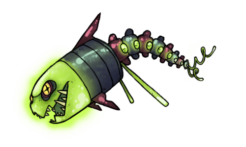
Well, here's what I've got so far, and it's pretty much done, ruling out any edits that I might make.
Still trying to think of more ways to get rid of the Swampert feel... If all else fails, and you guys think he's too derivative for his own good, I can change his face to make him a mammal full-out. (Although I think a mammal nose on him would look a bit silly.)
http://img9.imageshack.us/img9/4781/cap103color.png
His lower body is sufficiently original, it's just the upper body that I have to worry about.
~Nyasu

-
The moderators of this forum can be found in the CAP forum staff directory.
-
Welcome to Smogon! Take a moment to read the Introduction to Smogon for a run-down on everything Smogon, and make sure you take some time to read the global rules.
-
Congrats to the winners of the 2023 Smog Awards!
CAP 10 CAP 10 - Art Submissions
- Thread starter beej
- Start date
- Status
- Not open for further replies.

Well, I decided to present my LightBulb Jellyfish. I need a Color-scheme, please, choose the better. Thanks ^^
1.-
http://img39.imageshack.us/i/medusaelectrica1.png/

2.-
http://img231.imageshack.us/i/medusaelectrica2.png/


3.-
http://img683.imageshack.us/i/medusaelectrica3.png/

4.-
http://img176.imageshack.us/i/medusaelectrica4.png/

I'll add light effects in the helmet to resemble a Light bulb. But first I want to know what is the better color-scheme.

Caladbolg: Definetly the orange.

Some supporting stuffz for my creation
_________________________

_________________________

This shows how it could defend itself with water and whatnot.


I really shouldn't have to remind you all but I will: don't quote the image if you're going to critique a post (edit to a link), and if you're going to post in the first place, you need to say something more than "I like it" or "I'm voting for this". It does absolutely nothing for the artist and clogs up the thread.

Colour scheme 4 (Yellow) is the best one for me. that being said, I really don't like the dingy on it's head... it looks award; like it's just glued onto the helmet.Well, I decided to present my LightBulb Jellyfish. I need a Color-scheme, please, choose the better. Thanks ^^
I like the blue one the most, the red/orange one could be the shiny color.

so, because i am a spriter, i thought i'd like to put in my final submission in sprite-form
however, i'm having a bit of trouble thinking of an appropriate color scheme for this guy :/

here's the original sketch in case anybody cares
http://i11.photobucket.com/albums/a182/eyckzim/jelly-4.jpg
thoughts? should i add the other two "scarf tentacles" back in? i felt they were a bit crowding.
however, i'm having a bit of trouble thinking of an appropriate color scheme for this guy :/

here's the original sketch in case anybody cares
http://i11.photobucket.com/albums/a182/eyckzim/jelly-4.jpg
thoughts? should i add the other two "scarf tentacles" back in? i felt they were a bit crowding.

Hm..maybe this?


I really like this one. Although I appreciate the tedious work others went through to make their great artwork, I can honestly say this one strikes common ground with my interests. It's fat, loveably simple and conveys much about what the Pokemon we're making is. A fat, 151 base HP moldable Pokemon that is tethered to handle many "problems". I have no negative comments for it, except that the eyes could be only slightly less evil. Except if Intimidate wins, then that's *perfect* Don't feel discouraged by it's simplicity. It's exactly what Pokemon needs most of.Here is a front view of my design. I'll be gone for the weekend so I won't be able to add anything else until Sunday.
What do you guys think?


Anyways... I'd love to drop in now and say some things about everyone's but I can wrap it all up with this: well done everyone. And for those who haven't posted yet: post so we can see what ideas you people can think of.
Aragornbird: I like your shrimp design. A lot. Don't drop it. very similar to an idea I had, but instead of a shrimp, it'd be more like a type of plankton:
Only a lot more larger since plankton are microscopic. You see what i'm getting at? Remember the game Electroplankton? Yeah. That, but more Pokemon-ish.
Those are my thoughts, bonne chance everyone.
or wait...
perhaps another redesign?
http://i11.photobucket.com/albums/a182/eyckzim/jelly2.jpg
armored him a little bit, to convey the high HP more accurately, also to make it more of a mollusk/jelly. Added another lightningrod on the helmet, to conduct electricity.
perhaps another redesign?
http://i11.photobucket.com/albums/a182/eyckzim/jelly2.jpg
armored him a little bit, to convey the high HP more accurately, also to make it more of a mollusk/jelly. Added another lightningrod on the helmet, to conduct electricity.

thanks for the feedback darkmattr
i switched up the coloring here and changed the tail
gotta work on a shiny version next
(uncolored version here)
also here are some of the drawings i made when i was first trying to come up with a design
working on doing some supporting drawings of the flashlight fish using some attacks
if anyone has any criticism that would help the design itd be cool to hear it
thanks
i switched up the coloring here and changed the tail
gotta work on a shiny version next

(uncolored version here)
also here are some of the drawings i made when i was first trying to come up with a design
working on doing some supporting drawings of the flashlight fish using some attacks
if anyone has any criticism that would help the design itd be cool to hear it
thanks
Caladbolg: ...oh, I perhaps misunderstood. You're only asking about color schemes, correct? I personally like the greenish one with the pale yellow head-sphere thing best out of those (the third one). To be clear, are you planning to follow the route of your most recent design? =0 The one that added the electricky prong things (or whatever you want to call them) on its head? I hope so, because that was my favorite variation of Jellyfishman yet... ...in case that influences your decision at all. (IE, if you go that route, you pretty much get my #1 vote? Maybe that's a little more convincing, LOL...)
...hmm... what are those blue dots on its palms supposed to be? =0
YES. Definitely. The thing that bothered me the most about your old design was how plain it was, and the fact that it didn't look electric outside of its color scheme... this fixes both, nice job. I also like how it's a color scheme other than blue and yellow, olol.
...hmm... what are those blue dots on its palms supposed to be? =0
@Cartoons: I like the bottom left eye best, but the bottom right is great too.
@ Everyone who's saying Wyverii's design looks like an Ice type because of the white fur: Polar bear fur isn't actually white. The hairs are hollow and used to store heat, so they're actually clear...like water. I rest my case. Thank you, Animal Planet.
We shouldn't dismiss such a badass concept over something this trivial. Plus, if the CAP art submissions ever get put into a Pokemon game (dare to dream) Wyverii's could be the next Sudowoodo. "The strange bear didn't like it when you used Earthquake on it. The strange bear attacked!"


@Aragornbird:
I'm liking the upper and lower right, upper moreso personally.
EDIT:
Final design changes have been implemented. I added a bit more blue to balance it out, and as stated before I increased the size of the fish. I also sketched a bit around it, showing an pre-evo and how the fish would attack.

I will be whipping up an HQ final submission soon, along with a bit of supporting material
I'm liking the upper and lower right, upper moreso personally.
EDIT:
Nah, it's just going to be another supporting piece.Sezja said:I just have one curious question regarding the artwork itself. When you submit your final submission, are you planning on using the fish biting the lantern's arm pose as you main piece, or would it be a supporting piece?
Final design changes have been implemented. I added a bit more blue to balance it out, and as stated before I increased the size of the fish. I also sketched a bit around it, showing an pre-evo and how the fish would attack.

I will be whipping up an HQ final submission soon, along with a bit of supporting material

Busy, busy, busy...
@ Aragornbird: I was needing to go to bed when I made my last batch of comments, so it was inevitable that I would forget to comment on somebody's artwork. It happens when one is tired and in a bit of a rush, y'know. I'm sorry.
Anyways, I regards to giving the shrimp longer legs: no. Just... no. I see where you were going with the long legs on the desin, but the long-legged shrimp just creeps me out. I would say keep the legs shorter.
EDIT: Saw the color schemes right after I posted. Hmm... in regards to those, I'd say I like the lower right the best out of the four possibilities. They all are interesting, though.
@ CyzirVisheen: You're welcome. The minute I saw that you did not like that blue, alarm bells went off in my head, so I just couldn't keep my mouth shut about it. I'm glad you appreciate the fact that Midou and I spoke up. And I'd say that making the fish (but not the whole body) blue is a great compromise for the masses (and it looks great).
Anyways, I see that you seem to be leaning towards the green. I think it's a good choice myself.
I just have one curious question regarding the artwork itself. When you submit your final submission, are you planning on using the fish biting the lantern's arm pose as you main piece, or would it be a supporting piece?
@ Cartoons: I thought the eyes you originally had were fine. Strange, but fine. Strange eyes work well for this design, since the design itself is strange. Anyways, if you do intend to change the eyes, I would think the one on the bottom left would fit best in place of the original three dots design. None of the others, not even the one on the bottom right, look right to me.
@ Rocket Grunt: Ah, I see I communicated my suggestion. Sometimes, I tend to fear that I am not communicating as clearly as I like, but I seem to have gotten my message across. Putting things into words is not the easiest thing for me.
Anyways, I can see that you've reinvented the "skeleton fish" while keeping the same basic elements. I think that this design is even better than what you originally had (even if the reason you changed it was because the masses were complaining about the original design looking like a ghost / rock type). I definately like the second color scheme you've provided for us. It's lovely.
My only suggestion is to see what the design looks like without those two long green pieces sticking out towards where the body ends and the tail begins. It looks a little crowded to me with those there, but it may not look any good without them either, so just see what it looks like without and decide for yourself.
---
I really like what all of you guys are comming up with, which makes commenting on these pieces fun. Either way, keep up the good work.


I definitely support the bottom-left coloring scheme. It's consistent over the entire body and has a smoother feel to it. It keeps the yellow as a supplementary and secondary color that doesn't fight with the pink as much as it does in the other coloring schemes. For what it's worth, it also feels more akin to the typing, since the jagged yellow edges fit with electricity and all.AragornBird said:

@AragornBird: The top two seem a bit bland. The bottom two seem to have a bit more character to them. I am liking the bottom right the most right now as I love the belly pattern on armor but bottom left is growing on me. Both are excellent.
EDIT:@Cartoons!: The three dots worked fine. Single dot and squint are just as good however.
EDIT:@Cartoons!: The three dots worked fine. Single dot and squint are just as good however.

@Aragornbird: I prefer the bottom left. I think you should add something to make it a little more electric because right now it looks about as much Water as Corpfish.

disclaimer: I am a terrible artist, BUT here are my suggestions anyway :)
Aragornbird, have you considered lightning bolt legs or antennae? I feel that the submission really needs something to give it some pizazz, as right now it looks like a fairly generic shrimp. I know that lightning bolts are extremely cliche but it really needs something like that imo. Feel free to disagree with me on that. You have a good idea going. keep it up! Also, I like the bottom left pattern the best.
Cyzir, I think your submission could benefit from a slightly more visible light in the lantern and increasing the amount of area where the light is visible. The lantern is looking a bit too much like Bronzong and I think that increasing the brightness of the lantern a bit or maybe reducing the size of the arms and/or making the body more circular might reduce that impression. Don't do anything drastic because I really like your submission!
Rocket Grunt, not much I would change about what you have going there except maybe adding more blue and yellow to the mix.
Wind Kutone, your submission seems pretty cool but I think that making the head less realistic would be beneficial. The middle and bottom parts of your drawing are very abstract and I feel like making the head more abstract would help it mesh a bit better.

It looks like a hybrid of Vector the Crocodile and the generic enemy from Donkey Kong 64! xD
- Status
- Not open for further replies.