
-
The moderators of this forum can be found in the CAP forum staff directory.
-
Welcome to Smogon! Take a moment to read the Introduction to Smogon for a run-down on everything Smogon, and make sure you take some time to read the global rules.
-
Congrats to the winners of the 2023 Smog Awards!
CAP 5 CAP 5 - Sprite Submissions
- Thread starter tennisace
- Start date
- Status
- Not open for further replies.


I just think that the rocks should be smaller.
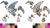
I created a backsprite.


The front sprite's rocks haven´t the same style of back sprite's rocks. The first one looks like cookies and cracky.
I created a backsprite.


T. I. B. M., the gems seem a little flat on the back sprite, but thats mostly it.
These two are by far the best in my opinion. It just have a greater air of presence and purpose to me then many of the others. Better use of the space as well imo. Not to discredit the other spriter, they are fantastic. This one just does it for me best.

New backsprite :S (I'll change the eyes depending on the final sprite people choose)


If I was to make any criticism it would be that in the front spire, I feel that the rocks "conjoining" the lower claws to the body are slightly too "straight". If you could "dis-aline" them just a little bit I think it would make a difference.
As for the back sprite I think it would benefit from moving the entire head down and maybe forward (right) just a few notches. I think it would give the impression of a slight more "hunched" leaning forward look. Rather then so bolt up right. Make it look slightly more aggressive and ready to act toward it's opponent. Thus, I feel, is the nature of the beast!
Just my two cents. Brilliant none the less :)
Your sprites look -really- good. My only complaint is that the 'head' and 'claws' look too much like, uh, steel or something like that, which could be misleading considering it's a pure Rock-type.
I changed the eye a bit and made them blue in the shiny version.
Otherwise, good job!
This is my most favorite so far.
Still tweaking the sprites, but atleast I was finally able to choose the shiny colours, atleast till I deside to change them again :/ I might make the backsprite slightly bigger, but other than that, I'm almost finished with this thing.


This here is my final entry.


Better late than never, I say.
Meh, it's mostly for posterity. It's my first real attempt at a scratch sprite, and I think I did a pretty good job of it.
Good luck to everyone who entered.
I agree with you; it is a decent sprite. I like how it seems to be leaping at the opponent.
Better late than never, I say.
Meh, it's mostly for posterity. It's my first real attempt at a scratch sprite, and I think I did a pretty good job of it.
Good luck to everyone who entered.


Better or worse?

I like the changes to the rock body, but I prefer the earlier eyes coloring, it looked more striking.
Better or worse?

I'll just flat out say this is my favorite pose out of all of them. Only problems I have with this is the shading on the head... it looks a bit flat. I love the subtle shiny colour change.
Better body, worse eyes.
Better or worse?
:S
I kinda wanted new eyes, but I guess you guys don't, excuse me while I try to make a compromise :3
I kinda wanted new eyes, but I guess you guys don't, excuse me while I try to make a compromise :3


I really like the work you have done on its body - the shading is much better in this one imo and it really makes it look more rock-like than your previous draft. Those rocks were just a tad to flat and pale.
Better or worse?
However I strongly prefer the eyes from your old sprite compared to this one. These new eyes are too pinkish and look a bit 'bloated'. Mix the old eyes with the new body and we have a winner.
LR.
EDIT: Rock placement on this sprite is also a lot better. Didn't notice it at first, but when I compared it with your old sprite I saw a noticeable improvement. Instead of replacing the eyes on this sprite, you could darken the hue for the eyes and bring it more towards red. If you can get the eye colour the same colour as my avatar then I think it would be perfect =).

(Halloween shiny colours because I can)

The alteration you made to the eyes look really good and fit well with the new body. Shiny colors also very cool.
A winner is you!?
(Halloween shiny colours because I can)
?
(Halloween shiny colours because I can)
I don't know if you made the changes to the body based on any of the advice I gave you, but I do like them. As do many others it seems =]
I agree that the new shading is also an improvement. Well done. Though the "pink" eyes were too much and I would still say I preferred the eyes you had to begin with rather then the ones you have now. Still... very cool!
Any chance you'll be making similar changes to your back sprite as those I suggested?? lol. I can hope.
Good work!
I love that you love it :3
Especially since the changes were made in paint while I was watching
the apprentice in my marketing class :D
then the later changes to the eyes were made in my communications-technology class...
Long story short, I got good results out of boredom :A
Especially since the changes were made in paint while I was watching
the apprentice in my marketing class :D
then the later changes to the eyes were made in my communications-technology class...
Long story short, I got good results out of boredom :A

Vader's looks the best imo, but I really rather have the original art's stance, like how Chaosscripler did. But actually, there are easily 8-9 that can be used
- Status
- Not open for further replies.