
-
The moderators of this forum can be found in the CAP forum staff directory.
-
Welcome to Smogon! Take a moment to read the Introduction to Smogon for a run-down on everything Smogon, and make sure you take some time to read the global rules.
-
Congrats to the winners of the 2023 Smog Awards!
CAP 8 CAP 8 - Art Submissions
- Thread starter CyzirVisheen
- Start date
- Status
- Not open for further replies.


Based on looks alone, I prefer Ixfalia's (electric blue, or maybe black?), Doug's, and Atyroki's.
Also, I think that Atyroki's lends itself the best to Sheild Dust, which seems to be winning the ability poll. That being said, I would like to see how/if other's adapt to whatever ability is chosen.
Also, I think that Atyroki's lends itself the best to Sheild Dust, which seems to be winning the ability poll. That being said, I would like to see how/if other's adapt to whatever ability is chosen.

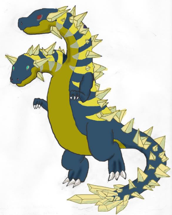
pkmn-taicho321, did an amazing picture of my "CSD" (Crystal Storm Dragon) concept for me. Firstly it's fantastic and secondly thanks again pkmn-taicho321! :D
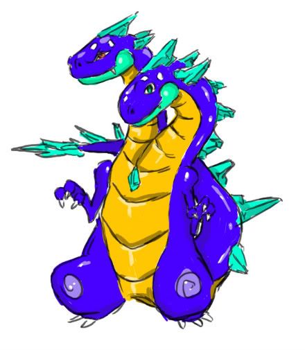
Some Cool Artistic Things He Did With The Concept:

Some Cool Artistic Things He Did With The Concept:
- Gave the two heads a very interesting duality appearance. The left one with red eyes and an evil expression and the right one blue eyes and a kind expression. This duality is so interesting because of electricity having positive and negative.
- The crystals; they look fantastic and excellently detailed.
- Hands are very well done and are a good tip for me.
- The tail has the crystals running up it right to the tip, which looks awesome.

gooey i really like that, but i'm not crazy about the color of blue used for the body. maybe black?


Wow, the quality submissions are really ramping up, I'm intimidated. X); I know the likelihood of mine making it far is low, but I'm forging on anyway; it's fun and good practice.
That said, I'm sketching up a bit of supplementary material. Does anyone have any suggestions of what they like to see in supplementary stuff or any particular requests of such for my fellow?
That said, I'm sketching up a bit of supplementary material. Does anyone have any suggestions of what they like to see in supplementary stuff or any particular requests of such for my fellow?

My new favorite. I would LOVE this Pokemon. =D
Here we go. =) possible final submission? I dunno...

The problem with most Pokemon, as I have seen, is they are delving far too much in 'concepts' and not enough in simplicity. The few that are really exceptional are just simple dragons with little details sewn in to make them electric in nature. I think you should stray from the whole electric concept, and just make a great looking dragon with a few electric details/colors.Wow, the quality submissions are really ramping up, I'm intimidated. X); I know the likelihood of mine making it far is low, but I'm forging on anyway; it's fun and good practice.
That said, I'm sketching up a bit of supplementary material. Does anyone have any suggestions of what they like to see in supplementary stuff or any particular requests of such for my fellow?
Just my personal opinion on the matter. If I could draw, at all, I would totally be in on this. =D

And Palkia's "main" typing is water, but it doesn't look remotely like a water-type.Just playing devils advocate but the "main" typing is electric.
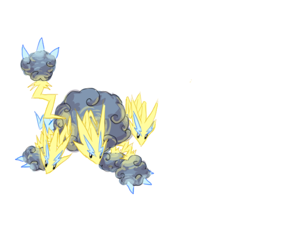
Right now, Cartoons' design is my favourite by a mile. It looks like a cross between a good guy and a bad guy from Spyro the Dragon.


What do you guys think? Worth finishing for CAP?

I definitely liked your previous one better. The yellow dinosaur, with the bulky arms.What do you guys think? Worth finishing for CAP?
That one's face, body, and hands all look really awkward.

Nah BW, your first one was a masterpiece, stick with it man >>

agreed, buffalo, your bulky dragon was one of my favouritesI definitely liked your previous one better. The yellow dinosaur, with the bulky arms.
That one's face, body, and hands all look really awkward.


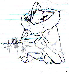
Ah, let see..just decided to scrap my previous one, and try with this one. A bit more 'bulky', and odd looking..why does it remind me of elvis. lol

I hope I'm not too late.
Well, here's my submission, the Friction Frilladora:
Design is simple, an on two Frilladora with a "Royal Cape". The cape is made out of (those wool used in Science classes for friction, and to demonstrate electron and proton attraction). The wool itself protects the fakemon from getting sick. It repels any floating substances that can make the fakemon sick(Shield Dust). The end of its tail is where it can discharge electricity when there's too much friction in the wool of its cape(Like a taser).
Well, here's my submission, the Friction Frilladora:

Design is simple, an on two Frilladora with a "Royal Cape". The cape is made out of (those wool used in Science classes for friction, and to demonstrate electron and proton attraction). The wool itself protects the fakemon from getting sick. It repels any floating substances that can make the fakemon sick(Shield Dust). The end of its tail is where it can discharge electricity when there's too much friction in the wool of its cape(Like a taser).
I really like this, but I think something like a swirling tail (like in Doug Just Dougs) would solidify the dragon feeling. It is really great already though!Curse Photoshop and its constant crashing.
I'll do my other designs over the next few days. Grah. This was a haphazardly drawn design, just to get the feel of the colors. Any suggestions on color changes etc.? And what colors do you think would make my other designs cool?


pkmn-taicho321, did an amazing picture of my "CSD" (Crystal Storm Dragon) concept for me. Firstly it's fantastic and secondly thanks again pkmn-taicho321! :D
Some Cool Artistic Things He Did With The Concept:
- Gave the two heads a very interesting duality appearance. The left one with red eyes and an evil expression and the right one blue eyes and a kind expression. This duality is so interesting because of electricity having positive and negative.
I really like this one, Gooey, but he needs something more "electricky" instead of the crystals. Also, is there a way to put positive and negative signs on each head? Crystals beside, I think it's one of the best here.

I like your concept a lot. I find that if you put more of a background into it people will be more willing to accept it. I highly suggest you color it though, because coloring has a VERY large influence on voting.I hope I'm not too late.
Well, here's my submission, the Friction Frilladora:
Design is simple, an on two Frilladora with a "Royal Cape". The cape is made out of (those wool used in Science classes for friction, and to demonstrate electron and proton attraction). The wool itself protects the fakemon from getting sick. It repels any floating substances that can make the fakemon sick(Shield Dust). The end of its tail is where it can discharge electricity when there's too much friction in the wool of its cape(Like a taser).
Wow, thanks a lot Penguino! :) I haven't thought of much else to make it more "electricky" and to alter that picture is really up to pkmn-taicho321. But in the meantime I altered my picture, while I'm making a new one that has a different color as well as some aspects taken from the one pkmn-taicho did (for example the eyes and tail).
I wanted to put it up before I got into the shading or into drawing a new picture and pose altogether so I could get some opinions, and possibly help get pkmn-taicho321 some opinions, if he wants to change it as well. :)
for comparison you can look up to see my latest: ^^^
Or look at the awesome one done by pkmn-taicho321: http://i257.photobucket.com/albums/hh223/jurassicskin/gks-1.jpg
Or My similar but slightly different older version: http://i257.photobucket.com/albums/hh223/jurassicskin/IMG-2-1colourstriped2.jpg
Or the super oldschool version: http://i257.photobucket.com/albums/hh223/jurassicskin/7.jpg
Let me know what you liked the best of each and I'll make changes accordingly, or if you have a completely new idea let me know about it.
Thanks.
- Status
- Not open for further replies.