
The head is kinda, well, odd. The legs and neck seem too small to support the big head and feet. I like the swirls on the clouds a lot though.
I know I'm a little on the late side but here's mine sans shading. Comments?
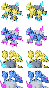
Edit: Added a Shiny. Thought I'd go for the cotton candy look.

-
The moderators of this forum can be found in the CAP forum staff directory.
-
Welcome to Smogon! Take a moment to read the Introduction to Smogon for a run-down on everything Smogon, and make sure you take some time to read the global rules.
-
Congrats to the winners of the 2023 Smog Awards!
CAP 8 CAP 8 - Part 15a - Sprite Submissions
- Thread starter CyzirVisheen
- Start date
- Status
- Not open for further replies.


Here's my front pose. I thougth I'd keep it relatively simple since I don't have too much time for finishing all the sprites. I'll try to get the backpose and possibly the shiny done tomorrow. My favourites right now are Clawed Nyasu's, Headpunch's and Wyverii's, and I have no idea how I'll choose which one to vote for.
I like your pose, but not the pastel yellow. Maybe make it a bit more vivid,and we might just have ourselfs a winner!
Here's my front pose. I thougth I'd keep it relatively simple since I don't have too much time for finishing all the sprites. I'll try to get the backpose and possibly the shiny done tomorrow. My favourites right now are Clawed Nyasu's, Headpunch's and Wyverii's, and I have no idea how I'll choose which one to vote for.
BTW, I hope there's going to be a little shading?

Estranged, I love that pose. It is very dynamic without being too confusing, and the heads are very sleek and cool.

Plus Shading. I think they turned out really well. I have some nit picking that I might do with the out line, mostly make it darker.

Outline is a little darker in this one.

@Estranged: Like already stated, the pose is really cool, but the colors seem a little pale.
@pkmn-taicho321: The ones with the darker outline definetly look better.
Here's my front and back sprites together:

I think these are pretty much done except for any minor tweaking I can do. And how the possible shinies look. I'm not sure on either of them, and will try to tinker around for a better scheme.
Oh, and a question. If we don't make male/female differences do we still need to post a sprite for each gender?
@pkmn-taicho321: The ones with the darker outline definetly look better.
Here's my front and back sprites together:
I think these are pretty much done except for any minor tweaking I can do. And how the possible shinies look. I'm not sure on either of them, and will try to tinker around for a better scheme.
Oh, and a question. If we don't make male/female differences do we still need to post a sprite for each gender?

Ok, well some people seem to be expressing concern for my coloring but no one is really giving me specifics so I dunno what to change. ?_?
What can I change that would make it more pleasing to the eyes? I am quite content with the normal sprites, but I guess the shiny is kinda vivid., i dunno.
What can I change that would make it more pleasing to the eyes? I am quite content with the normal sprites, but I guess the shiny is kinda vivid., i dunno.
KoA I think your biggst problem is with the colors. They look almost grayed out. In addition you have black outlines on a yellow sprite, which makes it look odd. Just some things I noticed.Ok, well some people seem to be expressing concern for my coloring but no one is really giving me specifics so I dunno what to change. ?_?
What can I change that would make it more pleasing to the eyes? I am quite content with the normal sprites, but I guess the shiny is kinda vivid., i dunno.


Alright, made some changes to the front sprites and did the back sprites. Still need to make some more changes before doing a final submission tonight. I lightened the gray, fixed the feet so that it's facing more forward, and made lots of little shading alterations.
I've never done back sprites before, so any advice is greatly appreciated. The shading on the clouds is especially subject to change.
I've become strangely attached to the shiny coloration, so unless anyone has any groundbreaking issues with it, I might keep it.


These look really good. My only issue is on the back sprite, the left head looks a little... "out there" if you know what I mean. Try squishing it in a little towards the other heads.

Alright, made some changes to the front sprites and did the back sprites. Still need to make some more changes before doing a final submission tonight. I lightened the gray, fixed the feet so that it's facing more forward, and made lots of little shading alterations.
I've never done back sprites before, so any advice is greatly appreciated. The shading on the clouds is especially subject to change.
I've become strangely attached to the shiny coloration, so unless anyone has any groundbreaking issues with it, I might keep it.


I thought my front sprite was pretty much done, but then I started messing around with the eyes again. I moved them down a little bit, which I think improves the look. What do you think?
Old->
 New->
New->
 ...
...

I also experimented with completely different head positions.
 ...
...

I'm not sure whether this is a better pose or not. It doesn't look as "defensively ready" as the previous version, but it looks more like it is "stalking" or something. I'm not sure if that improves the sprite, or makes it worse. Your opinions on this would be much appreciated.
Old->


I also experimented with completely different head positions.


I'm not sure whether this is a better pose or not. It doesn't look as "defensively ready" as the previous version, but it looks more like it is "stalking" or something. I'm not sure if that improves the sprite, or makes it worse. Your opinions on this would be much appreciated.
These are very, very, good. This totally has my vote, and I like how you made the shiny, the colours look fantastic and match the concept well. Personally, I like your first position. It seems more bulky and defensive as you said, and it looks more "big". The other one seems a little confused with the heads pointing in different directions and it doesn't look defensive at all. Also, the shorter heads look terrible with the big eyes.I thought my front sprite was pretty much done, but then I started messing around with the eyes again. I moved them down a little bit, which I think improves the look. What do you think?
Old->New->...
I also experimented with completely different head positions.
...
I'm not sure whether this is a better pose or not. It doesn't look as "defensively ready" as the previous version, but it looks more like it is "stalking" or something. I'm not sure if that improves the sprite, or makes it worse. Your opinions on this would be much appreciated.
I would go with the first one, it totally has my vote.
I like the new pose waaaay more, Doug. The new heads too, they just feel better in the Pokémon. While I have to admit I didn't really like the previous sprites you posted in this thread, the new pose + smoother heads have made me reconsider my almost-certain vote to Clawed Nyasu.
Great job!
Great job!


Doug the new pose is amazing, keep that one, and the shiny sprite, amazing as always =)


The newer version certainly looks a lot cooler IMO. Not quite sure which pose is better, though. Pose 1 looks like it could be from the "original" game whereas pose 2 looks more like a "3rd version" sprite. THey're both good, though.I thought my front sprite was pretty much done, but then I started messing around with the eyes again. I moved them down a little bit, which I think improves the look. What do you think?
Old->New->...
I also experimented with completely different head positions.
...
I'm not sure whether this is a better pose or not. It doesn't look as "defensively ready" as the previous version, but it looks more like it is "stalking" or something. I'm not sure if that improves the sprite, or makes it worse. Your opinions on this would be much appreciated.

Eh... Those lightning bolts look WAAAY too thin for my tastes.
Outline is a little darker in this one.
The necks look strangely long compared to the heads, which also look strangely small compared to the body, in my opinion...
I've never done back sprites before, so any advice is greatly appreciated. The shading on the clouds is especially subject to change.
Try making them slightly bigger, and/or bringing them a bit closer.
I definitely like the new pose better...I thought my front sprite was pretty much done, but then I started messing around with the eyes again. I moved them down a little bit, which I think improves the look. What do you think?
Old->New->...
I also experimented with completely different head positions.
...
I'm not sure whether this is a better pose or not. It doesn't look as "defensively ready" as the previous version, but it looks more like it is "stalking" or something. I'm not sure if that improves the sprite, or makes it worse. Your opinions on this would be much appreciated.
However, the eyes on the lowest head look... strange. I think... Too spaced out? Or maybe... low?
Dunno exactly... Compare to the head on our right... I think maybe they look... Wide? Maybe it's the forehead...?
I can't really pinpoint it, but it looks off...
Perhaps you could move move them up, or mess around with them a bit...?
The head on our right's face looks "sharper" and "shorter" than the other two...
...IMO, at least.
But regardless, good job. I really like it.

I much prefer the new pose, Doug. The symmetry of the original head positions felt kind of bland and the new pose I find much more visually interesting.
By far and away Clawed Nyasu's is my favorite back sprite. It's a tricky design to work with and it's easy to end up with something cluttered and hard to read while trying to get in all the elements. I think you've succeeded fantastically in making a backsprite that doesn't look flat, is clear, and, of course, is really cool looking. Overall my favorite colours too.
By far and away Clawed Nyasu's is my favorite back sprite. It's a tricky design to work with and it's easy to end up with something cluttered and hard to read while trying to get in all the elements. I think you've succeeded fantastically in making a backsprite that doesn't look flat, is clear, and, of course, is really cool looking. Overall my favorite colours too.
Alright, thanks for the comments everyone! I had noticed that the necks on my backsprite seemed too long while working on it, but passed that off because Cyzir's original design has such long necks and small heads. But when you put my front and back sprites alongside each other, the difference is really noticeable. I'll make some alterations to that, and also try to make the left head less "out there." Should have a Final Submission out tonight!


I feel that Wyverii has the complete package right now, her front pose is very majestic, and the back pose is very well-done (considering how hard it would be to fit three heads).
Nyasu's front sprite is giving Wyv's some competition, though, imo. Just that your back sprite doesn't seem to match the proportions you've set on your front sprite. The necks are a little too long, and the left head seems out of place. Also, they look very flimsy. The middle head also has way more zigzags than the left and right ones, which makes it look a bit off.
Just my two cents.

I think Nyasu's is currently the number one art out there in this sprite submissions' thread. Feel free to disagree, but to one their each own.

This. Use this please.
Just tilt the left head to the opponent, and you should keep the other two heads as they are.
Then my 1st vote has been decided.
Edit: Ok maybe you should do something about it's far back leg, the lightness of it is strange. Try darkening it.
- Status
- Not open for further replies.