CAP 9 CAP 9 - Sprite Submissions

Status
Not open for further replies.
Doug, the backsprite is great. It looks cool, and I like the way your sprite is taking a different direction than all the other sprites. However, I noticed that the spikes on the back are shorter than they appear on the front sprite.

Also Wyverii, I'm digging that Black/Gold combo =)
 
Since there's still plenty of time to burn and very little critque for my work, I might as well try a few shinies. I've made four very different shinies with the original on the left along with back sprite versions for comparison. Backsprite has also been tweaked.

Original sprites:


Shinies:


I'll be perfectly happy to make variations on these. The alternate colours of the sprites are a minor thing but I have little else to do.
I like the orange one, I think it is a brilliant colour scheme.
 
Man, both Wyverii's and Cartoons!'s are really good. I dig that smile on Wyverii's since it makes it look kinda like a jerk. Which kinda translates to dark type for me.

The orange looks good for the shiny, as does Cartoons!'s red.
 
I just don't like the black drills, Cartoons!. That's the only thing that doesn't 100% sell me on yours. Other than that, I'd say it's pretty much perfect.
 
Since there's still plenty of time to burn and very little critque for my work, I might as well try a few shinies. I've made four very different shinies with the original on the left along with back sprite versions for comparison. Backsprite has also been tweaked.

Original sprites:


Shinies:


I'll be perfectly happy to make variations on these. The alternate colours of the sprites are a minor thing but I have little else to do.
I know this has been said many times, but that orange shiny is great. BUT I think that those golden drills & teeth on the grey shiny would look awesome on the orange shiny.
 
First of all, I would just like to say this: Cartoons!, that final submission is looking good. Guess I'll be seeing you at the polls.

Anyways, onto the next round of commenting and critiquing...

@ aragornbird: I gotta say that I am loving that back sprite of yours. It's just... wow...

I've already commented upon your front sprite at some point earlier on, so I'm not going to reiterate my complaints on it since you have already heard them and considered them.

@ Wyverii: Personally, I think that the original shiney colors that you put up there were fine. The one next to the original and the one on the right look good too, though. It's your choice, though. Go with a set of colors YOU like.

@ KoA: Thanks for going on to make the sprites animated for me, especially since I seem to be the only one who suggested it. I really apreciate it.

Also, I really thing that it should give the "bursting from the ground roaring like a Hell hound" sort of image even better that way. Obviously, if you find that you don't like it that way, you don't have to keep it that way: it was merely a suggestion (anything that I post is meant to be that way) and I certianly hope I didn't make it seem like a demand or something along those lines.

@ XandZero2: The dirt on the front sprite is in better alignment now. Now I think everyone who has commented upon it feels a little better about that issue now.

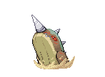
At this point, I can't comment on the back sprite right now even though you would like us all to "tear it apart"; it's too early for me to do so. I need to see some color first.

Overall, great job to all of you guys, whether you are done or you are still chugging away at your sprites.

Edit:

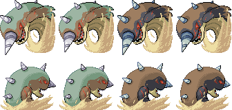
Okay, Xandzero2, now that your back sprite is colored, I can say something. The coloring on it is lovely so far, like it is on the front sprite. That arm, though, looks like it's just... there. I'm not entirely sure what Colosoil is doing there; I'm guessing that he's clenching his fist.

Either way, I'll be watching your progress on this, as well as that of everyone else who is still working on their sprites.

Edit (again):

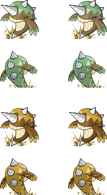
KoA, that animation is AWESOME! I agree that it IS, in fact, faithful to what you were initially going for. Your hard work has really paid off here.


Haha, the Colossoil with yellow drills and teeth makes me think of 'grillz.' It's got quite the 'bling-bling,' if I do say so myself.
/stupidity

Er, I think that if you're going to use a yellow, you should tone it down.
 
@ Wyverii:

I really like the orange and brown colour scheme; the colours go great together. If you were going to change the colour of the teeth I would much sooner prefer to see a grayish colour rather than the golden yellow.
 
Taking that into account, I added some "soul" to his eyes as well as toned down the scars just a smidge.


Working on a supporting animation as per Sezja's request. I'm hoping it sets my vision across.
The one drop point here, in my opinion, is the stomach of the front sprite.
It's how it's body curves, all the way around.
It looks like he just jutted out of the sand on his back, and makes him look much longer and way too thin.
Really, just trim it down a bit. So that it ends a little closer to the... "Stomach lines". Or whatever they are called...
And possibly move those up a bit as well...

Also, while less of a problem, the back sprite also looks a bit thin.
It's also likely because of the curveback. It curves back towards our right towards the bottom.


But yeah. Other than the "thinness" problems and such, you have a solid sprite there. Great job.
Even now it's better than anything I could do. =3
 
:)

Well, I'm turning in, but I was able to just finish the still WIP version of my backsprite, although it's now in color! Whoo!


I plan on moving the arm to where it is more in front of it rather than drooping, but other than that, C+C determines what this sprite will look like. I am going to have lots of free time tomorrow since school convieniently lets out early, so I plan on working out all the kinks in the meantime and finalizing it tomorrow. So, Hit Me Now!

^And remember, C+C is highly smiled upon.^
 

DougJustDoug

Knows the great enthusiasms
is a Site Content Manageris a Top Artistis a Programmeris a Forum Moderatoris a Top CAP Contributoris a Battle Simulator Admin Alumnusis a Smogon Discord Contributor Alumnusis a Top Tiering Contributor Alumnusis an Administrator Alumnus
Moderator
I changed my backsprite, based on the suggestion from ReysonTheNoble, who noted that the drills on the back sprite were a little short compared to the front sprite. Originally, I had to do that due to lack of space. But, I later changed things and I have plenty of room at the top. So I extended the top drill a little on the backsprite, to make it less stubby. Thanks for the tip, Reyson!

Anyway, here are my current "leaping" sprites, including shinies. These are all the male versions. The female versions will not have any scars.


KoA

Sorry, I thought anteaters were real
is an Artist
Doug I quite like it, however the middle spike on the back pose sticks out to me. Something is off about it and I think it is that the spirals aren't matching the angle you have the spike at.

If you curve in the edges of the spike a bit more, I think it would look alot better and be more fitting to the angle you want it in. :)


Anywho, as per Sezja's advice, I did a lil animation. It was tough to get the desired dynamism I wanted to portray using only two frames, so I emulated the sprite effects that most D/P animations use. I think it is quite faithful to the vision in my mind that I was trying to get across.


I'm on Google Chrome because Firefox ecided to stop working, so i dunno how fast the animation is playing because it is slow on my end but supposed to be going at .02 secs a frame.


Also tweak up the main sprite submission and thinned out his bottom a bit:


And if you guy are curious, here's my "full sheet", including all the frames so far of Mr. Blubbers.
http://i10.photobucket.com/albums/a.../My Sprites/collosoil_full7819097616-iaza.png
 
I changed my backsprite, based on the suggestion from ReysonTheNoble, who noted that the drills on the back sprite were a little short compared to the front sprite. Originally, I had to do that due to lack of space. But, I later changed things and I have plenty of room at the top. So I extended the top drill a little on the backsprite, to make it less stubby. Thanks for the tip, Reyson!

Anyway, here are my current "leaping" sprites, including shinies. These are all the male versions. The female versions will not have any scars.

I think your back sprite is easily on of my favorites, but I feel like I should still be seeing some head drill, and that you should drop the chin a few pixels so it's more consistent with the front sprite.

KoA I have something to say that I almost feel sorry for saying, but I actually like the "second frame" of your animation more than I do the actual sprite. It's really too bad that we couldn't see the sprite animated on shoddy, because that would be awesome.


I'm crazy, I need to get some sleep... ah but here are some changes to my sprites, hope I'm not breaking any rules since I said I put in my final submission:


Made the chin a little less prominent and shaped up those back drills as well as tried to make the eyes look better... I don't think I succeeded.


The dirt was bothering me... It just didn't look right. I like it now but I want to hear what you think!
 
I think the front sprite could do with either a crease in its belly, or the top few pixels [on the left side of its belly] moved to the right a bit. Theres something about it at the moment that seems off to me.

Also, the back sprites drills seem to have too dark an outline, like they've just been stuck on his back.

Other than that, this is one of my favourite sprite sets.

@KOA - the only thing I think looks 'wrong' on yours is that the sand follows the curve of the pokemon, looking almost like part of it rather than a plane that its crashing through. I think if the sand were flat at the bottom it would look more like its bursting through the ground.
 
KoAs sprite best for me. It looks really dynamic, and the back sprite is great. I don't know if the front is little to thin to match the mass of the art, but I think it looks great still.
 

Arkeis

(づ。◕‿‿◕。)づ
is a Top Artist Alumnusis a Community Leader Alumnus
Almost done here


I made some adjustments based on comments. Also made a female version, which has no scars and a curly pattern instead of a jagged one.
 
Here's my current backsprite. I repositioned the arm to where it looks less limp. I also made the eye a bit smaller and squinty, too. Hopefully this can help net me a win. Tell me what you guys think.


If you disagree with my reasoning, please tell me how I can make it better. Because, like everyone here, I also thive off of Comments and Criticisms. So please, speak out! :)
 

DougJustDoug

Knows the great enthusiasms
is a Site Content Manageris a Top Artistis a Programmeris a Forum Moderatoris a Top CAP Contributoris a Battle Simulator Admin Alumnusis a Smogon Discord Contributor Alumnusis a Top Tiering Contributor Alumnusis an Administrator Alumnus
Moderator
I updated my sprites a little based on feedback. Here's a full cutsheet (male on the left, female on the right):


KOA, I took your advice and reworked the middle drill on my backsprite. I agree the perspective on the spiral was a little off. I don't know about the rest of you spriters -- but these drills on this design are a major pain to sprite! Angles and curves are hard to sprite anyway -- combining a cone and a spiral is a total nightmare. I've done my best to make them look right, but it is certainly not easy...

Taicho, I've tried a bunch of ways to show a little bit of the head drill somehow on the backsprite. Because of the angle of the pose, at best there should only be perhaps the tip of the drill visible, if at all. When I add just the tip showing, it looks really out of place, and it's not obvious that it is the tip of the head drill showing. If I make it longer, then it doesn't fit the perspective of the pose, and looks weird. So, I decided to leave it out -- which is actually true to the pose and perspective anyway. But, I agree that the head drill is a major part of the pokemon design, and it's a little odd that you can't see it in my backsprite. But, I think the fact that you CAN'T see it distinguishes my backsprite somewhat, and reinforces that you are looking at the pokemon from behind. Also on your suggestion, I experimented with the chin on the backsprite, but couldn't lower it without sacrificing the illusion of body curvature, which is hard to pull off with all the foreshortening I'm using.

YDG, after your suggestion to add a crease to the belly of my front sprite, I tried a couple of different creases. I even posted it on #cap and discussed it with Wyverii. We both agreed that the crease just didn't work. And we both concluded that any decent belly crease would require a fairly big overhaul in the positioning of my front sprite. I honestly don't have the motivation to make a big change to my sprites at this point. But, I agree with you that the belly is just slightly off somehow. I tweaked the outlines on the drills of the backsprites, based on your suggestion. I agree they were a little too bold and rigid.
 
Status
Not open for further replies.

Users Who Are Viewing This Thread (Users: 1, Guests: 0)

Top