Eh, I guess it makes sense that a Slaking would pick its nose. I just don't get why people would want to train a pokemon that is seen picking its nose. I do love the smug look it has on its face though - its Gen 6 sprite lends itself well for looking smug with its new lounging pose.Pretty sure this was the intention here. Slaking is a super lazy Pokemon so why not have it pick its nose? Its a really common gesture of lazy people. Also if you interpret this a bit more then you can also make out this along with Slaking's facial expression makes it look smug. This probably means it doesn't care if it's lazy or not. You can tell quite a lot from a sprite... it's not the matter of if a sprite is appealing or not though as this was probably intended as this sprite definitely matches Slaking's known way of life (being lazy), I think it's a good sprite because of these reasons as it conveys what the Pokemon stands for nicely.
If only they can make the nose sticking more clearer though, but otherwise there doesn't seem to be anymore problems, its a good sprite imo.

-
Welcome to Smogon! Take a moment to read the Introduction to Smogon for a run-down on everything Smogon, and make sure you take some time to read the global rules.
-
Congrats to the winners of the 2023 Smog Awards!
Worst Pokemon Sprites?
- Thread starter Rankumander
- Start date

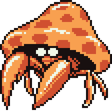
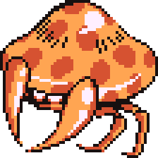
Not sure if they count, since they're not meant to be viewed in battle or such, but here goes anyway. The mini-sprites used for Pokemon in the menus for example can be a bit unappealing when taking a closer look at them. I guess the Pokemon don't always look good in all perspectives, though. Main example I wanted to bring up was Hoopa-Unbound.
Quite a bit of detail is lost, like it only has 2 of the 6 arms, and the face mostly seems like a jumbled mess of pixels. Guess this is just a consequence of having complicated designs

Quite a bit of detail is lost, like it only has 2 of the 6 arms, and the face mostly seems like a jumbled mess of pixels. Guess this is just a consequence of having complicated designs
When I was little, Articuno's sprite in Red/Blue scared the hell out of me when I first encountered it for some reason. Sure, Golbat's sprite was worse, but you got used to it after a while, whereas the legendaries you only encounter once. Maybe it was how I interpreted the sprite, to me, it looked like Articuno had tiny, dead-looking eyes that were set too low on its face and the open beak was way too large in proportion to the face and eyes, giving the appearance of a deformed dead bird. Basically, this is what I saw:
What it was:
Not sure if Articuno's sprite is supposed to be depicting small, beady eyes or if the white part above the pupil is supposed to be the sclera, making his eyes much bigger than I imagined. If it was the latter that was intended, it makes Articuno look slightly less creepy.
And speaking of the Legendary Birds, Moltres's sprite was even worse. Just look at the Moltres sprite from the Japanese Red/Green:
Looks derpy with his eyes half closed, and not even facing the right direction.
The updated sprite from the international Red/Blue was hardly any better:
To me it looks like a Fearow that was run over by an 18-wheeler truck and later set on fire by a sadist. It doesn't even look like Moltres
Last edited:
Not sure if anybody has mentioned this, but another thing that I always found baffling was the number of halfway decent sprites in the Japanese Green/Red version that actually became worse when they were supposedly "fixed" in the international Blue/Red version. Why did GameFreak even bother expending the effort to make perfectly decent sprites look worse?
Cloyster in Green. Not too bad, really
Cloyster in Blue. Why is Cloyster lying sideways here?
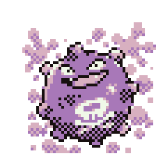
Koffing in Green. Not a bad sprite of Koffing at all.
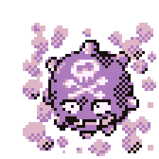
Koffing in Blue. Why is his face upside-down?
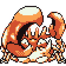
Kingler in Green
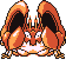
Kingler in Blue. Why is Kingler mirrored? And his claws are not supposed to be the same size.
Exeggcute in Green.
Exeggcute in Blue. Why is the middle egg disproportionally huge?
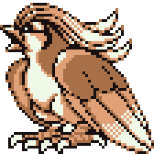
Fearow in Green.
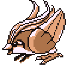
Fearow in Blue. Why does Fearow have no neck? And why does it appear his wings are not attached to his body?
Parasect in Green.
Parasect in Blue. Parasect's claws are not supposed to be attached to the mushroom.
Pidgeot in Green.
Pidgeot in Blue. Where's the rest of his body? Pidgeot is basically a head with feet and wings. Kind of reminds me of another unrelated Pokemon:
Cloyster in Green. Not too bad, really
Cloyster in Blue. Why is Cloyster lying sideways here?
Koffing in Green. Not a bad sprite of Koffing at all.
Koffing in Blue. Why is his face upside-down?
Kingler in Green
Kingler in Blue. Why is Kingler mirrored? And his claws are not supposed to be the same size.
Exeggcute in Green.
Exeggcute in Blue. Why is the middle egg disproportionally huge?
Fearow in Green.
Fearow in Blue. Why does Fearow have no neck? And why does it appear his wings are not attached to his body?
Parasect in Green.
Parasect in Blue. Parasect's claws are not supposed to be attached to the mushroom.
Pidgeot in Green.
Pidgeot in Blue. Where's the rest of his body? Pidgeot is basically a head with feet and wings. Kind of reminds me of another unrelated Pokemon:
Last edited:
Geez, what is that? Some sort of glitch or something? ;)I just really don't like this one: View attachment 144550
I feel like, it's just a very random sprite and totally not creative.
Yes! This is my thought haha! Its can't be a bird, never!Geez, what is that? Some sort of glitch or something? ;)
I'm currently playing Crystal, and I noticed something: this Furret has a mustache:


I s'pose I'll go about this gen-by-gen. I feel like, after going through this thread, I'm not as bothered with the ones people usually are and vice versa.
Front sprites
-----------------------------------------


Charmander's unusual face shape bugs me, Ratatta's strange coloring (especially when you see it compared to RBG colors) is odd, Ekans' face is strangely long, & Raichu is oddly proportioned. I know it's a common one, but Jigglypuff and Wigglytuff's eyes really bother me, along with Golbat's, which I see people hating on for the RB sprite- which I actually like. Parasect's weird bulge on its back bothers me, along with Golduck's siberian-fox like face. Primape is too spiky, Bellsprout has these weird dot eyes they used a few times & Graveler's face is too far back. The RBG Gastly has always bothered me because it specifically looks like purple MS Paint spray tool with eyes. I get that it's gas, but even Haunter stayed truer to its true depiction while adding some gas particles around it. I hate Hypno's nose, how there's just one giant Exeggcute in the background (the fact that that's never used again simultaneously makes me question and dislike this more but also makes me glad), Exeggutor's faces never looked right in first gen and Lickitung's tongue is backwards, and its head is too big. Rhydon just looks odd, Pinsir's got those dot eyes and I'm not sure why, while Porygon's got these super round eyes that look like they've just been stuck on. Most RBY sprites are improvements on G but G totally did this one better. I love the Pokemon, but Dragonite looks badass in RBY and really dumb in G. Don't get me wrong, a silly happy dude is fine, but it's a bit over the top.
Back sprites
-----------------------------------------


What's up with the weird beady eyes? Bulbasaur, Beedrill, Machop, Lapras, Jolteon & Dragonite all have really dead looking eyes, and they make me kinda uneasy. Charmeleon's got a weirdly plump nose, and its spike looks like its separated from the head. Charizard is mostly fine but the mouth really bothers me. I never got why Squirtle and Wartortle have dimples, something that's never been depicted elsewhere. Weedle is fine except its nose is too far down its face and they never fixed this. Beedrill doesn't even look like Beedrill. Nidoqueen (..I think) is too squashed. I have a Clefable in my Blue team (a really cute Pokemon, especially in its Yellow depiction) but the lopsidedness of its proportion in this sprite always bugs me. Vulpix is unrecognizable- its eyes and hair are super inconsistent to anything else. Meowth's ears got curved somehow, and Golduck looks shocked. Mankey just looks like squiggles, and it's disproportionate. Poliwrath has a weird shoulder blade and Bellsprout needs to be put back in the kiln. I've always disliked Geodude's RBGY appearance because it's got these weird lumps on its head- I didn't add the front sprite to this because the artwork is fine it's just this detail that bothers me. As much as I love Grimer's RB front sprite its back sprite is something else. Horsea looks like it's broken its neck, and Scyther looks wack. Jynx is odd too, and Tauros is super hard to make out. Vaporeons is interesting- not that it's particularly bad, but that it seems like they used the beta design, and what's weirder is they never updated this in RBY. Last of all Kabuto's eyes are way too far back and it has ridges that shouldn't be there.
 By MahoxyShoujo on deviantArt
Front sprites
-----------------------------------------


Charmander's unusual face shape bugs me, Ratatta's strange coloring (especially when you see it compared to RBG colors) is odd, Ekans' face is strangely long, & Raichu is oddly proportioned. I know it's a common one, but Jigglypuff and Wigglytuff's eyes really bother me, along with Golbat's, which I see people hating on for the RB sprite- which I actually like. Parasect's weird bulge on its back bothers me, along with Golduck's siberian-fox like face. Primape is too spiky, Bellsprout has these weird dot eyes they used a few times & Graveler's face is too far back. The RBG Gastly has always bothered me because it specifically looks like purple MS Paint spray tool with eyes. I get that it's gas, but even Haunter stayed truer to its true depiction while adding some gas particles around it. I hate Hypno's nose, how there's just one giant Exeggcute in the background (the fact that that's never used again simultaneously makes me question and dislike this more but also makes me glad), Exeggutor's faces never looked right in first gen and Lickitung's tongue is backwards, and its head is too big. Rhydon just looks odd, Pinsir's got those dot eyes and I'm not sure why, while Porygon's got these super round eyes that look like they've just been stuck on. Most RBY sprites are improvements on G but G totally did this one better. I love the Pokemon, but Dragonite looks badass in RBY and really dumb in G. Don't get me wrong, a silly happy dude is fine, but it's a bit over the top.
Back sprites
-----------------------------------------


What's up with the weird beady eyes? Bulbasaur, Beedrill, Machop, Lapras, Jolteon & Dragonite all have really dead looking eyes, and they make me kinda uneasy. Charmeleon's got a weirdly plump nose, and its spike looks like its separated from the head. Charizard is mostly fine but the mouth really bothers me. I never got why Squirtle and Wartortle have dimples, something that's never been depicted elsewhere. Weedle is fine except its nose is too far down its face and they never fixed this. Beedrill doesn't even look like Beedrill. Nidoqueen (..I think) is too squashed. I have a Clefable in my Blue team (a really cute Pokemon, especially in its Yellow depiction) but the lopsidedness of its proportion in this sprite always bugs me. Vulpix is unrecognizable- its eyes and hair are super inconsistent to anything else. Meowth's ears got curved somehow, and Golduck looks shocked. Mankey just looks like squiggles, and it's disproportionate. Poliwrath has a weird shoulder blade and Bellsprout needs to be put back in the kiln. I've always disliked Geodude's RBGY appearance because it's got these weird lumps on its head- I didn't add the front sprite to this because the artwork is fine it's just this detail that bothers me. As much as I love Grimer's RB front sprite its back sprite is something else. Horsea looks like it's broken its neck, and Scyther looks wack. Jynx is odd too, and Tauros is super hard to make out. Vaporeons is interesting- not that it's particularly bad, but that it seems like they used the beta design, and what's weirder is they never updated this in RBY. Last of all Kabuto's eyes are way too far back and it has ridges that shouldn't be there.

Many of the problems of the back sprites come from the fact they are actually based on the Red/Green front sprites, and were not remade for Red and Blue.Back sprites
-----------------------------------------
What's up with the weird beady eyes? Bulbasaur, Beedrill, Machop, Lapras, Jolteon & Dragonite all have really dead looking eyes, and they make me kinda uneasy. Charmeleon's got a weirdly plump nose, and its spike looks like its separated from the head. Charizard is mostly fine but the mouth really bothers me. I never got why Squirtle and Wartortle have dimples, something that's never been depicted elsewhere. Weedle is fine except its nose is too far down its face and they never fixed this. Beedrill doesn't even look like Beedrill. Nidoqueen (..I think) is too squashed. I have a Clefable in my Blue team (a really cute Pokemon, especially in its Yellow depiction) but the lopsidedness of its proportion in this sprite always bugs me. Vulpix is unrecognizable- its eyes and hair are super inconsistent to anything else. Meowth's ears got curved somehow, and Golduck looks shocked. Mankey just looks like squiggles, and it's disproportionate. Poliwrath has a weird shoulder blade and Bellsprout needs to be put back in the kiln. I've always disliked Geodude's RBGY appearance because it's got these weird lumps on its head- I didn't add the front sprite to this because the artwork is fine it's just this detail that bothers me. As much as I love Grimer's RB front sprite its back sprite is something else. Horsea looks like it's broken its neck, and Scyther looks wack. Jynx is odd too, and Tauros is super hard to make out. Vaporeons is interesting- not that it's particularly bad, but that it seems like they used the beta design, and what's weirder is they never updated this in RBY. Last of all Kabuto's eyes are way too far back and it has ridges that shouldn't be there.
By MahoxyShoujo on deviantArt
Among other things, it explains Charmeleon's weird round snout, or (which you didn't mention) Venusaur looking like it's being squashed by its flower.
Ah, that makes sense. I noticed they stayed same throughout the versions.Many of the problems of the back sprites come from the fact they are actually based on the Red/Green front sprites, and were not remade for Red and Blue.
Among other things, it explains Charmeleon's weird round snout, or (which you didn't mention) Venusaur looking like it's being squashed by its flower.
I remember the old days of the menu sprites. Your Bulbasaur looks like some unidentifiable fire flower mutant, Onix was some snake thing with a lump on its head, and Squirtle was a doggy-paddling Kirby?


One of these is not like the other.


MegaArceus just reminded me of one thing from my childhood.
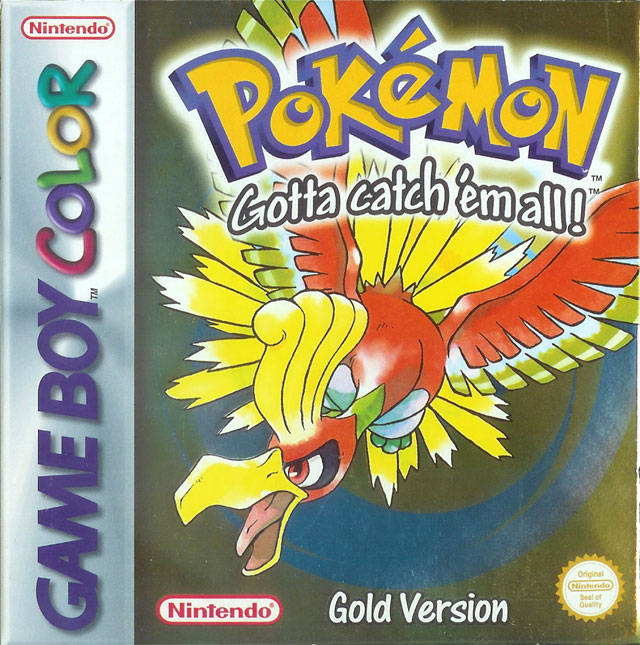
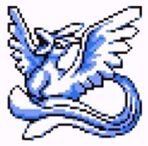
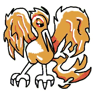
When I saw box art of Gold I always thought it was a blue eyed demon bird who had a red eye in the mouth. I think this pose + colors used in ho-oh and background that messed up with my mind.
I was so confused when I never saw this pokémon in the game but Silver still had their mascot. :(
When I saw box art of Gold I always thought it was a blue eyed demon bird who had a red eye in the mouth. I think this pose + colors used in ho-oh and background that messed up with my mind.
I was so confused when I never saw this pokémon in the game but Silver still had their mascot. :(
I don't like this pose at all. Charmander looks like it's asking for an ice beam to its crotch.

I also hate what Platinum did to Chatot too. First sprite is from debut game, Diamond Pearl, inoffensive, unassuming, fine. But in Platinum, they made it so much meaner-looking, and it just doesn't suit its personality at all. At least they fixed it the next generation.


Magneton is also really confused on how it should orient itself, and how many screws it should get total (like does one get three screws other two get two screws or do all three get three each?). Even its box icon hasn't been updated, though Game Freak has shown to update box icons for some existing Pokemon like Latias and Blaziken, so what's the hold up on Magneton?


Latias has always looked strange Gen 3, as she looks shocked as you are to see her on a random route, but what the hell exactly is going on in her Emerald animation? Is she getting hit by invisible pin missiles and losing balance?

Porygon2's back sprite in Gen 5 is just bad. It has seen better back sprites. I blame it on how the battlefield is set up, it makes the sprite smaller and gives Porygon2 less space to have accurate eyes. Its second sprite just looks better. In fact, something about Porygon2's Gen 5 sprites look off, like its feet seem misplaced and gives too little weight to its body, like the feet are too small and tucked too close in the body.


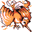
But hey, all Porygon2 sprites beat out this abomination

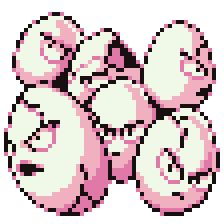
Seaking has its own mood slider in Gen 4.


But look how devastated Seaking is in Gen 3. :(

I also hate what Platinum did to Chatot too. First sprite is from debut game, Diamond Pearl, inoffensive, unassuming, fine. But in Platinum, they made it so much meaner-looking, and it just doesn't suit its personality at all. At least they fixed it the next generation.
Magneton is also really confused on how it should orient itself, and how many screws it should get total (like does one get three screws other two get two screws or do all three get three each?). Even its box icon hasn't been updated, though Game Freak has shown to update box icons for some existing Pokemon like Latias and Blaziken, so what's the hold up on Magneton?
Latias has always looked strange Gen 3, as she looks shocked as you are to see her on a random route, but what the hell exactly is going on in her Emerald animation? Is she getting hit by invisible pin missiles and losing balance?
Porygon2's back sprite in Gen 5 is just bad. It has seen better back sprites. I blame it on how the battlefield is set up, it makes the sprite smaller and gives Porygon2 less space to have accurate eyes. Its second sprite just looks better. In fact, something about Porygon2's Gen 5 sprites look off, like its feet seem misplaced and gives too little weight to its body, like the feet are too small and tucked too close in the body.
But hey, all Porygon2 sprites beat out this abomination
Seaking has its own mood slider in Gen 4.
But look how devastated Seaking is in Gen 3. :(
I'd say Platinum Chatot looks like it's yawning or waking up, rather than mean.I also hate what Platinum did to Chatot too. First sprite is from debut game, Diamond Pearl, inoffensive, unassuming, fine. But in Platinum, they made it so much meaner-looking, and it just doesn't suit its personality at all. At least they fixed it the next generation.
Well, either way, it doesn't make too much sense to me. Birds don't hold up one foot while they're yawning. Birds do go on one foot, like Torchic or Hoothoot, while they're resting, but not awkwardly like Chatot.
Make of what you will from its back sprite; it looks like it's ready to bite someone (and yeah, birds bite and look exactly like this while they bite).

And there's Chatot's art, which is... why did they give Chatot those eyes...? Is it supposed to replicate those times people took a photograph of someone blinking but didn't want to do a retake? Is Chatot ticked off at Ken Sugimori's taking too long to draw? Did it just got woken up? Is it trying to be threatening? Is it depressed that it has the stats and movepool of a generic bird Pokemon and subject to constant bullying by Dodrio?

That, the pc box sprite, and the Platinum sprite are the only times it has those eyes.
Make of what you will from its back sprite; it looks like it's ready to bite someone (and yeah, birds bite and look exactly like this while they bite).
And there's Chatot's art, which is... why did they give Chatot those eyes...? Is it supposed to replicate those times people took a photograph of someone blinking but didn't want to do a retake? Is Chatot ticked off at Ken Sugimori's taking too long to draw? Did it just got woken up? Is it trying to be threatening? Is it depressed that it has the stats and movepool of a generic bird Pokemon and subject to constant bullying by Dodrio?
That, the pc box sprite, and the Platinum sprite are the only times it has those eyes.
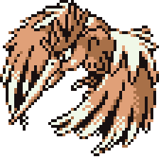
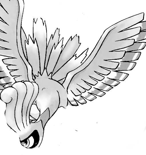
Ho-Oh, the majestic rainbow bird, has had some pretty... eh... sprites.
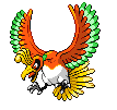
I don't buy this flapping animation. That's just not how birds fly. I think there's way too much weight at the body of Ho-Oh, and the flapping feels like there's no force. Overall, I'm not getting this "majestic Rainbow bird". An angle change, a pose change (it might not even have to be flying). It is certainly a left over from the Gen 4 sprite, but it didn't translate all that well. I know developers don't go out of their ways to make new poses for a lot of older Pokemon, but if the result is bad, it's worth pointing out.
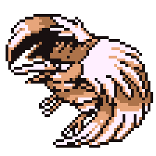
Somehow, the back sprite looks a little better, probably because the head reads a lot better by not overlapping in front of the wing, so it makes for a better silhouette. But still, it's not consistent with the front sprite. I have to knock on the animation too; Ho-Oh looks like its headbanging to a metal song and the wing animation is still completely off (heck, I just have an issue with Ho-Oh's overall wing design which probably is part of the reason the animation looks off). The perspective on the tail is wrong too.
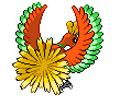
This is the 3D model, where you don't have to worry about perspective.

They CAN do pretty good flying animations. Pelipper's is great, it actually captures the graceful flight the pelican is known for doing.

But actually, I don't really like any of Ho-Oh's sprites. 3D model is the best depiction of Ho-Oh. The original Gold sprite is the second best, but the disproportionate parrot beak makes it look more silly than majestic. Mainly because Ho-Oh's neck isn't unnaturally bent downward in a forced way to make it seem threatening. But I like the 3D model and its animations capture Ho-Oh better especially as its flapping animation is pretty slow, but helps give it a ton of volume that the Black White sprite failed to do. I also dig the color better in the 3D model. I prefer this cooler shade of orange more than the yellow orange one Ho-Oh previously had because it serves better contrast to the yellow tail feathers. Ho-Oh actually does go through several different types of red-orange and orange, but they should settle on red-orange.

And while I don't have a problem with Ho-Oh's back sprite being reused several times, because it's a mostly decent back sprite. I just don't understand why some of its tail feathers show up. They certainly don't read as tail feathers. You have to mess around with both perspective and proportion to get those feathers showing. I think they have to put them volume there because having just Ho-Oh's head and neck can be awkward for a back sprite.

But overall, I do like Ho-Oh a lot. But it seems to me that, despite being initially designed with 2D in mind, it looks better in 3D than 2D. I'm really not a fan of how they keep craning Ho-Oh's head down, making the bird's neck look strained. It doesn't help that well with the overall silhouette because the head is a good little piece of contrast between its massive wings and making that head too close to the body seems to throw it off. I guess they want to emphasize the wing size, but I don't think moving the head up detracts from it.
This is the worst offender.


I don't buy this flapping animation. That's just not how birds fly. I think there's way too much weight at the body of Ho-Oh, and the flapping feels like there's no force. Overall, I'm not getting this "majestic Rainbow bird". An angle change, a pose change (it might not even have to be flying). It is certainly a left over from the Gen 4 sprite, but it didn't translate all that well. I know developers don't go out of their ways to make new poses for a lot of older Pokemon, but if the result is bad, it's worth pointing out.
Somehow, the back sprite looks a little better, probably because the head reads a lot better by not overlapping in front of the wing, so it makes for a better silhouette. But still, it's not consistent with the front sprite. I have to knock on the animation too; Ho-Oh looks like its headbanging to a metal song and the wing animation is still completely off (heck, I just have an issue with Ho-Oh's overall wing design which probably is part of the reason the animation looks off). The perspective on the tail is wrong too.

This is the 3D model, where you don't have to worry about perspective.

They CAN do pretty good flying animations. Pelipper's is great, it actually captures the graceful flight the pelican is known for doing.

But actually, I don't really like any of Ho-Oh's sprites. 3D model is the best depiction of Ho-Oh. The original Gold sprite is the second best, but the disproportionate parrot beak makes it look more silly than majestic. Mainly because Ho-Oh's neck isn't unnaturally bent downward in a forced way to make it seem threatening. But I like the 3D model and its animations capture Ho-Oh better especially as its flapping animation is pretty slow, but helps give it a ton of volume that the Black White sprite failed to do. I also dig the color better in the 3D model. I prefer this cooler shade of orange more than the yellow orange one Ho-Oh previously had because it serves better contrast to the yellow tail feathers. Ho-Oh actually does go through several different types of red-orange and orange, but they should settle on red-orange.

And while I don't have a problem with Ho-Oh's back sprite being reused several times, because it's a mostly decent back sprite. I just don't understand why some of its tail feathers show up. They certainly don't read as tail feathers. You have to mess around with both perspective and proportion to get those feathers showing. I think they have to put them volume there because having just Ho-Oh's head and neck can be awkward for a back sprite.

But overall, I do like Ho-Oh a lot. But it seems to me that, despite being initially designed with 2D in mind, it looks better in 3D than 2D. I'm really not a fan of how they keep craning Ho-Oh's head down, making the bird's neck look strained. It doesn't help that well with the overall silhouette because the head is a good little piece of contrast between its massive wings and making that head too close to the body seems to throw it off. I guess they want to emphasize the wing size, but I don't think moving the head up detracts from it.
This is the worst offender.

Generation IV Rayquaza looks like it's wearing lipstick: (at least to me. None of the other games seem to have this issue)


Well, it's the only sprite or model that ever depicted Rayquaza with its mouth closed...Generation IV Rayquaza looks like it's wearing lipstick: (at least to me. None of the other games seem to have this issue)