


What he could do is make the regular version glowing red and the shiny version glowing green, or vice versa. I think that might help to distinguish it as a fire type.@Doug I also really love the design! It's a really cool concept, but I think you should change up the palette a little bit to make it seem a little more Fire-typish.

-
The moderators of this forum can be found in the CAP forum staff directory.
-
Welcome to Smogon! Take a moment to read the Introduction to Smogon for a run-down on everything Smogon, and make sure you take some time to read the global rules.
-
Congrats to the winners of the 2023 Smog Awards!
CAP 14 CAP 3 - Art Submissions
- Thread starter Wyverii
- Start date
- Status
- Not open for further replies.


I like this dog.


Mos, that pic is GREAT! The little flourishes are delicious. Makes me love your lava lamp snail even more than I already did. You rock!
So adorable, guys! Just fell more in love with both designs.
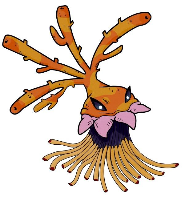
Here's a quick anatomy lesson on my current WIP, cos I think that "skirt" might be confusing currently. It's actually a mass of red-tipped tentacles.

Here's a quick anatomy lesson on my current WIP, cos I think that "skirt" might be confusing currently. It's actually a mass of red-tipped tentacles.

Tea_and_Blues, I think that the 3rd color scheme is the best way to go.
However I do have to question why you chose that tunic of tentacles to have such thin components? I think it would serve the design better to have only a few, really thick tentacles like what lileep and cradily have; perhaps you could alternate them with the pink acrorhagi-thingies?
@Sonic the Hedgedawg, do you say this knowing that I based it on a cone snail? if not, you might want to read up on them.
I looked closely at Tentacruel while thinking about tentacles, so I considered very thick ones, but eventually decided that I wanted a sense of density to the base. The tentacles snag on and wrap around rocks and things on the ocean floor. They're this Pokemon's anchor. I'd very seldom depict the tentacles as more than a diffuse mass, like a lot of jellies have (example). Although, that said, I'm actually working on a piece of supporting art where it is using its tentacles to draw in prey.
I'll sketch out some versions with Lileep-like tentacles and see how it looks. Thanks.
I'll sketch out some versions with Lileep-like tentacles and see how it looks. Thanks.
Easily my favourite 2 submissions for the contest by far.[pic]
I like this dog.
I really really really wish both could make it :(
My only complaints on either design are as follows:
Mos-Quitoxe - I am aware that the fluid inside the shell must be toxic because it is a poison pokemon, but nothing about the design screams "poison" to me... lava, as in a laval lamp, could just as easily look like a Rock/Fire, Steel/Fire or Ground/Fire pokemon.
Doug Just Doug - I love the idea of radiation as a spin on poison/fire, and I always like your submissions... and this qualm is but a tiny one, but the tongue in the drawing.... I just don't get what it's connected to :/
Side-Note, I'm a bit surprised that so few people went in an "oil" themed direction, as flammable oil fully captures both poison and fire typings.
I definitely like Doug's second design more than the first, it's cute, and the theme of radiation definitely fits with the typing. My other favorites remain Cyzir's manticore and Mosquitoxe's snail (awesome and totally creative!), though a few others caught my eye and will definitely get my vote if detail or technique is improved a bit.... among them the fire raptor, the scorpion, skull spider, and cartoons' dinosaur (which actually is pretty much perfect, though I prefer the other two myself).
I might contribute a design.... maybe. It's already so far along and I don't think I can really contend with you guys. ;w; We'll see....
I might contribute a design.... maybe. It's already so far along and I don't think I can really contend with you guys. ;w; We'll see....

Update
with all the criticism about the smoke v things, I think I'll get rid of them, however I think that this would make it look to plain and not poison enough
if anyone has some suggestions on what i should replace the smoke vs with I would love to hear it


Oh look at that
Radioactive slime dogs and lava lamp cone shells abound, and yet here I am offering up my boring old fire lizard
Travesty...

Darkened colour and new pose. Though, I think I liked the old pose better, now I come to think on it...
Although, this did get me thinking. Blue fire anybody?

...yeah that's all I've got.
I'm wondering whether it's worth still pursuing this design or trying the more convoluted ninja-lizard that I originally had planned but never got past the design stage. Either way, feedback is appreciated.
Also, I prefer that it looks simple, as that's really how most Pokemon tend to be. I'm seeing magnificent designs here and there but quite a few of them are very complicated or busy. But that's just my personal opinion; I wouldn't dream of asking for anything else.
Steampowered it would honestly be better if you ditched the v's entirely and had the smoke come out of those oddly-shaped holes on the back.
Finneomnomnom


Made him stumpier because someone suggested it. We need more OU cutemons.
Bobe Beebbabb!
Blea and Tues - Love where it's goin'. Ya may want ta keep the mouth an' such a bit less complex, the way ya have those red dots now will probably end up being bitchy for the spriting step.
BugBaniacMob - I'd say maybe thin the blades. Those fuckers are thick as his fingers, an' if you imagine it in proportion to wolverine's claws, that would be one hell of a heavy hand. Maybe also shortening would help.
Peamstowered - I kinda like where this is going, but yeah, the v's are my only not-liked-that-much part. Maybe if ya made the smoke coming out of those holes in his back? (and probably darken it a lot too.)
DougDustJoug - I really like this puppy one, it's cute. I might suggest giving him a faint glowiness to further improve the idea of radioactivity.
Yilx - I love where this is going now. That is zeta awesome.
Chornthild - I like the most recent one a lot better than the older ones, making it more like a lantern was exactly what I woulda suggested. I think the fire on the top may be unnecessary.
Tarc6kMeam - Ahahaha, I get it. I like it, and I can't really pin anything down wrong other than the awkward angle on its stage-right head.
Tintin - Yeah, I'm getting a lot more steel out of it, just like everyone else. I'm not sure how I'd suggest to change that.
Nov - I'd like to see it with its tail not behind its head, I couldn't tell that was a tail at first. Other than maybe being a bit too complex or cluttered, it's an awesome design.
CueBloncept - Pretty awesome. I'd say maybe having the flamethrower hands without the flames on them would look the way coolest.
Heetloof - I don't know what it is but something for me doesn't really jive. I almost feel it's more of a fire/steel that was coloured purple instead of a naturally purple creature.
SaintPeagull - I have all the squee obsessing over how much he looks like stitch. I fucking love this thing.
Solstice - The orange is probably not the best colour choice. I'd maybe say something a lot duller, like a white or an orangey-grey.
Mueblon - I'm not getting the fire out of this at all. I'd most likely think it was a water/rock at first. Probably adding some orange and yellow flame patterns to the crab could help remedy this, but that seems like too obvious a solution.
Ruckechoo - I'm not too keen on the orange/purple cloudy texture. Maybe if you made it more of an orange/red cloudiness? Also I think the idea of coral would be moreso conveyed if the lines were more rigid instead of curvy.
OSiYerdLouSikeHENTRET - This is pretty awesome. The posing seems a bit off-balance but the design is rockin'.
DroranDagon - I think I already suggested this, but I feel the purple and orange clash too much.
Noobiess - I like the look of the uncoloured one, but the snake has a really nice colour scheme goin' on.
Luneralfaughter - Not sure about the farting part, but otherwise, awesome.
Ikasu - Pretty good, but I'd attach the tentacles. Also, if that middle part is a fire, I'd suggest detaching that to make it not appear as some flowey frilly things.
Calad - LOVE it. Mucus seems a bit of an odd colour, but if it's the proper colour, then hey, it's the proper colour.
StenergyOrm - Maybe add some bend in the wings and colour that bitch, and it'll be fuckin' incredible.
Mari - I'd suggest making it more of a brown to camouflage with the desert sand, and make the scars red to really let us see this alleged magma. Also purple rose tail (probably not a rose but it looks like one) Seems unbalancing and too vivid.
MLaRF - Watch out for the spikes.
BugBaniacMob - I'd say maybe thin the blades. Those fuckers are thick as his fingers, an' if you imagine it in proportion to wolverine's claws, that would be one hell of a heavy hand. Maybe also shortening would help.
Peamstowered - I kinda like where this is going, but yeah, the v's are my only not-liked-that-much part. Maybe if ya made the smoke coming out of those holes in his back? (and probably darken it a lot too.)
DougDustJoug - I really like this puppy one, it's cute. I might suggest giving him a faint glowiness to further improve the idea of radioactivity.
Yilx - I love where this is going now. That is zeta awesome.
Chornthild - I like the most recent one a lot better than the older ones, making it more like a lantern was exactly what I woulda suggested. I think the fire on the top may be unnecessary.
Tarc6kMeam - Ahahaha, I get it. I like it, and I can't really pin anything down wrong other than the awkward angle on its stage-right head.
Tin
Nov - I'd like to see it with its tail not behind its head, I couldn't tell that was a tail at first. Other than maybe being a bit too complex or cluttered, it's an awesome design.
CueBloncept - Pretty awesome. I'd say maybe having the flamethrower hands without the flames on them would look the way coolest.
Heetloof - I don't know what it is but something for me doesn't really jive. I almost feel it's more of a fire/steel that was coloured purple instead of a naturally purple creature.
SaintPeagull - I have all the squee obsessing over how much he looks like stitch. I fucking love this thing.
Solstice - The orange is probably not the best colour choice. I'd maybe say something a lot duller, like a white or an orangey-grey.
Mueblon - I'm not getting the fire out of this at all. I'd most likely think it was a water/rock at first. Probably adding some orange and yellow flame patterns to the crab could help remedy this, but that seems like too obvious a solution.
Ruckechoo - I'm not too keen on the orange/purple cloudy texture. Maybe if you made it more of an orange/red cloudiness? Also I think the idea of coral would be moreso conveyed if the lines were more rigid instead of curvy.
OSiYerdLouSikeHENTRET - This is pretty awesome. The posing seems a bit off-balance but the design is rockin'.
DroranDagon - I think I already suggested this, but I feel the purple and orange clash too much.
Noobiess - I like the look of the uncoloured one, but the snake has a really nice colour scheme goin' on.
Luneralfaughter - Not sure about the farting part, but otherwise, awesome.
Ikasu - Pretty good, but I'd attach the tentacles. Also, if that middle part is a fire, I'd suggest detaching that to make it not appear as some flowey frilly things.
Calad - LOVE it. Mucus seems a bit of an odd colour, but if it's the proper colour, then hey, it's the proper colour.
StenergyOrm - Maybe add some bend in the wings and colour that bitch, and it'll be fuckin' incredible.
Mari - I'd suggest making it more of a brown to camouflage with the desert sand, and make the scars red to really let us see this alleged magma. Also purple rose tail (probably not a rose but it looks like one) Seems unbalancing and too vivid.
MLaRF - Watch out for the spikes.


Okay, in an attempt to make it more potentially sprite-able, and less detailed, I've redesigned slightly keeping most of the same elements:
- No longer has a mouth, now it absorbs food through its tentacles.
- Tentacles are fewer and bulkier, though not massive, just hopefully thick enough to sprite distinctly.
- Can still close its pink toothacles, and retract its tentacles, making it bulkier looking.
- Still has red-stingers on tentacles.
- Less massive coral arms.
- Can more plausibly swim now, with its arms acting as a tail.
I'm pretty happy with the results, and think I'm finally getting the hang of drawing with a mouse instead of colour pencils.
- No longer has a mouth, now it absorbs food through its tentacles.
- Tentacles are fewer and bulkier, though not massive, just hopefully thick enough to sprite distinctly.
- Can still close its pink toothacles, and retract its tentacles, making it bulkier looking.
- Still has red-stingers on tentacles.
- Less massive coral arms.
- Can more plausibly swim now, with its arms acting as a tail.

I'm pretty happy with the results, and think I'm finally getting the hang of drawing with a mouse instead of colour pencils.
I am going to have such a hard time picking between Mos and Tea's entries when it comes to voting. :O
That looks more reasonable now tea; good job!

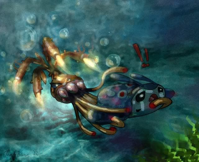
I guess this could be an example of how it might use Bind, Giga Drain, or even just Poison Sting. Yes. I had waaaay too much time on my hands, but drawing with a computer is still fairly new to me, I only ever try it out for CAP entries, so only just discovering what I can do. ...and obviously having too much fun.
I, too, am iffy about underwater flames. I wanted to make it look like it might be boiling the water around it, but I think that would take more detail than I'm currently capable of.
tea_and_blues, that concept art is absolutely incredible. Could you do some of it using Poison-type moves such as Acid Spray, Toxic Spikes, Gunk Shot, Poison Jab, etc? I'd 100% vote for it if there was more evidence of it being a Poison-type.
Also, I wouldn't worry about the underwater flames, You could say it works like a welding torch, with a protective shielding gas seperating the flame from the water. Attacks such as Flamethrower and Fire Blast could be used by releasing flammable gas towards opponents at high velocities before igniting it with the coral stems.
Also, I wouldn't worry about the underwater flames, You could say it works like a welding torch, with a protective shielding gas seperating the flame from the water. Attacks such as Flamethrower and Fire Blast could be used by releasing flammable gas towards opponents at high velocities before igniting it with the coral stems.

That supplementary art is beyond amazing, tea_and_blues! My only gripe about it is that you should give it a reasonable amount of tentacles if you still wish to keep them.
MLaRF, I think it looks better this way too. Definitely gives more of a 'pokemon' feel.
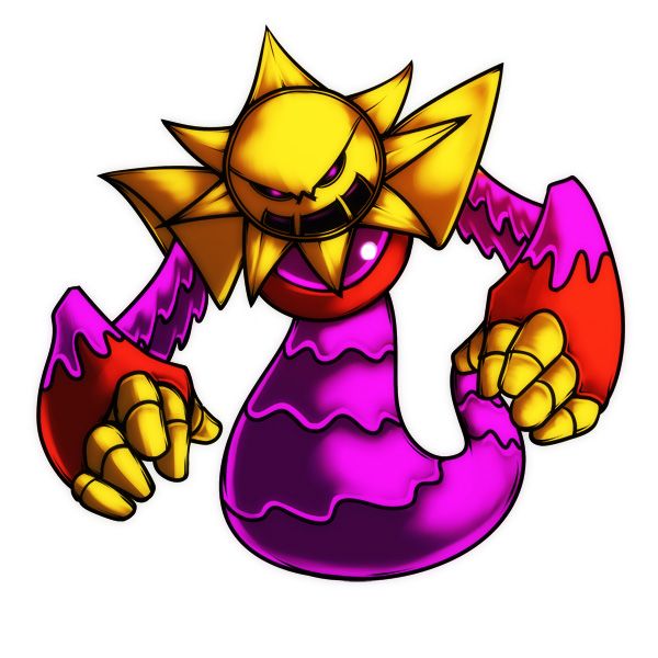
Finished my sun golem thing...
MLaRF, I think it looks better this way too. Definitely gives more of a 'pokemon' feel.
Finished my sun golem thing...


Mos Quitoxe, DougJustDoug and Tea and Blues, all of you guys have amazing designs.
@Mos Quitoxe: I just flat out love the design. It's so cute, and it'll depend on the stat spread for me to decide which cap to use. If it's not the most powerful but is more defensive yours is one of the better, if not the best, design.
@DougJustDoug: I'm going to agree with what scampy said. With a tongue that matches the interior that dog would be perfect, but a little more fire in the look would be nice as well. Other than that, I love it.
@Tea and Blues: I love this design. It's really creative and I love how it works with stopping water types. Maybe make it resemble a little more fire? Something like making the top coral parts resemble flames or something like that, just a suggestion. It looks great.
Overall, all of your guys designs are amazing. Potentially make them look a little more reptilian because of dry skin winning the ability poll, but they are phenomenal. Keep up the good work guys!
- Status
- Not open for further replies.