CAP 8 CAP 8 - Part 15a - Sprite Submissions

Status
Not open for further replies.
I was just about to say it looked great, but I just noticed...
...Compared to some of the others, it looks rather... Small...
Look at Wyverii's and aragornbird's...
...Although I think I'm just getting nitpicky. =P
Good job- and I like that gray color.

Oh, I like this one.

Er... The area the necks conjoin looks strange...?
And I guess the leg on our far right (it's left paw) seems kind of small compared to the others. Perhaps you could puff it a bit...?
That's all I can think of.
Great work!
 

DougJustDoug

Knows the great enthusiasms
is a Site Content Manageris a Top Artistis a Programmeris a Forum Moderatoris a Top CAP Contributoris a Battle Simulator Admin Alumnusis a Smogon Discord Contributor Alumnusis a Top Tiering Contributor Alumnusis an Administrator Alumnus
Moderator
I changed the eyes on my sprite to get rid of the "cross-eyed look" some people mentioned. I also made the eyebrows more like little lightning bolts.

Old->
New->


I really like Aragornbird's newest sprite, and I think Wyverii has a masterpiece -- as usual. If I decide not to make a full submission out of my sprite (it should make a nice avatar, don't you think?) then those two are the ones I'll support out of the current stuff posted here. I'm still curious to see what KOA comes up with though. I simply can't name a favorite until all the big names have weighed in.
 

KoA

Sorry, I thought anteaters were real
is an Artist
Eh well, I finally gots my sprites drawn up. I shall scan and edit the outlines at once.

Wow Wyv you were right, the backpose was a pain in the ass, but I'm quite confident the end result came up swell. ;)
 
So I made the female sprites (they have slightly shorter eyebrows), and a possible shiny palette.

I don't know how to sprite (although I would love to learn how...), but this is one of the best so far IMO. The only real issue I have with it is that I can't notice the eyebrow length difference very well. Maybe the female should have the eyebrow length everyone else has been using and the male can have eyebrows that are extra long compared to the female?

idk, just my 2 cents.
 
At long last...


It is complete! I can't believe this thing took me upwards of 3 hours...

Any comments? What colour should the shinies be?
I really like the pose on this thing, it's nice and dynamic, which is a little difficult to pull off well given the body type of our chosen pokemon, you've represented movement well. A problem that I see is that the coloring is dithered, which was okay for Gold Silver gen sprites, but the sprites in the current gen are more saturated. One way to fix that is to choose a median color between the two colors you are dotting the areas with and use that color in those areas instead.

You are onto something here and I think you should maybe consider continue working on this a bit more, it has really good potential!
 
I don't know how to sprite (although I would love to learn how...), but this is one of the best so far IMO. The only real issue I have with it is that I can't notice the eyebrow length difference very well. Maybe the female should have the eyebrow length everyone else has been using and the male can have eyebrows that are extra long compared to the female?

idk, just my 2 cents.
Alright, how about this?


Okay, so that's my last update for today. I'm off to bed.
 

KoA

Sorry, I thought anteaters were real
is an Artist
Just posting my outlines so you people don't think I'm a liar. ;o

They only exist in drawing form at the moment and are in no way finalized as of yet. I am aware of the massive tweaking to be done in the final stages.

Front sprite:
http://i10.photobucket.com/albums/a110/kingofanime/Art/Fairly%20Recent%20to%20New%20Art/frontspriecopy.png

Well, since this guy is more bulky, (and action poses didn't work out too well) I tried to put him in a more crouched defensive stance. It's got that "Hey come here and try to hit me" feel to it. Needs obvious head restructuring and foot placement, but that's the gist of how it will look.

Back sprite:
http://i10.photobucket.com/albums/a110/kingofanime/Art/Fairly Recent to New Art/backspriecopy.png

For once, I did a decent job on a pose for a backsprite. This thing was pure unadulterated horror to draw from the rear view, but at last I settled on a pose I like. I think I might even like it more than the front pose for now. Furthest head from the left needs some work but that's about it really.

I get to start the fun pixelling work when I wake up in the morning! <3
 

KoA

Sorry, I thought anteaters were real
is an Artist
Yeah, all three necks need to be kinda scooted over to the left.

This will be easy to fix though when i start pixelling and should make the rest of it look more pleasing to the eye.

It also didn't help that I originally drew him facing right. (I'm left handed and have a problem drawing pictures facing certain directions. It's hard to explain.)
 
KoA, your backsprite drawing is awesome, I can't wait to see your first sprite submission.

I love the right head, it's mouth makes it look really cute.
 
Wow, there are so many great sprites here! Anyway, I'm going to give my two cents on some of them.

Wyverii, that looks amazing. It really does look like a Pokemon sprite, the coloring is fantastic, and that pose is really cool. I would definitely be scared if I was facing that thing in battle. Great all around.

Chaoscrippler has another of my favorite submissions. That pose looks great, and I also like the coloring a lot. I also like the shiny sprite a lot better than some of the pink ones that have popped up.

DougJustDoug, I really like your pose, but the area where the heads are feels a little crowded. Maybe you could change it up a bit, where one or two heads are in a different spot? Just a minor nitpick - other than that, great sprite.

KoA, on your frontal drawing, all the heads look pretty much the same, which I have a bit of a problem with. "Twinning," as I like to call it, or heads on a multiheaded beast that look the same, doesn't look that great in the long run. However, the back drawing looks great.

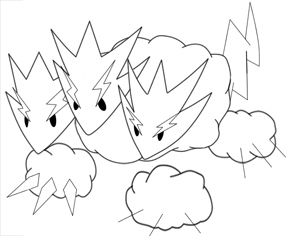
Atryoki, I agree with the others in that it looks a bit small, and the twinning problem exists again (the left and middle heads). I like where you're going, but it could still use some work.

I can't see aragornbird's sprite on my school computer for some reason, so I'll give some feedback when I get home.
 

Backs are done. I think i'll need to add an extra layer of shading for the heads on the back or deepen the shades slightly since it looks to bright at the back in my opinion. I like how the clouds and tail came out though. Maybe the necks need shifting and changed. Very difficult this one.
 

Backs are done. I think i'll need to add an extra layer of shading for the heads on the back or deepen the shades slightly since it looks to bright at the back in my opinion. I like how the clouds and tail came out though. Maybe the necks need shifting and changed. Very difficult this one.

Wyverii, you did an AMAZING job once again. I am glad that your heads and the clouds' are properly outlined, and don't fuzz into each other like a lot of the others. One thing though, if you are going to go pink on your shiny sprite, you should go pink. Make it a little bit poppier and brighter. Its a little too dark of a shade of pink in my honest opinion. Good luck with the polls, you almost certainly have my vote. :)

EDIT: Oh, and one other suggestion for the back sprite, you should have the neck of the middle head pointing more towards the screen. His head and neck look a little crooked in the back sprite.
 

KoA

Sorry, I thought anteaters were real
is an Artist

There's my fixed frontpose and now I'm off to paint. Peace out homeskillets.
 
I like it a lot Wyverii, but the right most head on the sprites that you would see if you were using it seems odd - it looks as if there is a spike and then a stumpy head. Sorry for being so obsessive about the small details, it just looks a bit strange. Great design though, KoA will have to surprise me for me to change my vote.
 

Backs are done. I think i'll need to add an extra layer of shading for the heads on the back or deepen the shades slightly since it looks to bright at the back in my opinion. I like how the clouds and tail came out though. Maybe the necks need shifting and changed. Very difficult this one.
I like the back's main idea, although the necks definitely look rather long and jagged. I wouldn't be afraid to maybe have one head cover the other's mouth or such, if only slightly.

And the shading on the (yellow) electricity definitely needs some tweaking... It looks kind of bright...

The tail and cloud definitely turned out turned out amazing.
No need to change those.


Still my #1 vote, at the moment. =P
 

bojangles

IF YOU TRULY BELIEVE,
is a Site Content Manager Alumnusis a Battle Simulator Admin Alumnusis a Smogon Discord Contributor Alumnusis a Tiering Contributor Alumnusis a Contributor Alumnusis a Top Smogon Media Contributor Alumnusis an Administrator Alumnus
Those are so amazing Wyverii, you've got my vote (again). The only thing is that the middle neck on the backsprite seems like its zagging really far to the left. I don't know if that was you intention, but maybe make it feel like its coming back (ignore this if its like impossible lol). Also, it may just be me, but the necks on the back sprite seem a bit think. still, what great work

PS I would love to use a front sprite as an avatar if you separated the image at some point
 
I love this sprite. My favorite thing about this sprite is how you've made the cloudes look armor-like but still have the feeling of a cloude. I love the shape of the heads and their placing. The whole pose has this "I am redy, bring it on!" feeling but still looks like it could be really cute and cuddly.
 
Status
Not open for further replies.

Users Who Are Viewing This Thread (Users: 1, Guests: 1)

Top